
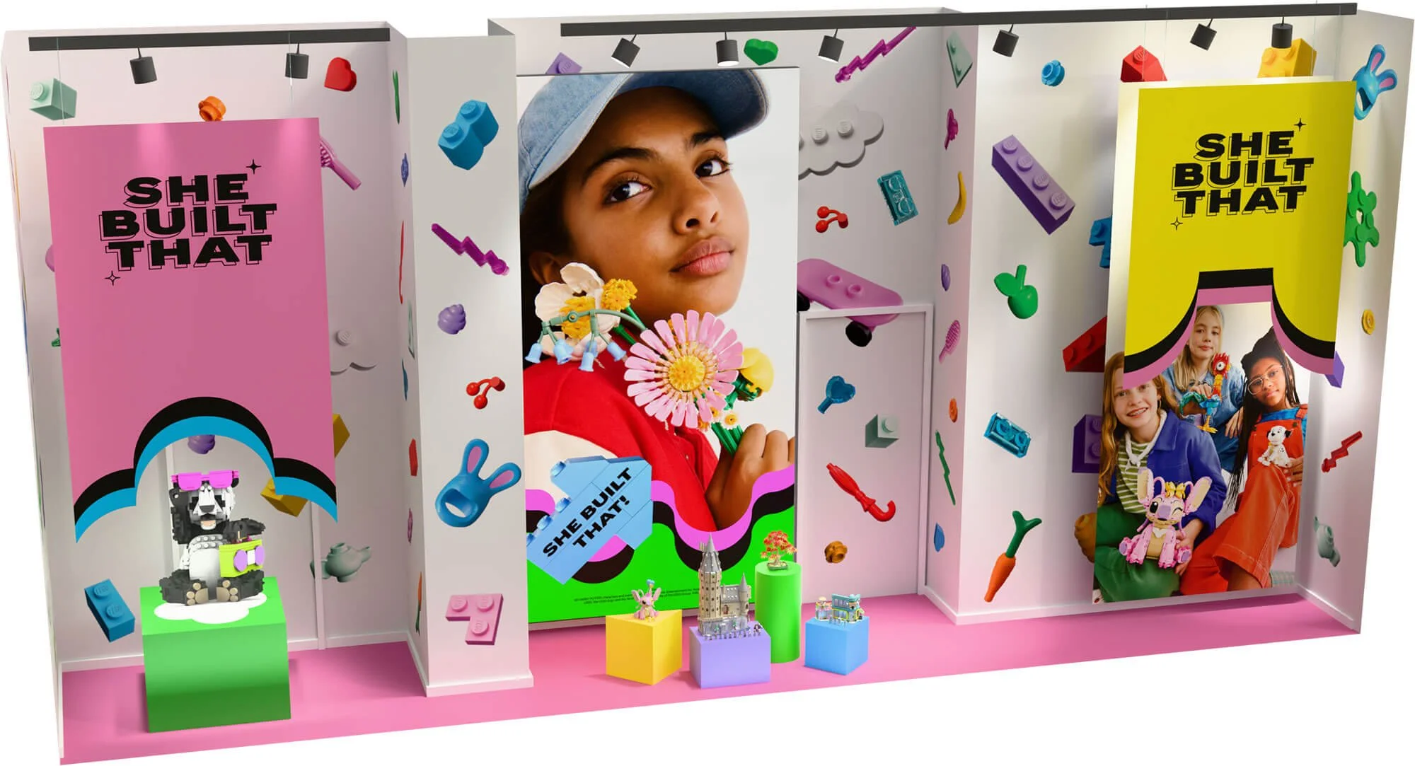
LEGO Girls Campaign
This campaign challenged the idea that “builders” are boys. Anchored by the message She Built That, each touch point put girls and their builds front and center. Clear, playful, and unapologetic, the campaign made creativity feel powerful the moment you entered the space.
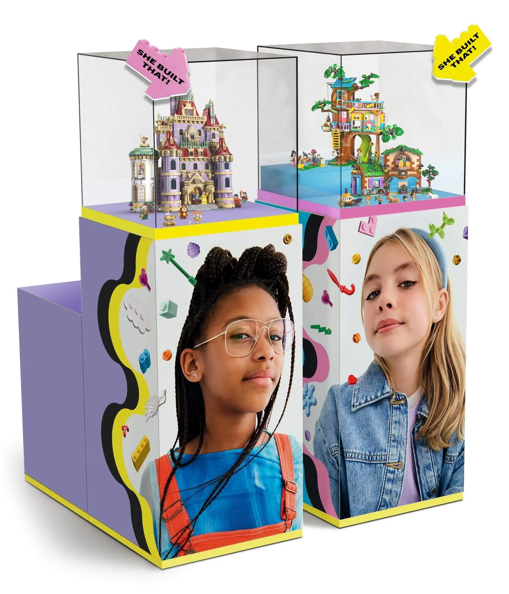
Primary Display
Upon entering the store, this central display set the tone immediately. Split into two themed sections, each case used a distinct color palette echoed across the campaign to create cohesion and clarity. Bold arrows paired with She Built That! directs attention to the models, conveying a strong sense of ownership.
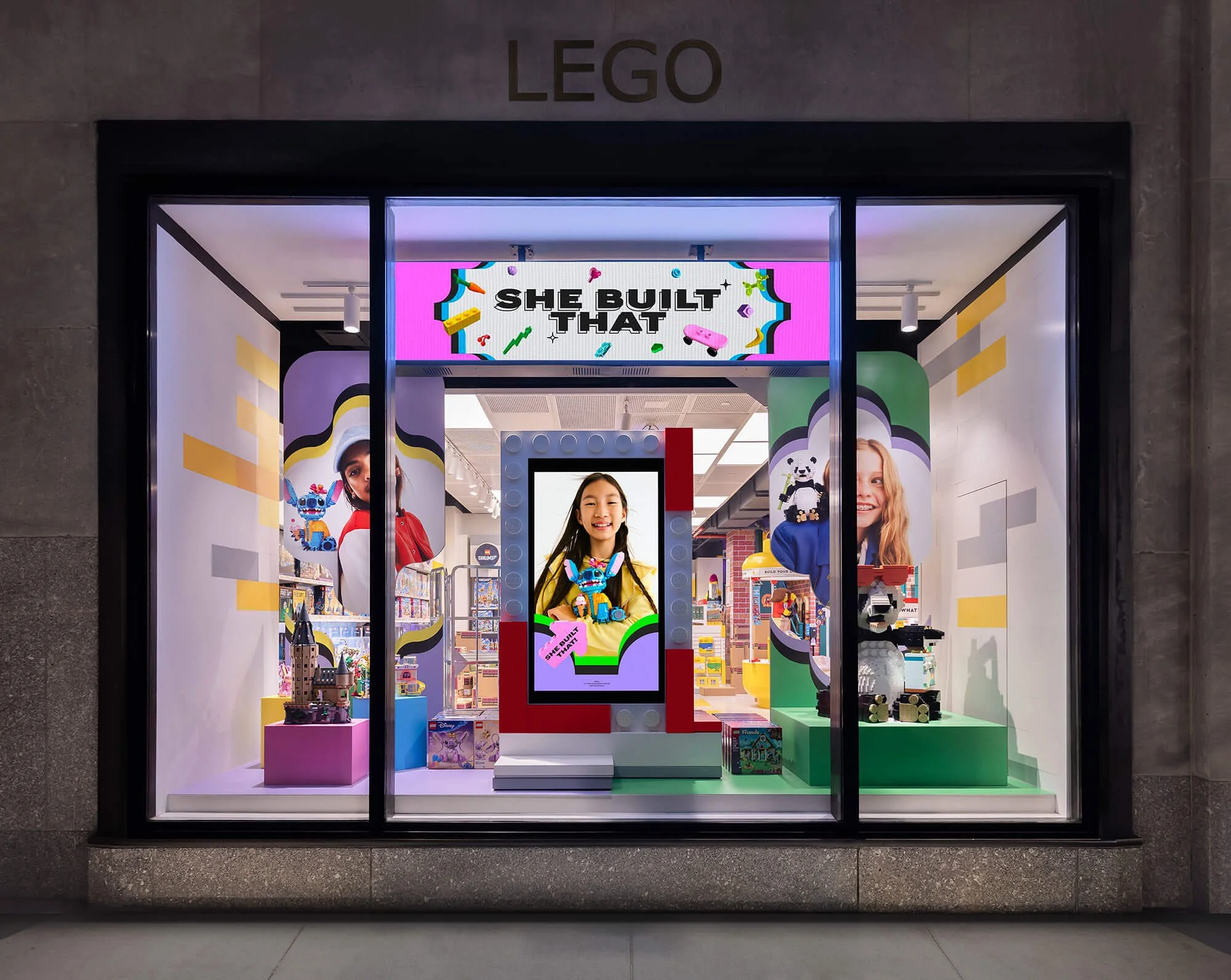
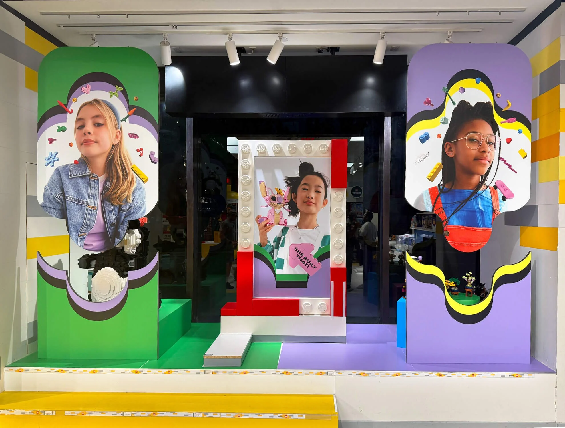
5th Avenue Campaign Window
The Fifth Avenue flagship window was designed as a bold public statement. Saturated color, custom podiums, and dynamic photography created energy without overwhelming the space.
A ripple backdrop framed the builds and imagery while maintaining clear sight lines into the store. The result was playful, polished, and impossible to miss.
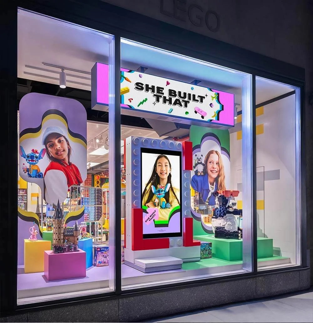
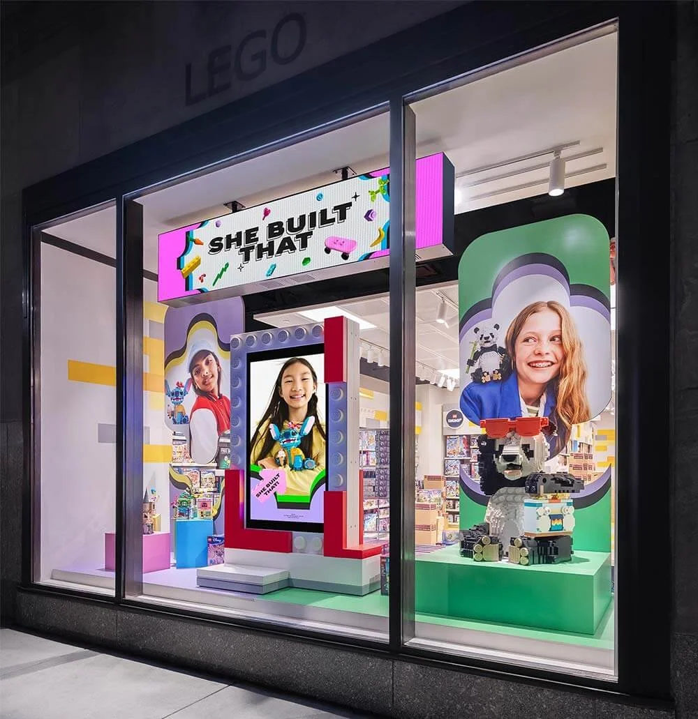
5th Avenue Windows
Located in a high traffic area, these windows needed instant impact. Oversized brick built models of Stitch and Angel capitalized on the buzz around the new Lilo & Stitch release.
Vibrant ripple graphics and tightly paired color palettes framed the models, creating excitement that cut through street level visual noise.
Leicester Square Window
Designed to align with the New York flagship, this London window carried the campaign into a new context. A large panda model anchored the display, supported by key products beneath a central digital screen.
Layered ripple elements, brick graphics, and flanking banners added depth and cohesion, creating a globally consistent yet locally impactful moment.