LEGO® LATES
A testing initiative with the goal of aligning the LEGO® brand with strategic partners and demonstrating relevance with low/no affinity adults through various passion points. Hosting a series of PR-worthy events with brick-in-hand experiences that turns attendees into promoters of the brand. These after hours events would be held at LEGO stores in major cities around the world including New York, London and Shanghai.
Partnering with brands like BAFTA, Universal Music Group featuring Skip Marley and fashion designer Grace Chen we were able to attract adults with a passion aligned to the focus for each specific event. The events were a huge success, driving traffic to LEGO retail channels and engaging new fans by showcasing how LEGO building fits within their lifestyle/passions.
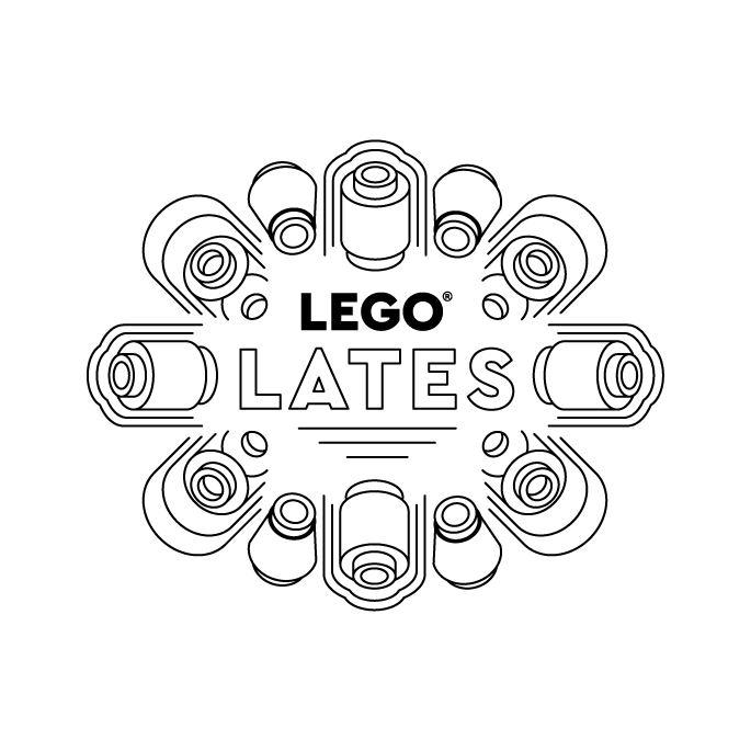
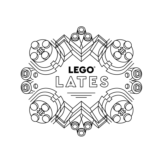
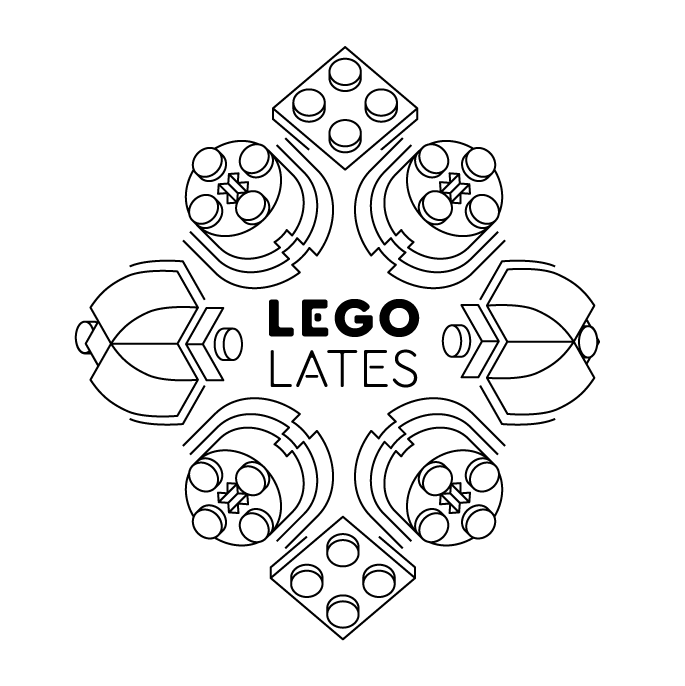
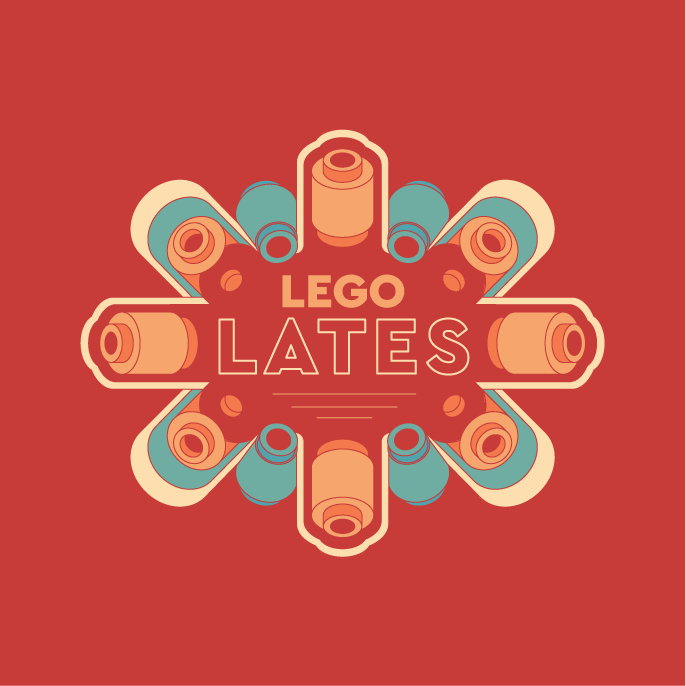
The visual identity, and toolbox for the various passion points had to elevate the brand while still retaining its DNA. We wanted to present the band in a way no one has seen before. I went with a minimalist line art approach for the lock up, giving it a clean and sophisticated aesthetic not typically associated with LEGO. Using a combination of abstract lines and brick elements we were able to transcend the brand's public image while still being identifiable.
Icons were created for each passion point category as well as a tool box relating to each event's topic. A cohesive and unique look was achieved by working brick elements into the designs of objects such as headphones, sound waves, cameras, film strips, thread and scissors.
Film Toolbox – Film strips, camera, reels and clack board made from LEGO brick elements.
Music Toolbox – Turntable, boombox, faders, music note and sound waves made from LEGO brick elements.
Sewing w/wo Botanical Forms Toolbox – Scissors, button, safety pin, needle and thread made from LEGO brick elements. We brought attention to the botanical sets since there are not fashion themed sets. With the external partner being fashion designer Grace Chen, we were tasked with combining the two themes.
Banner Ad
Some lock-up explorations


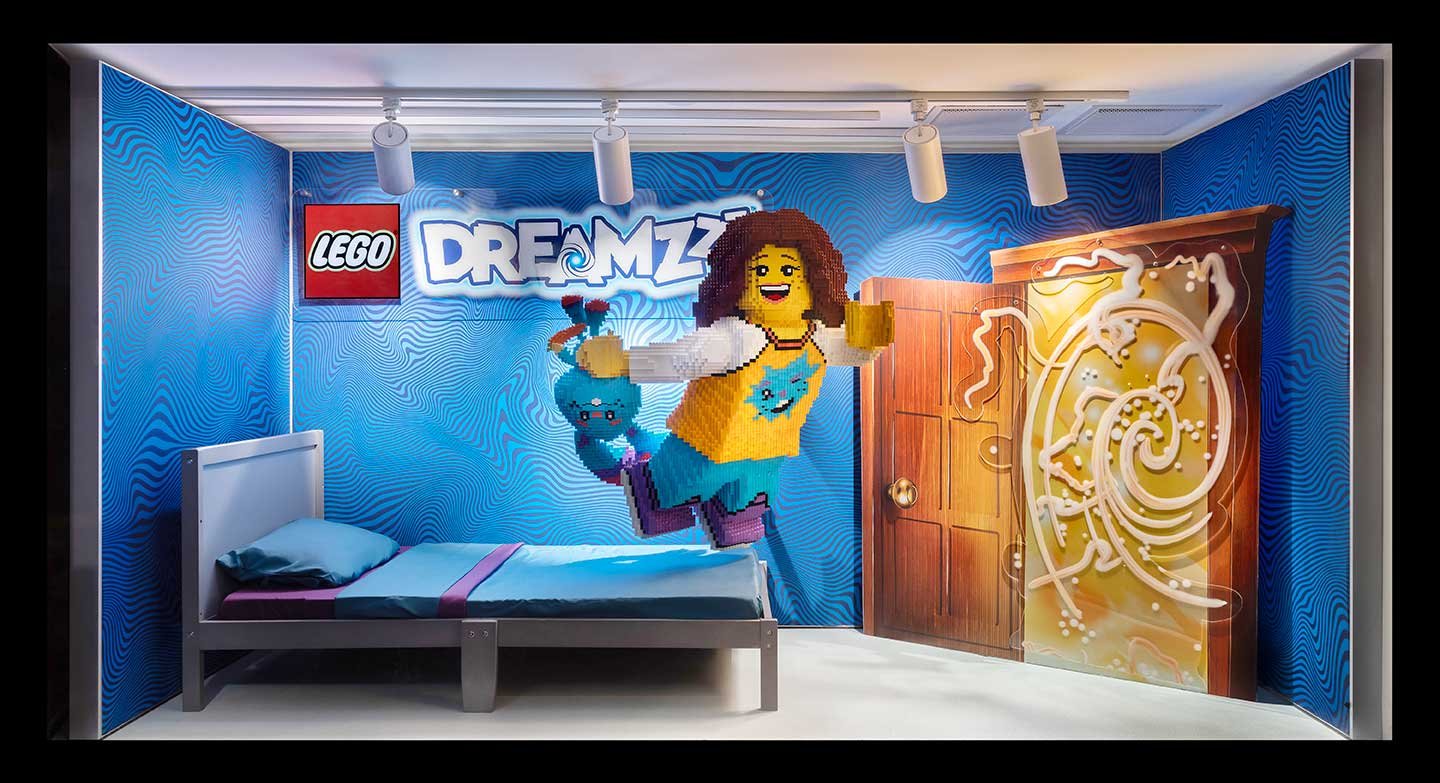
LEGO® DREAMZzz 5th Ave Window
Window display at the New York LEGO® Store on 5th Avenue for the launch of the new product launch of DREAMZzz. The two windows work together to tell a story of the character Izzie as she jumps out of her bed with her stuffed bunny through the dream portal. On the other side she is transformed into a warrior with her bunny Bunchu coming to life and growing to giant size. They stand at the precipice of the nightmare realm, ready for adventure!
I conceived the concept and created a render which I then shared with the model shop and a production vendor to ensure the execution matched the concept. Working closely with them we utilized props, printed materials and brick build models to achieve the end result which resulted in outstanding reviews.


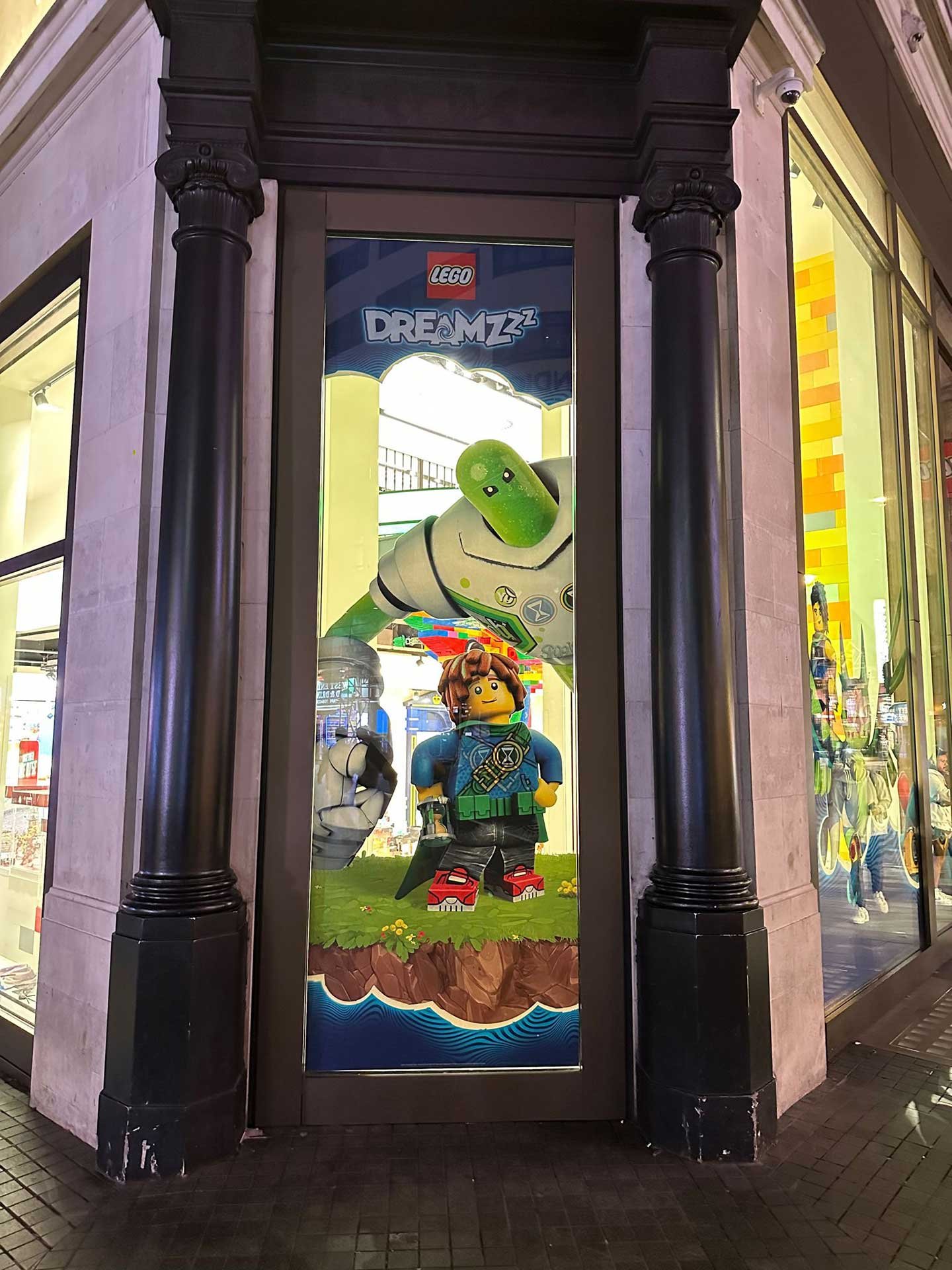
LEGO® Dreamzzz Leicester Square Window

Dreamzzz window cling display for the LEGO store in London England, depicting the heroes and villains flanking the entrance


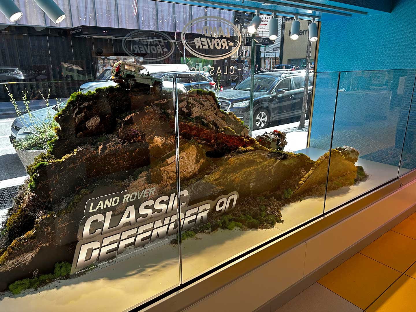
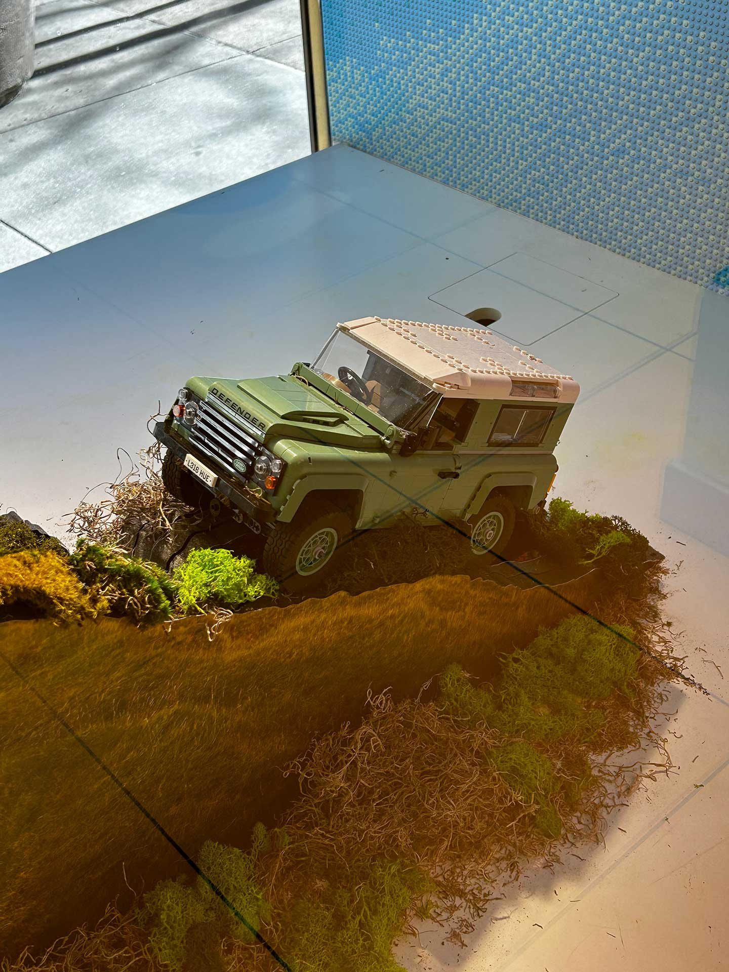
LEGO® Land Rover 5th Ave Exclusive Window
Window at the LEGO® Store in New York on 5th Avenue, highlighting the newest exclusive Land Rover set. With its conception originating in Scotland, we wanted to use this setting to celebrate the heritage of their Defender 90 model. I created a landscape with the iconic vehicle making its way over the hills of Scotland. Three models are shown traveling in different configurations, showing off the models features, and highlighting the winch being used to pull itself up the cliffside. This was a huge success and received many compliments, with the store manager saying it was one of their favorite displays to date.


LEGO® Jazz Club 5th Ave Exclusive Window
Window display at the New York LEGO® Store on 5th Avenue. Featuring the Jazz Club as the centerpiece while showing off the full range of modular building sets within the collection. I conceived the concept and working with an illustrator followed through to the production of the final assets with an outside vendor. The set sits on a mirror black topped plinth with a mosaic of musical instruments behind it. The other building sets within the series create a cityscape invoking the nightlife of the jazz club scene.


Render of Window Outside View
Render of Window Inside View
LEGO® 90th Anniversary 5th Avenue Windows
Concept Render
Concept Render
Celebrating their 90th Anniversary, these adjacent windows sit outside the LEGO® Store in New York on 5th Avenue and are a huge photo opportunity . The objective was to tie into the campaign playbook which showcased the endless possibilities of rebuilding one set into another. These 2D brick builds show a dragon rebuilding into a frog and the tiger rebuilding into a fish. These builds reference some of the 3in1 model sets being highlighted at the time.
Final Execution
Final Execution
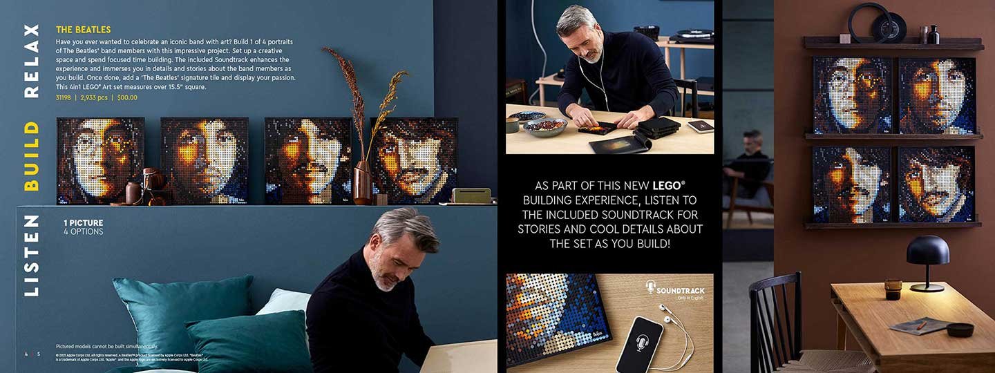
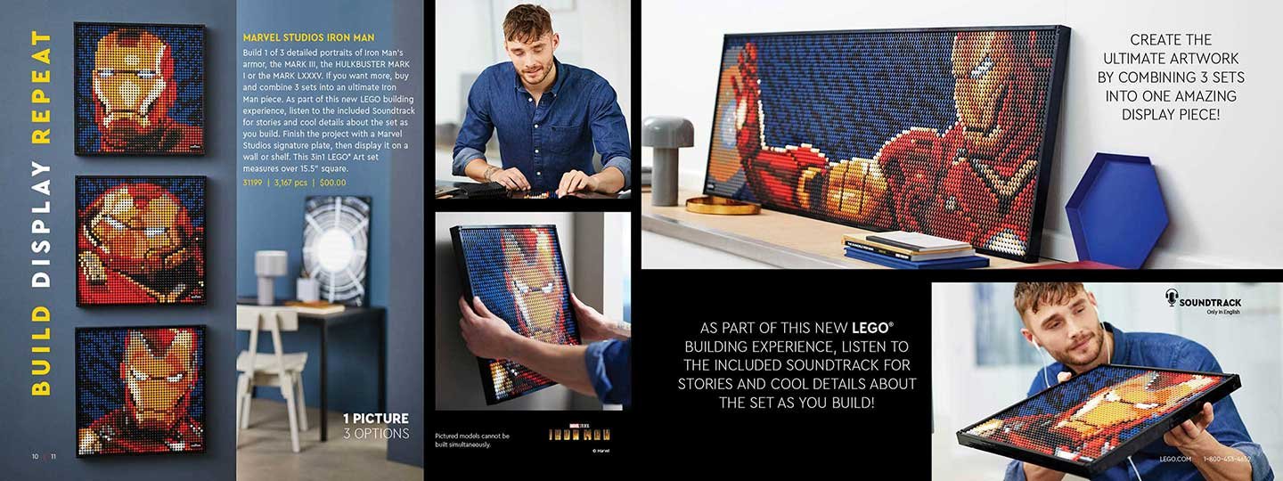
Adults Welcome Catalog
The objective of this premium test catalog is to reach adults who may have never purchased a LEGO set before for themselves. We targeted a select group of house adults ages 18-45 who have made 18+ set purchases with us before and used that model to create a prospect group to recruit new shoppers. Sets were carefully selected based on age, inventory, forecast, recruitment potential, and key passion points.
A very clean, simple cover in horizontal format. Black area has a tactile Soft Touch finish, the logo is varnished to stand out, and “Adults Welcome” is printed in a white foil to pop off the black. All treatments were selected or a premium look and feel. Simplified layouts show more lifestyle images of people building and how to display the set with usually only one set per page/spread.


Some Early Concepts
Below are some early iterations exploring different compositions. We didn’t know how many pages the catalog would be so I started giving many of the larger price pointed sets their own spread. This made sense especially for the Art series which encouraged consumers to collect multiple sets for alternative and combined builds.


Berkshire CBD
Berkshire CBD is a small New England farm dedicated to growing and sourcing the highest quality CBD hemp flower available. Working with small farms committed to organic growing practices, they cultivate a line of ultra-premium hemp flower products. The company wanted a clean, minimalist brand system with clear messaging. Unifying the product line and standing out from other brands. A color scheme and pattern was created for the different strains based on their attributes. These were then applied across boxes, jars, pre roll tins and sleeves.
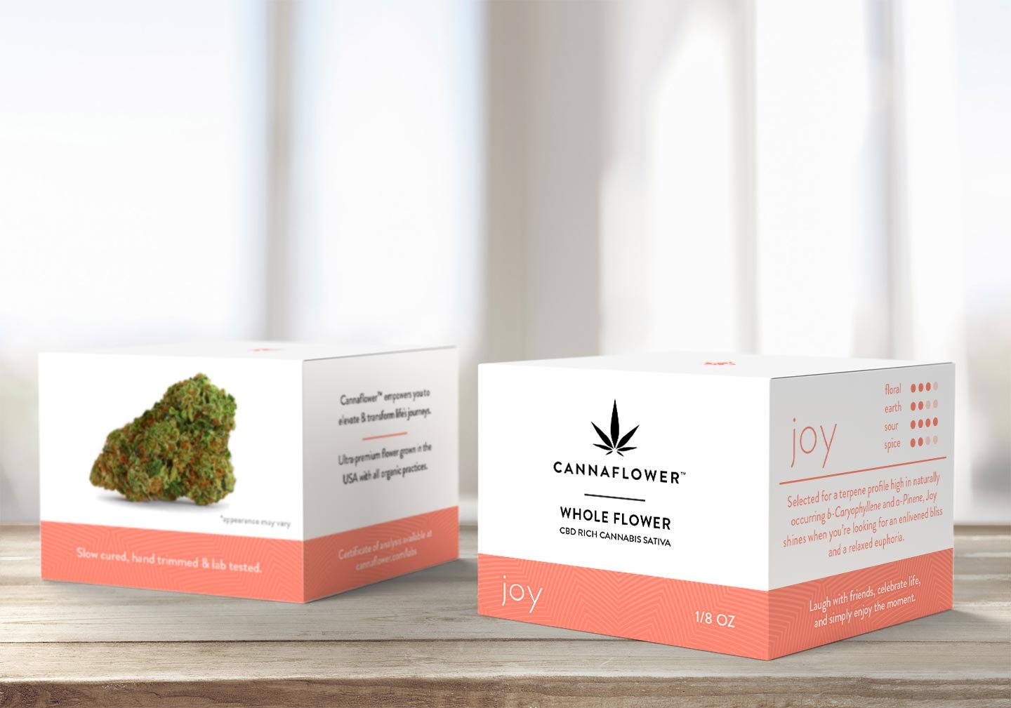
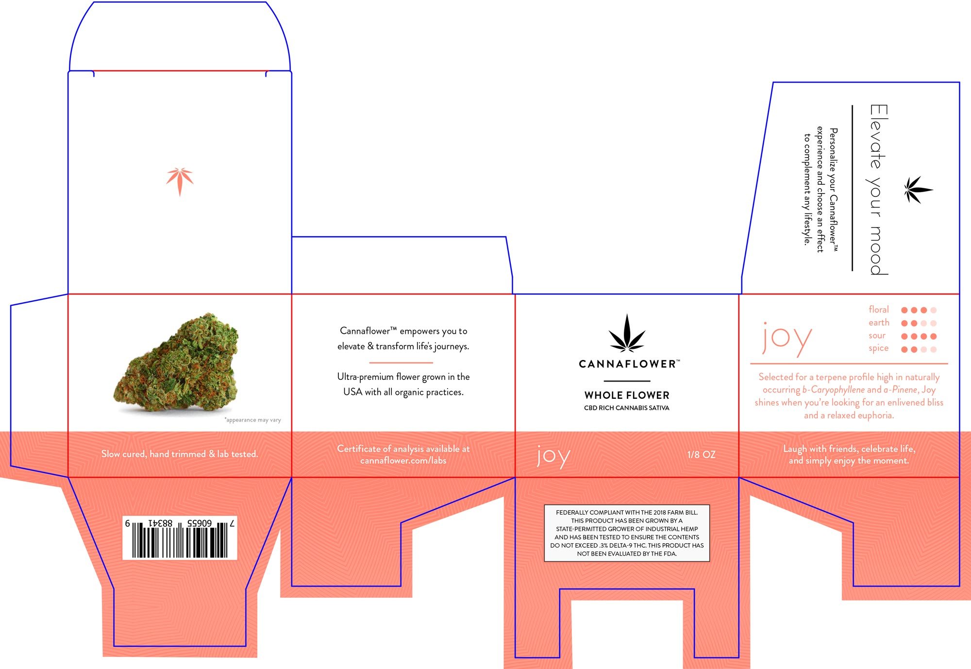
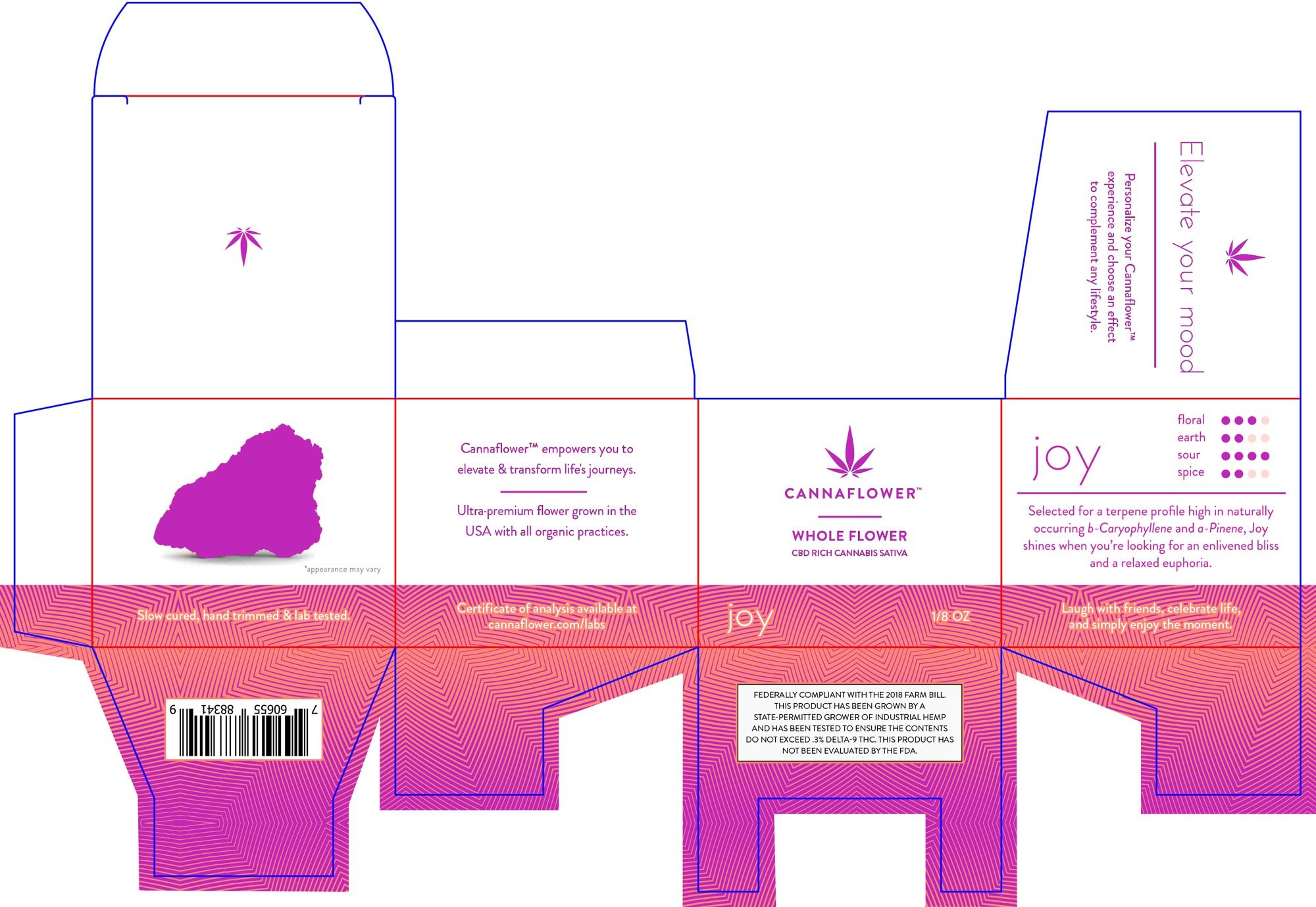
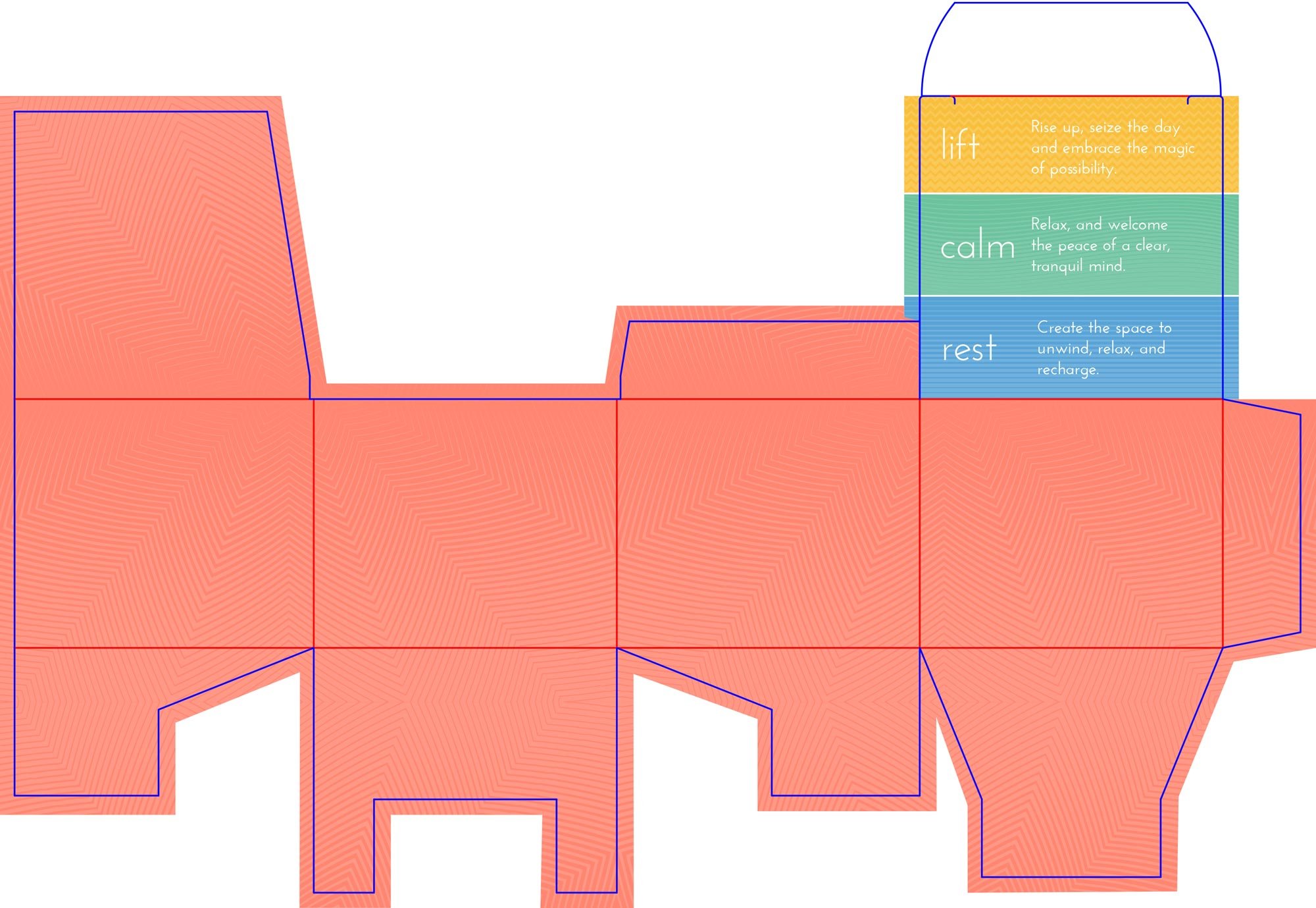
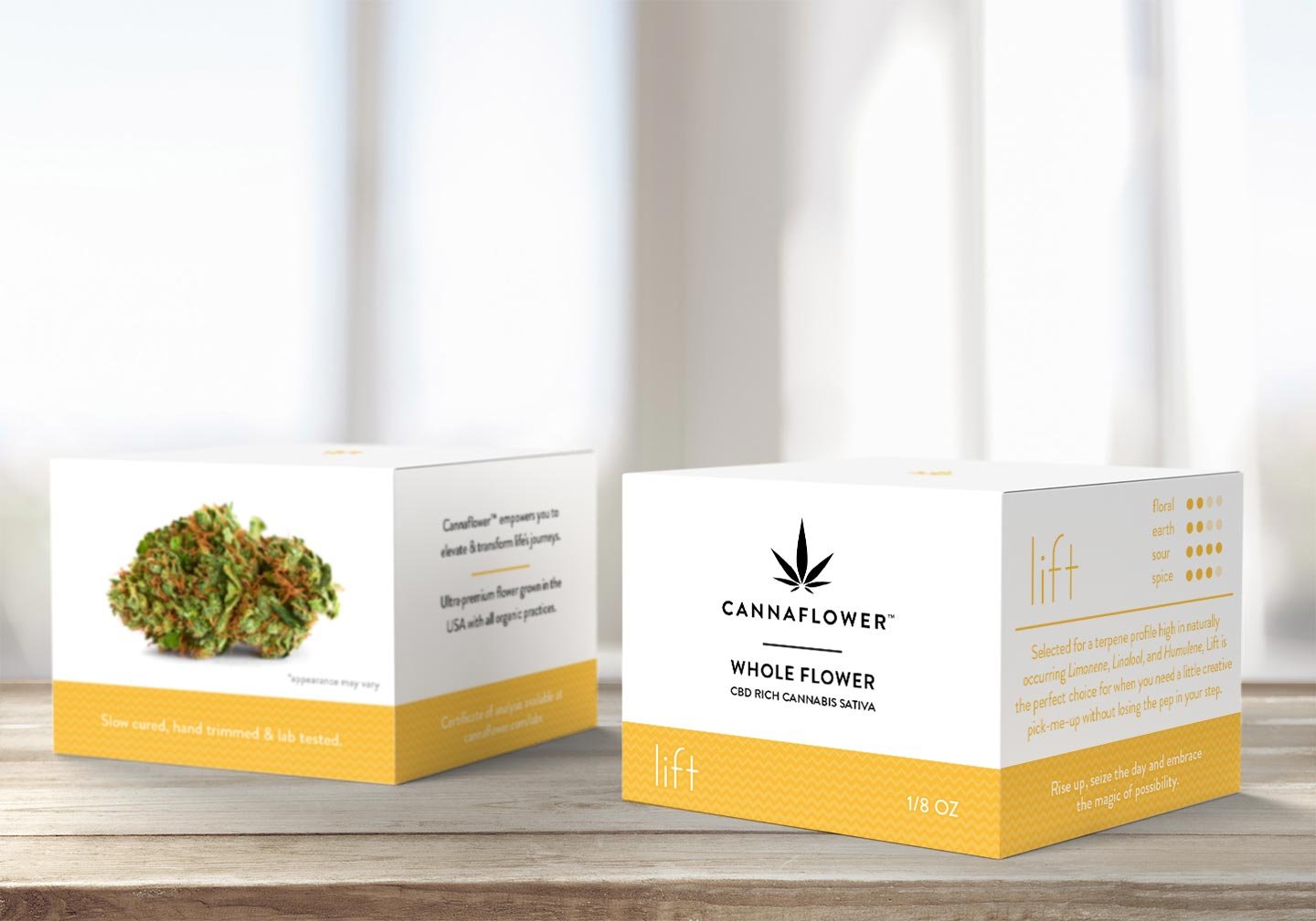
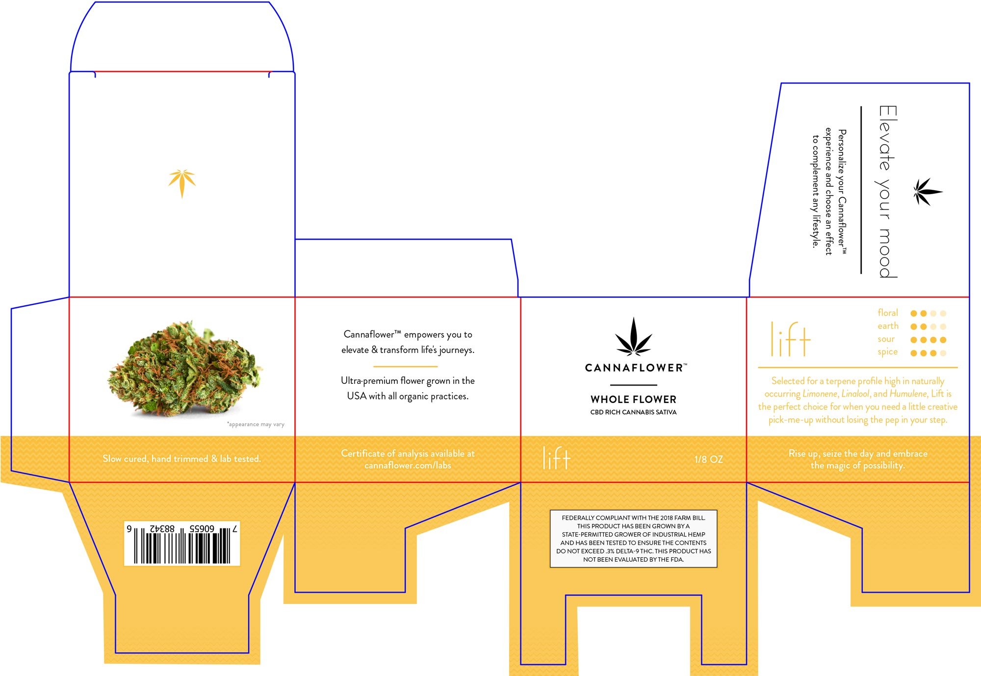
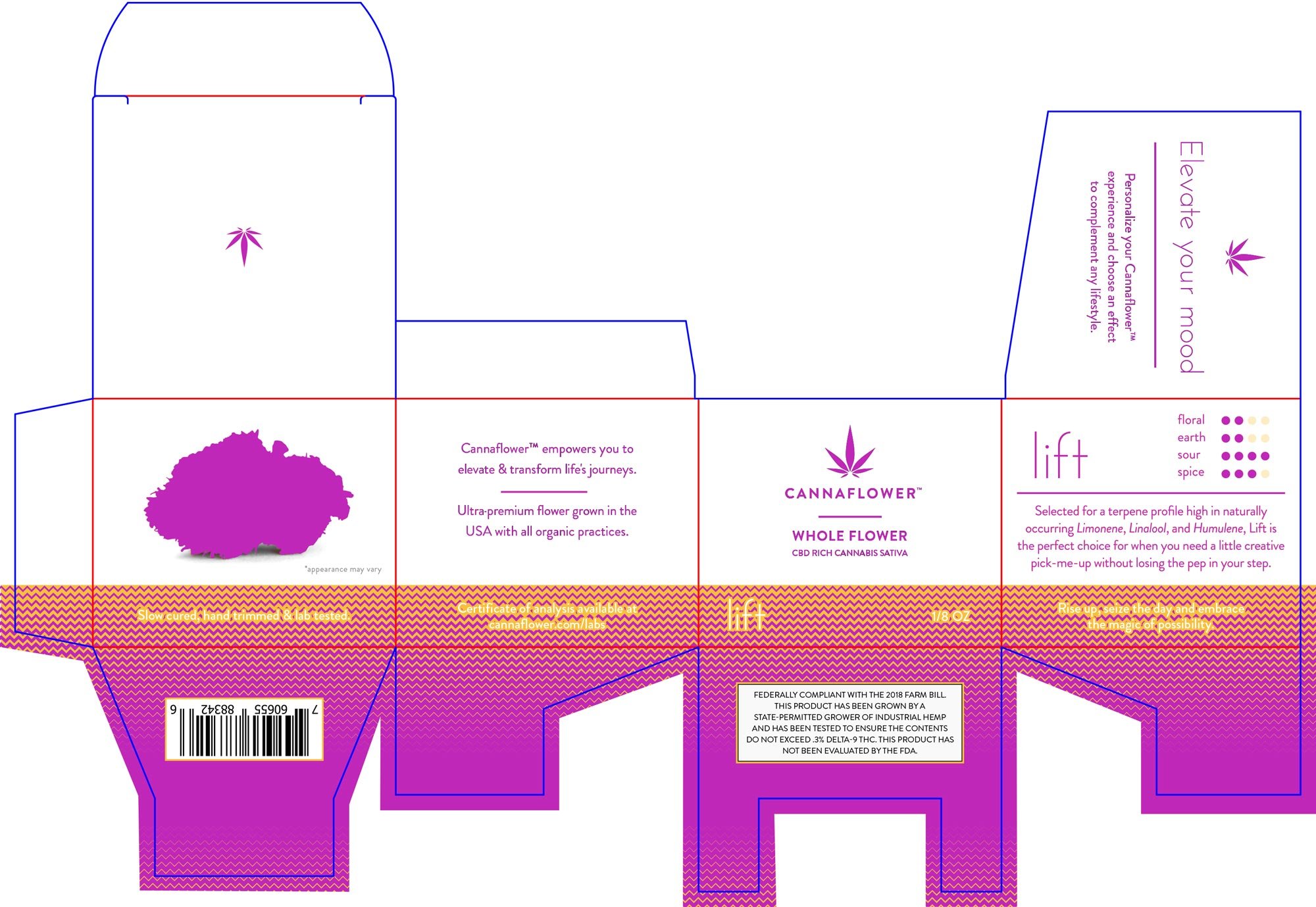
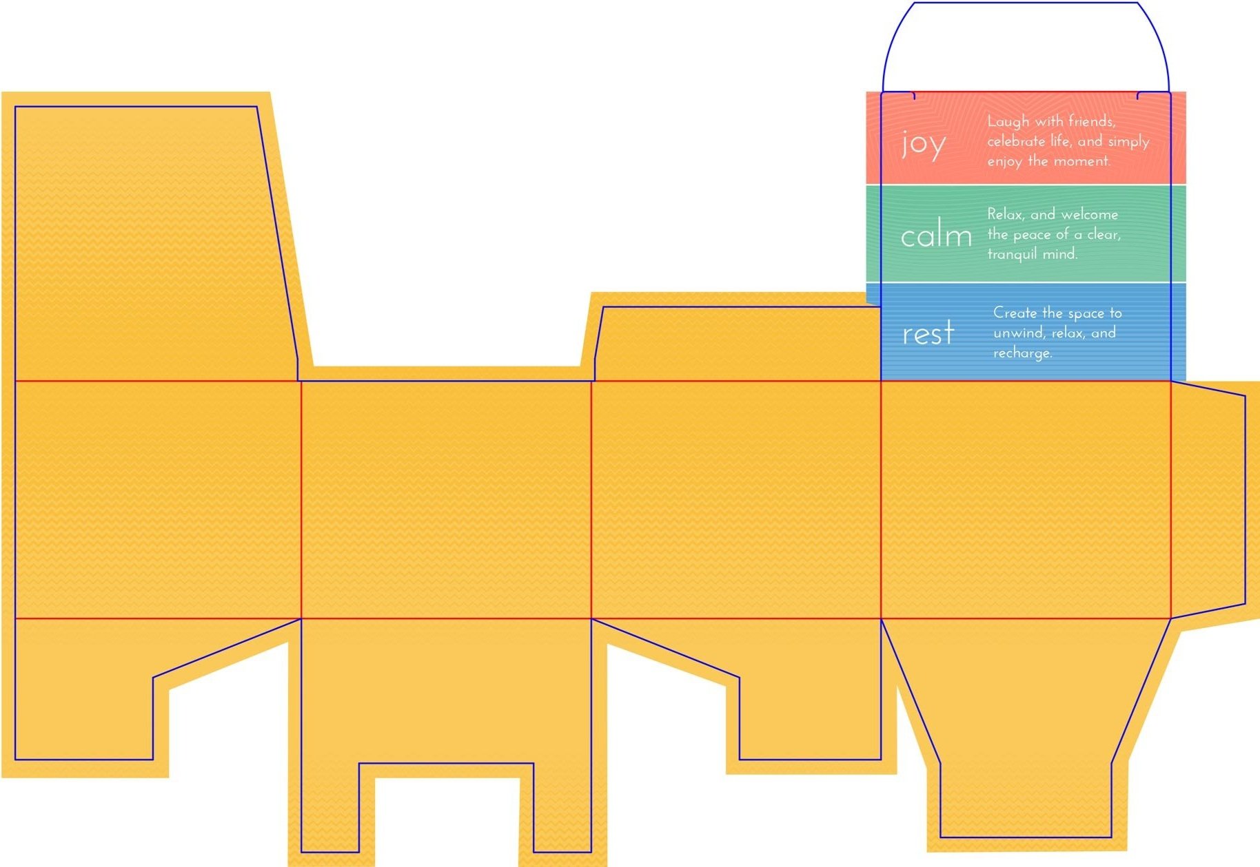
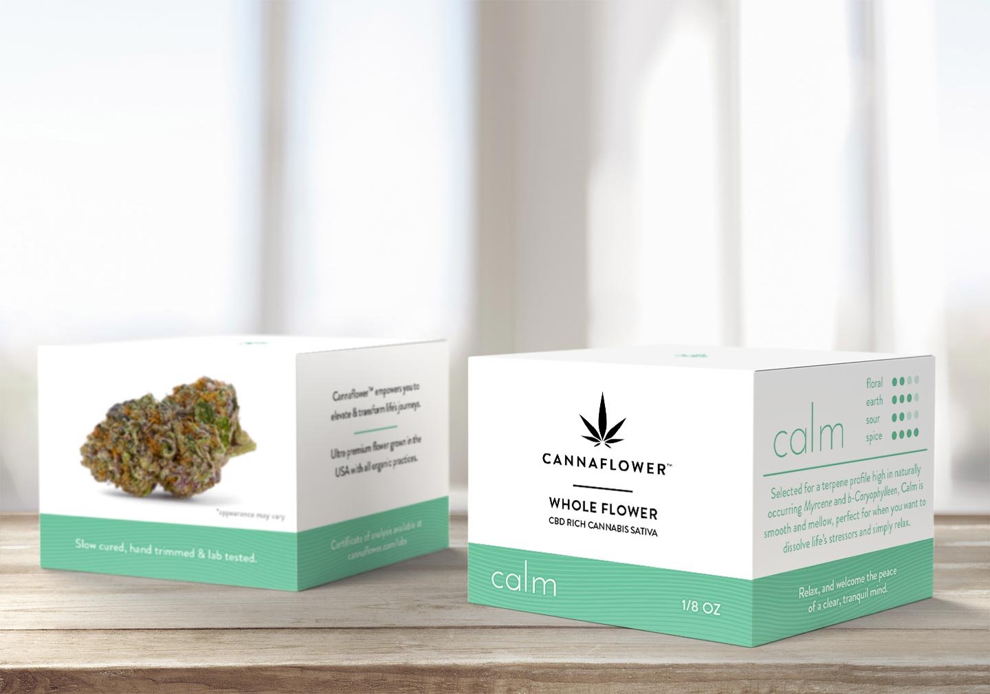
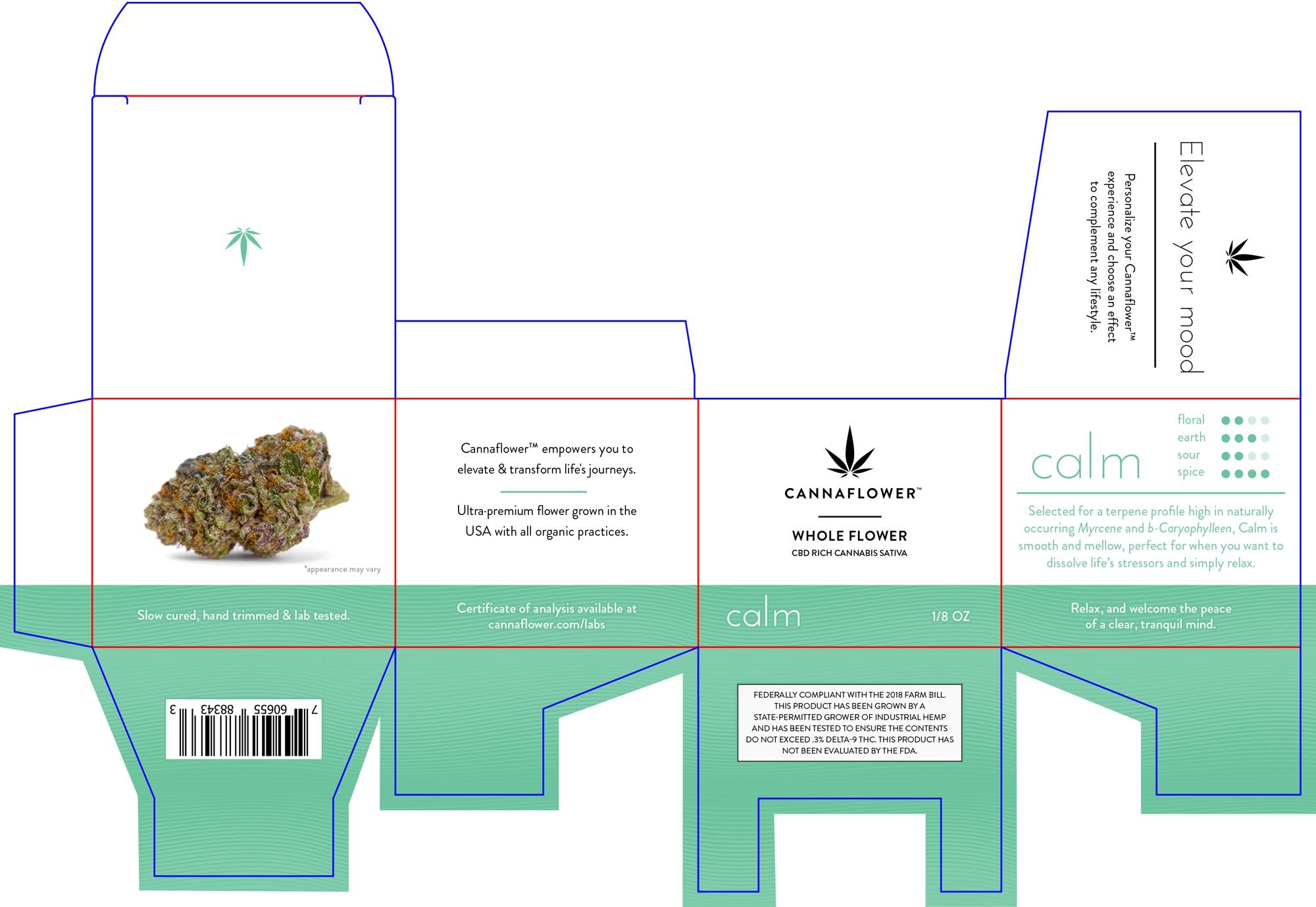
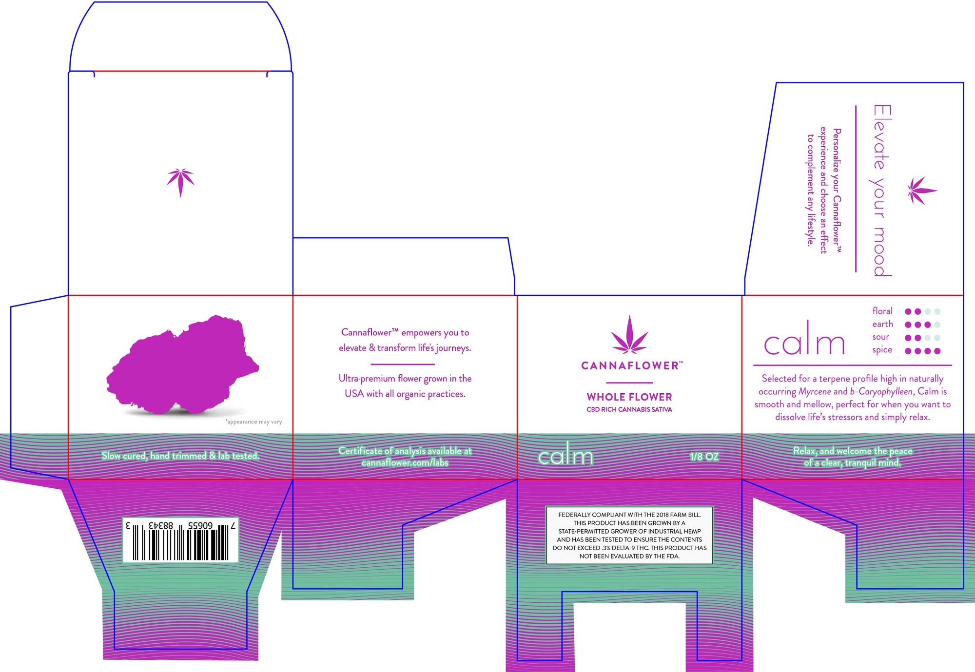
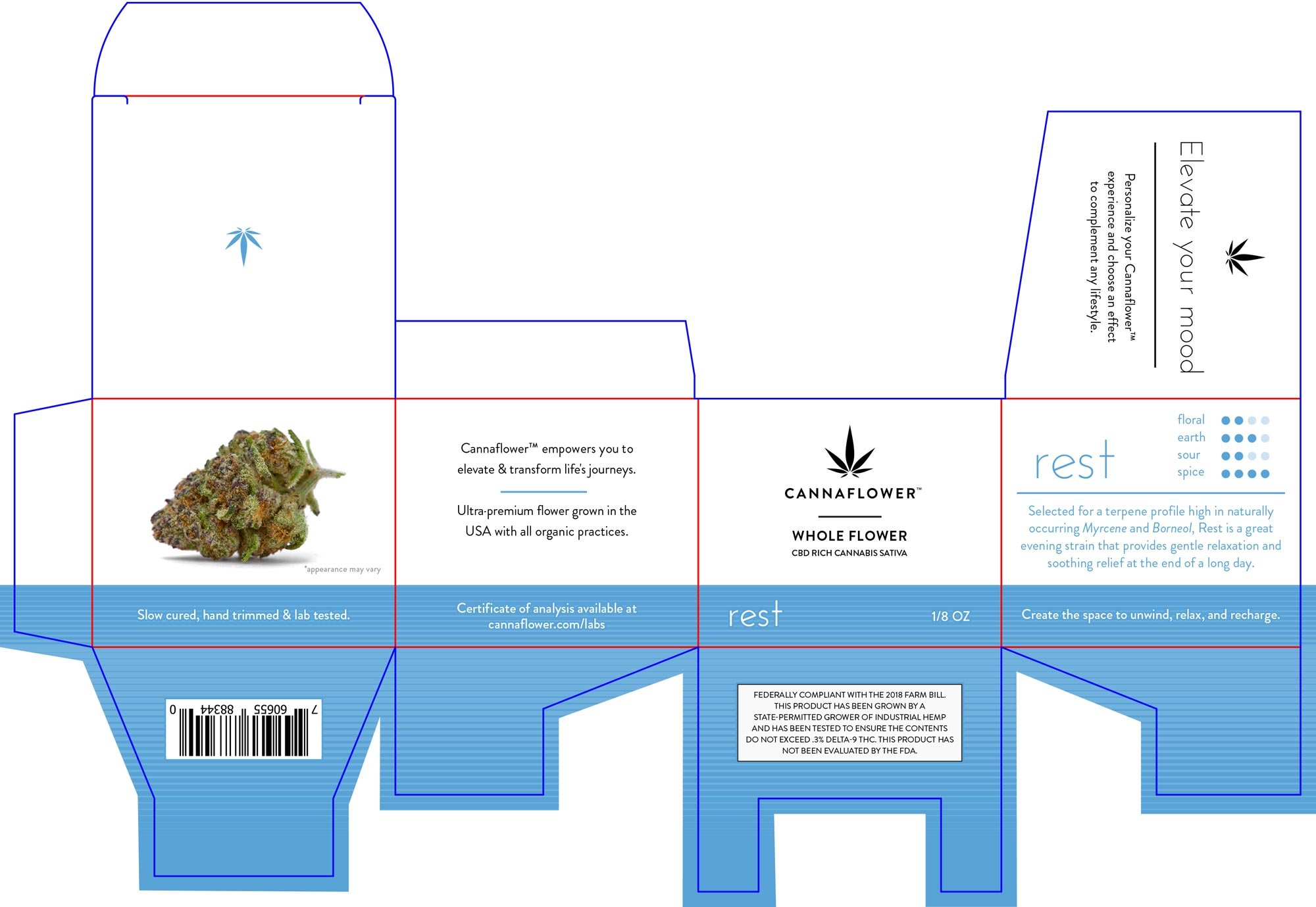
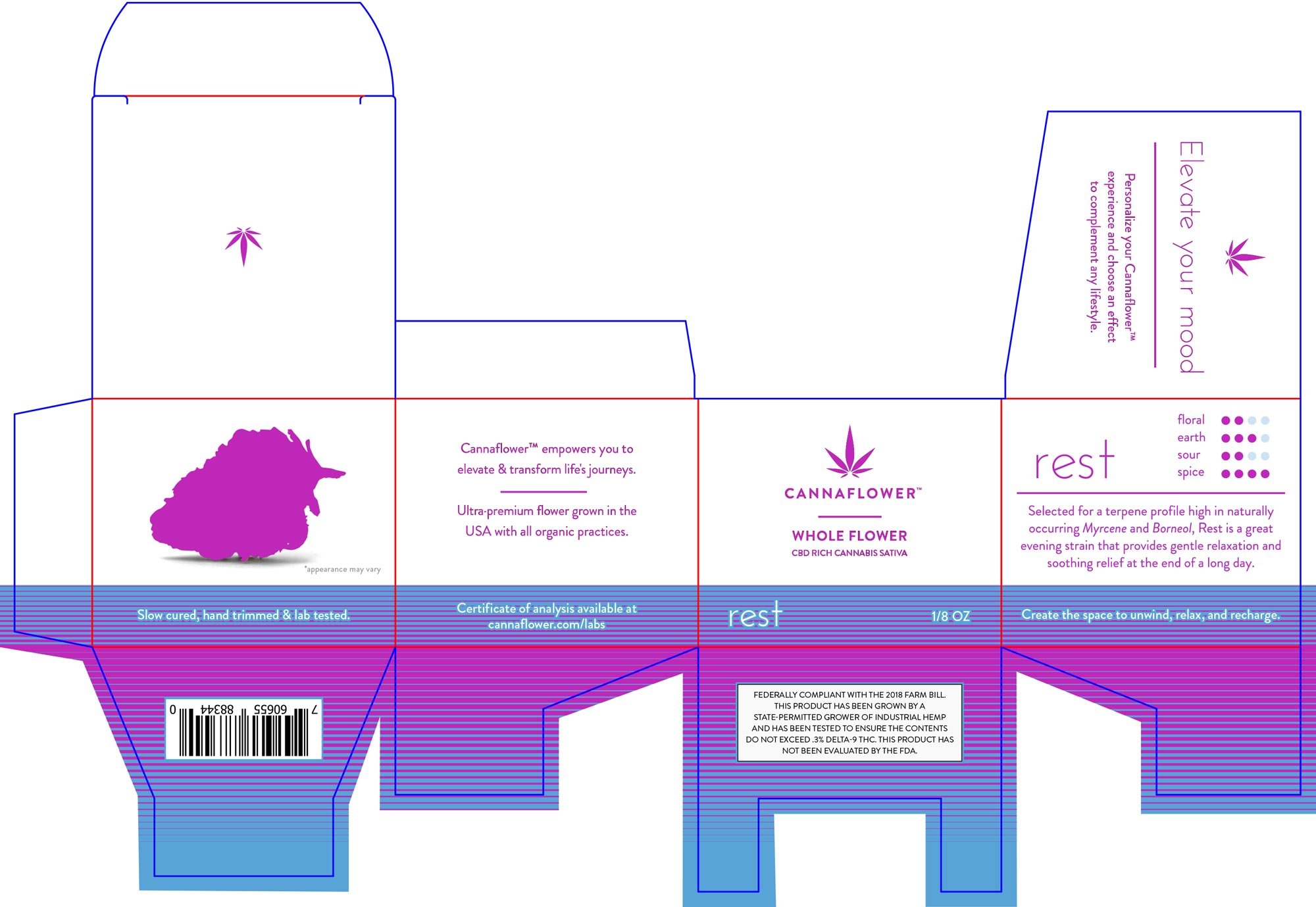
A spot varnish (shown in purple) was applied to the graphics on the boxes and pre roll tin sleeve, highlighting the pattern and relevant information while giving a premium look. The inside of the flower boxes are covered with the stains color/pattern making the jar stand out when opened. Giving the consumer insight into other products, a listing of the available strains and their attributes were placed on the inside flap. The pre roll tins have a painted powder coating with the brand graphics aligned with the sleeve which create a sophisticated and consistent look throughout.


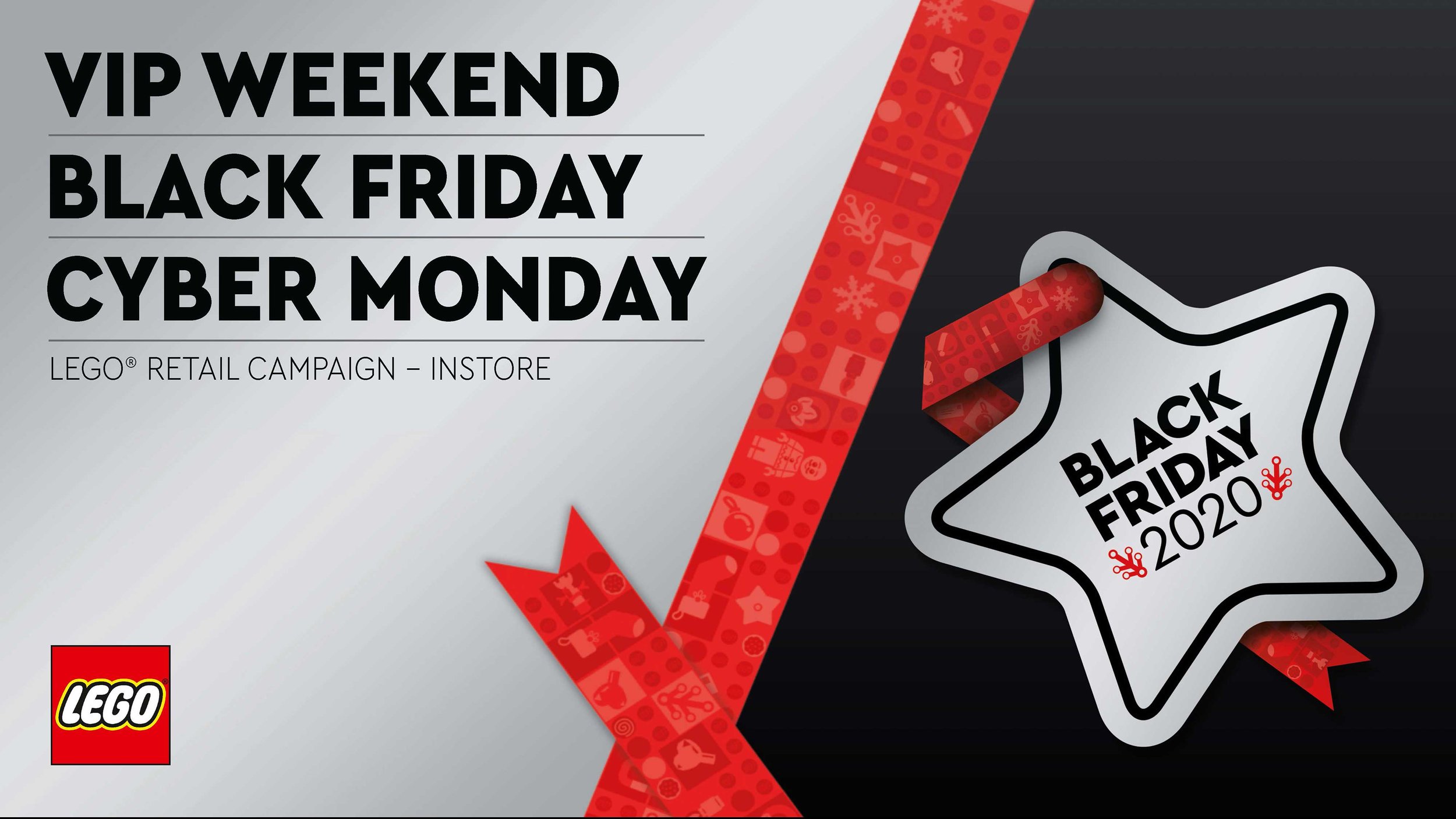
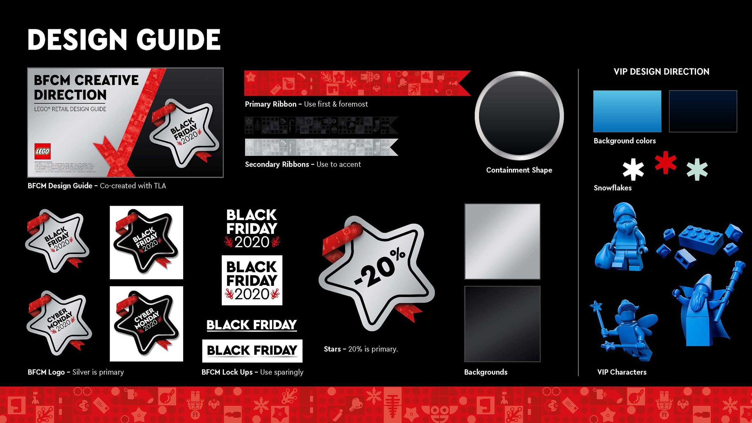
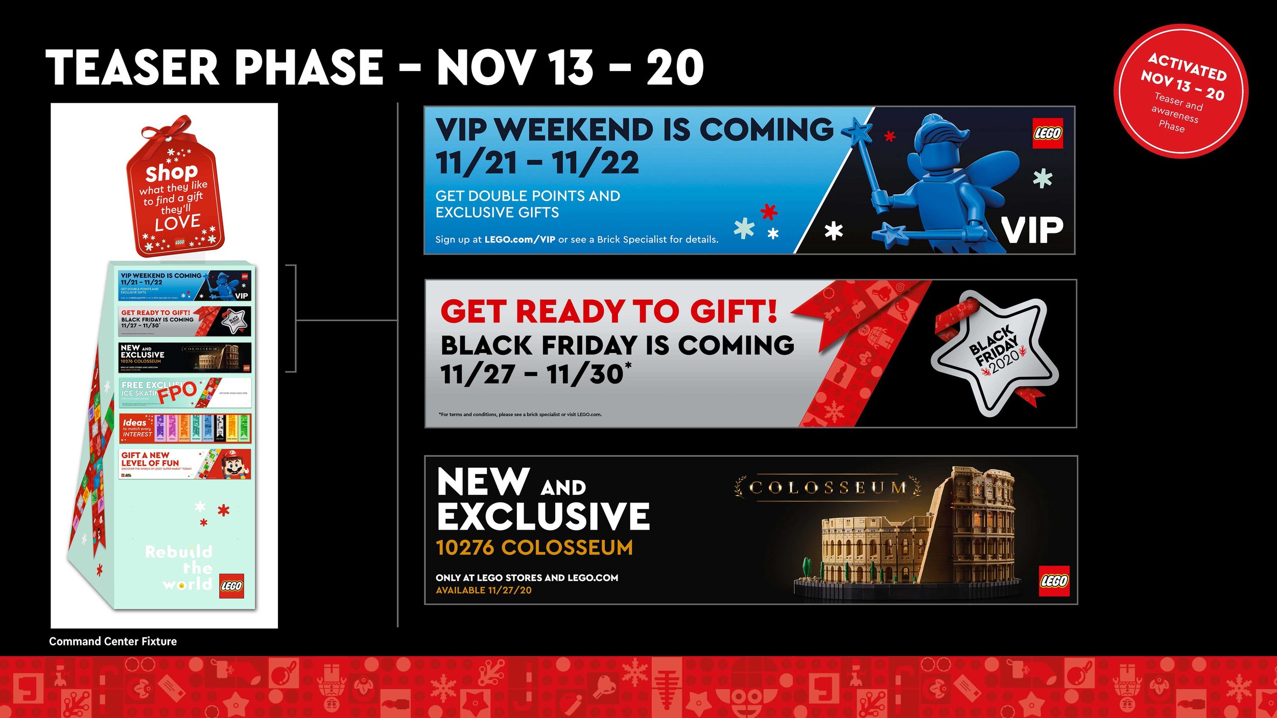
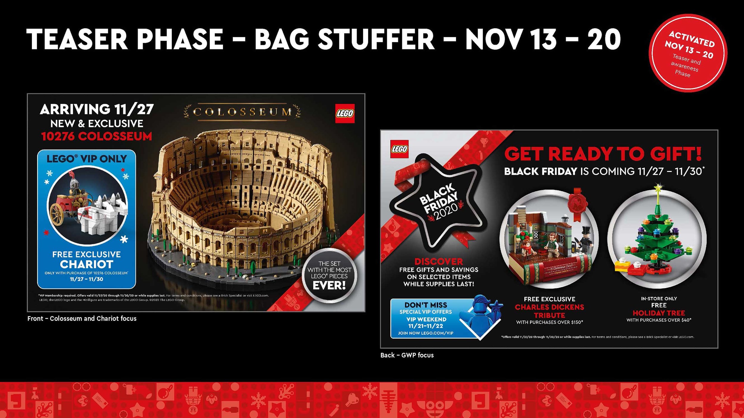
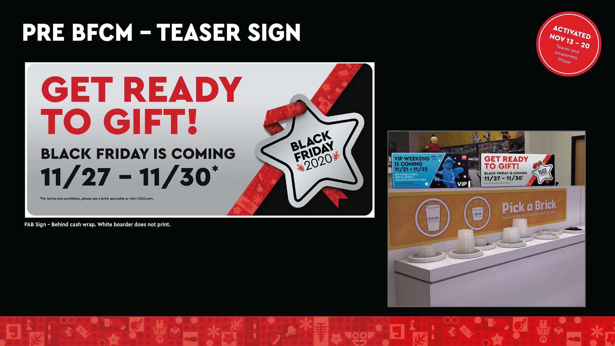
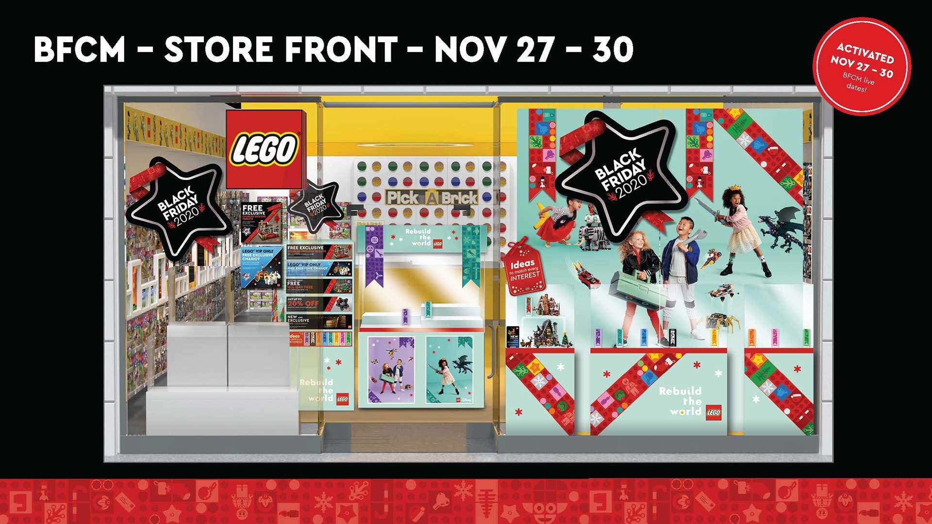
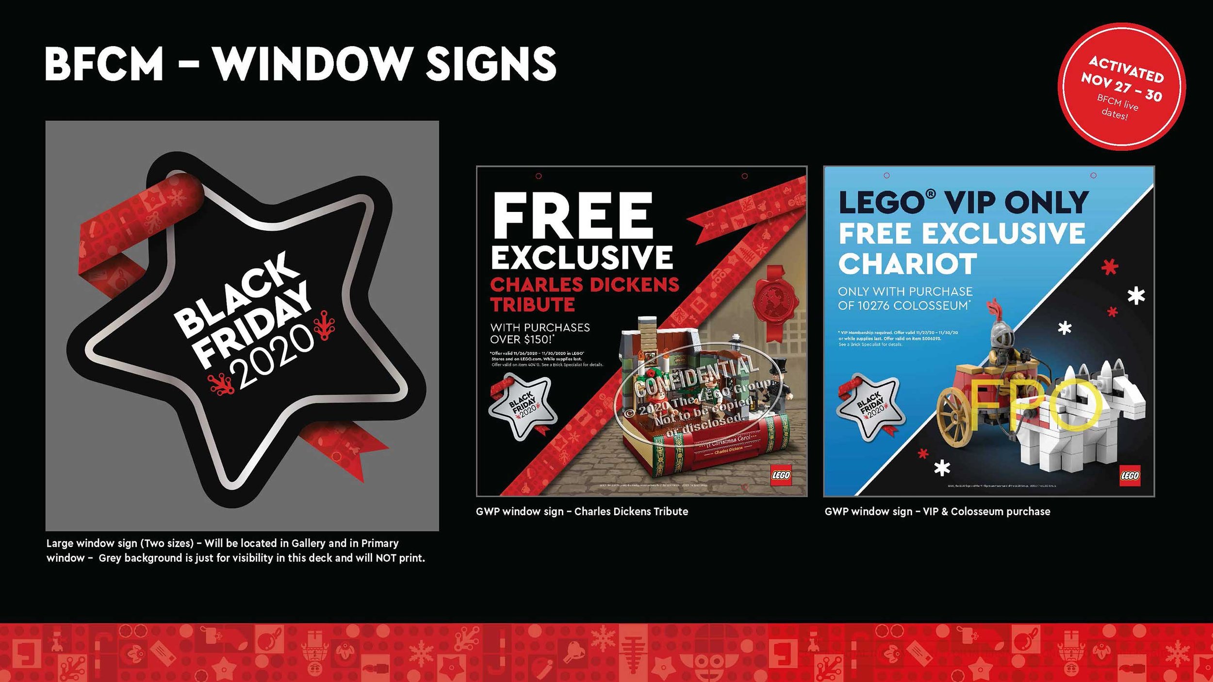
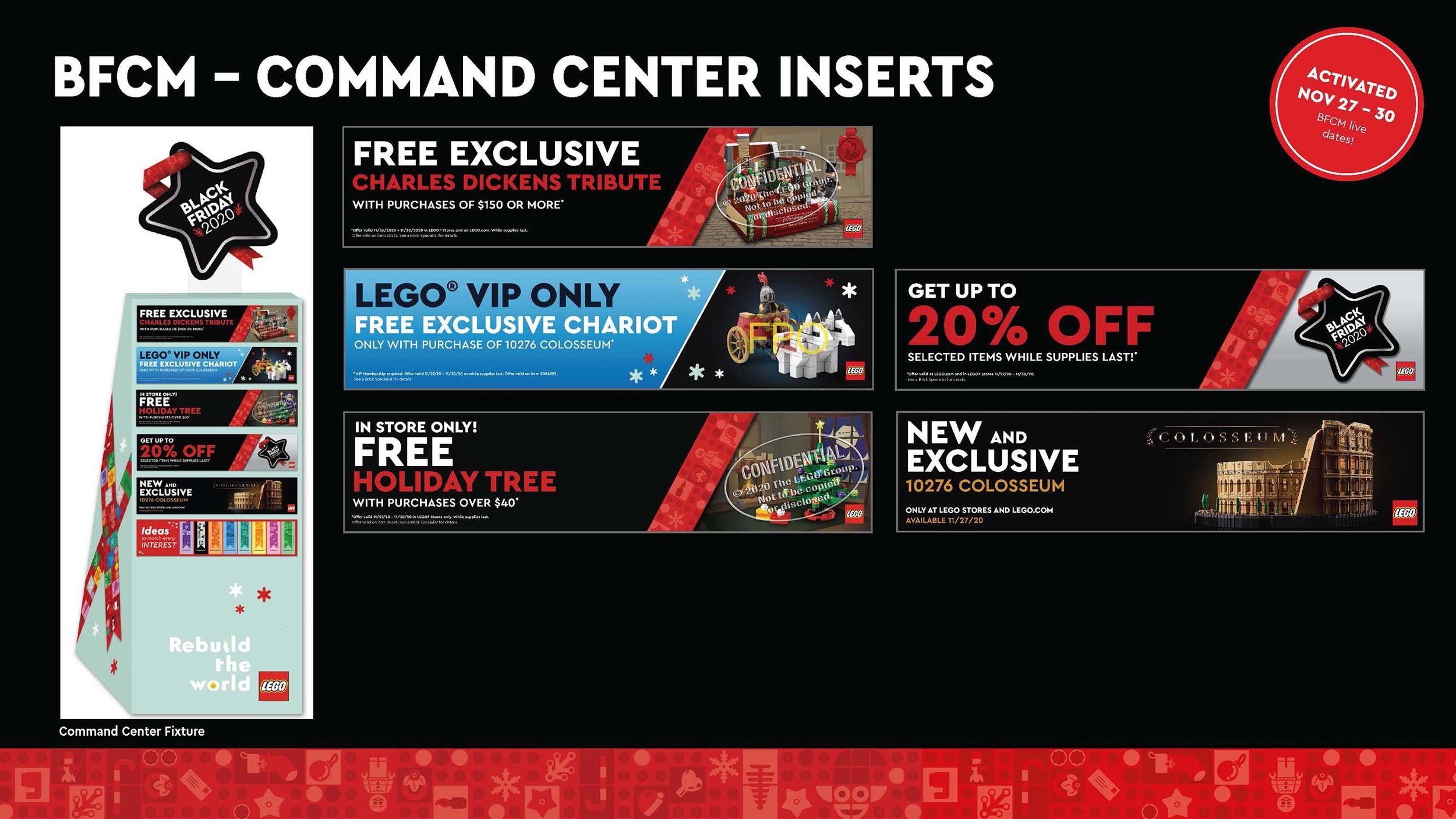
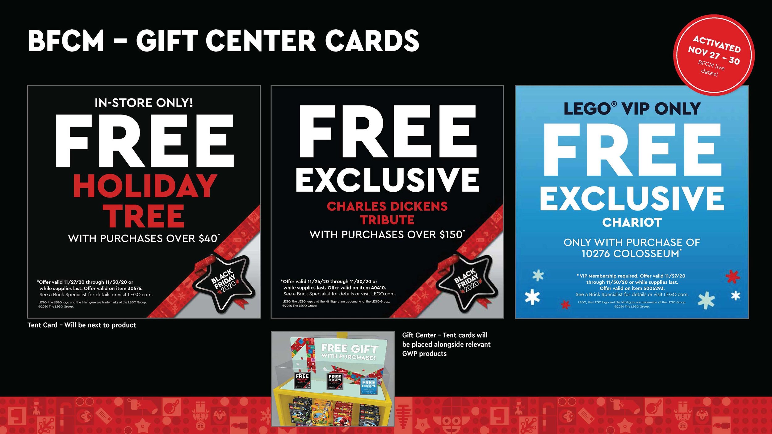
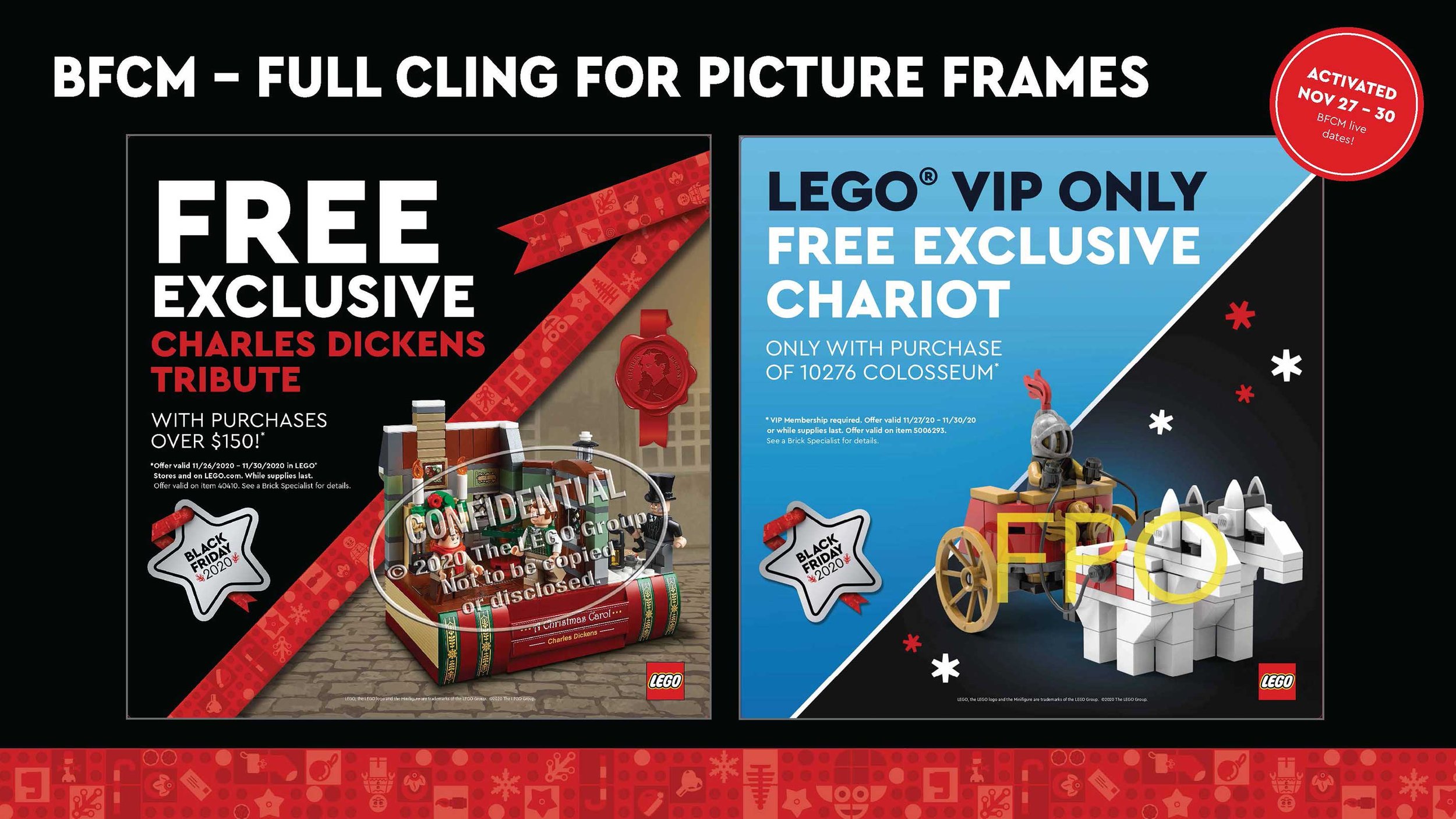
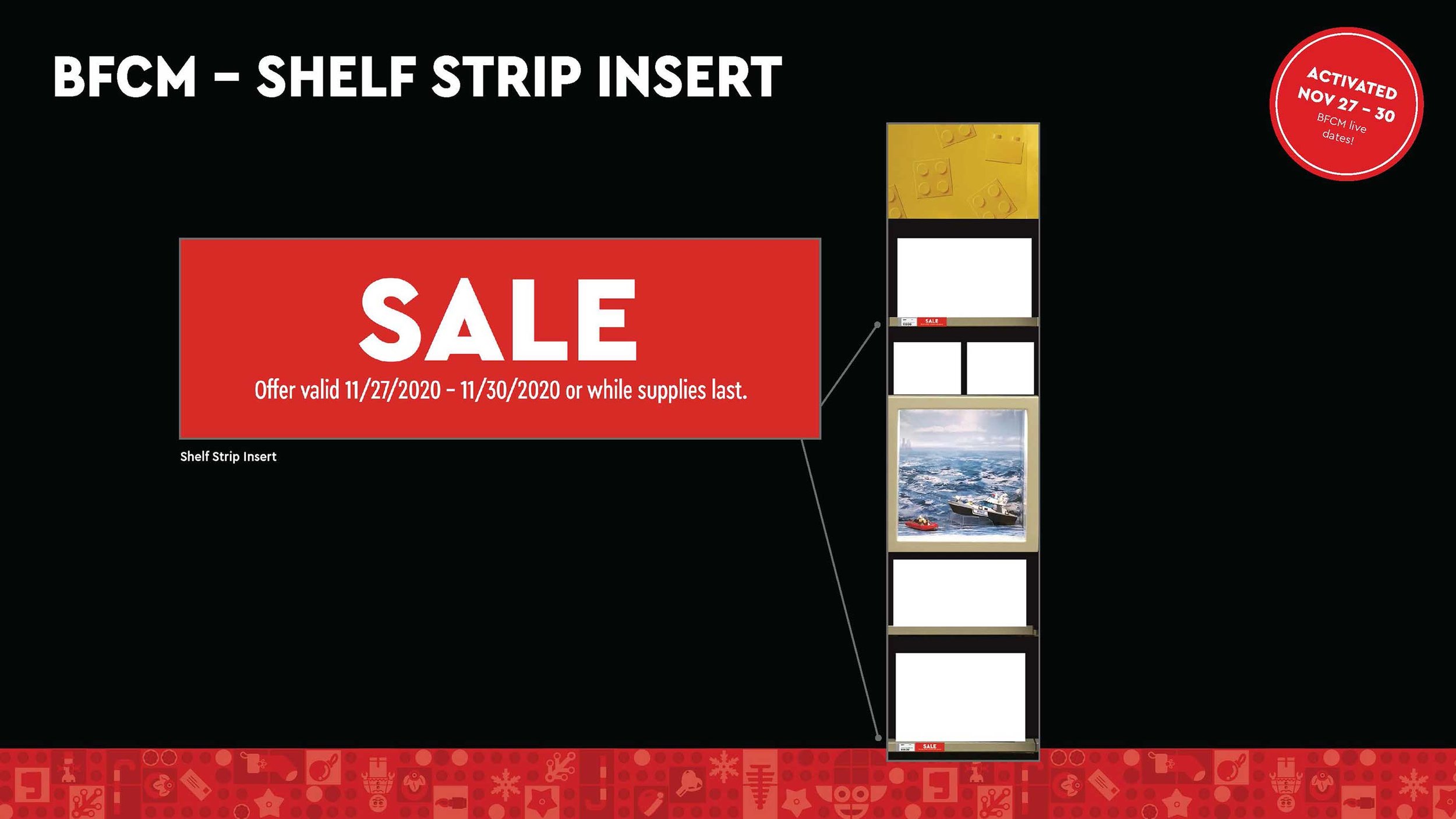
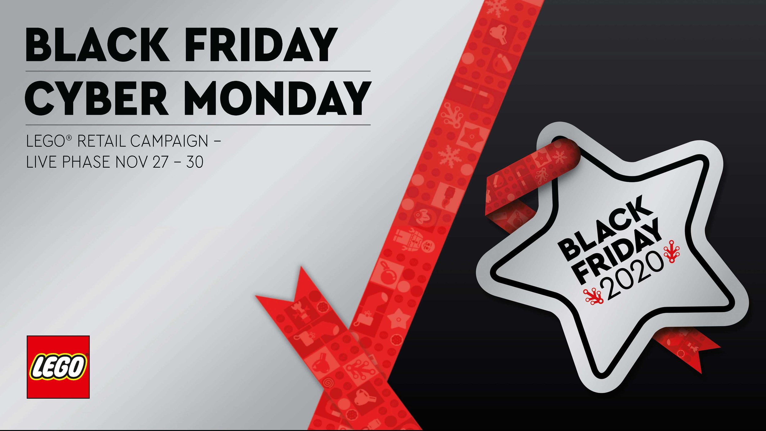
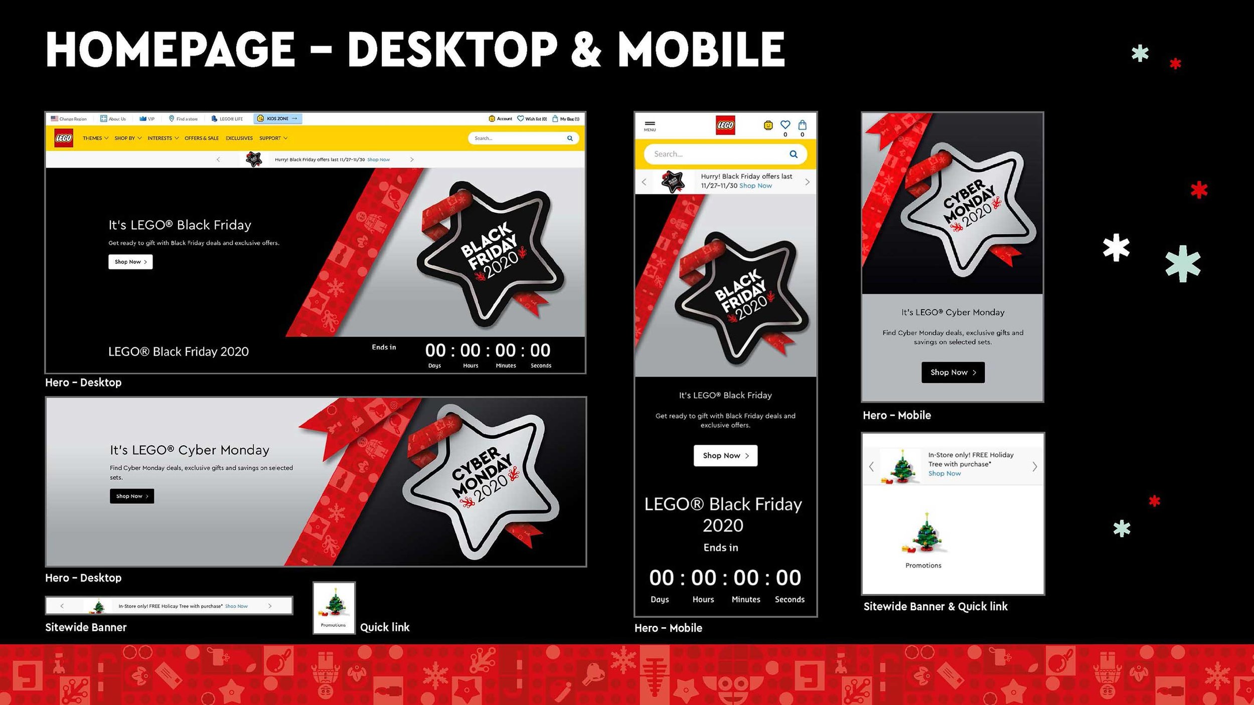
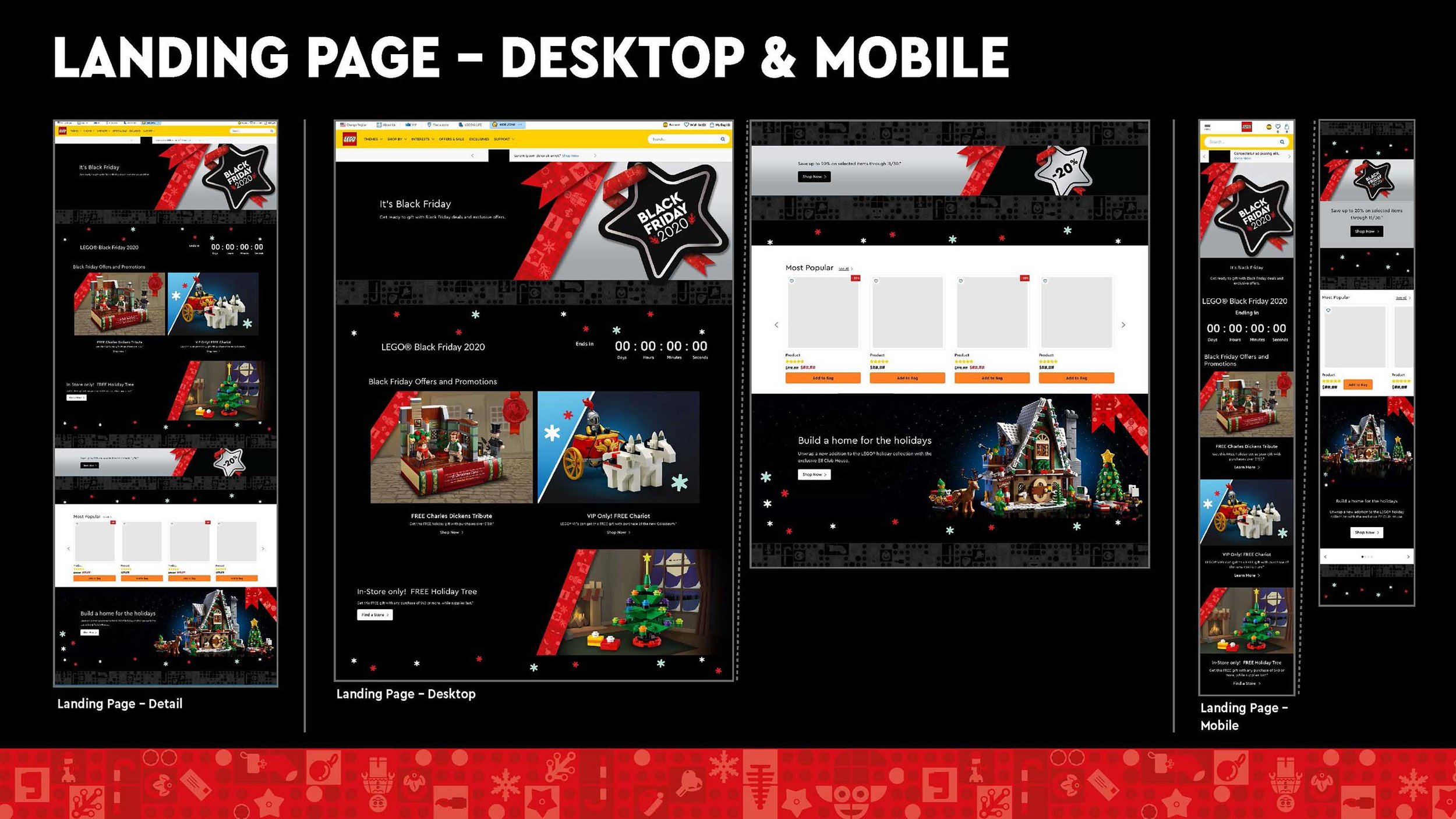
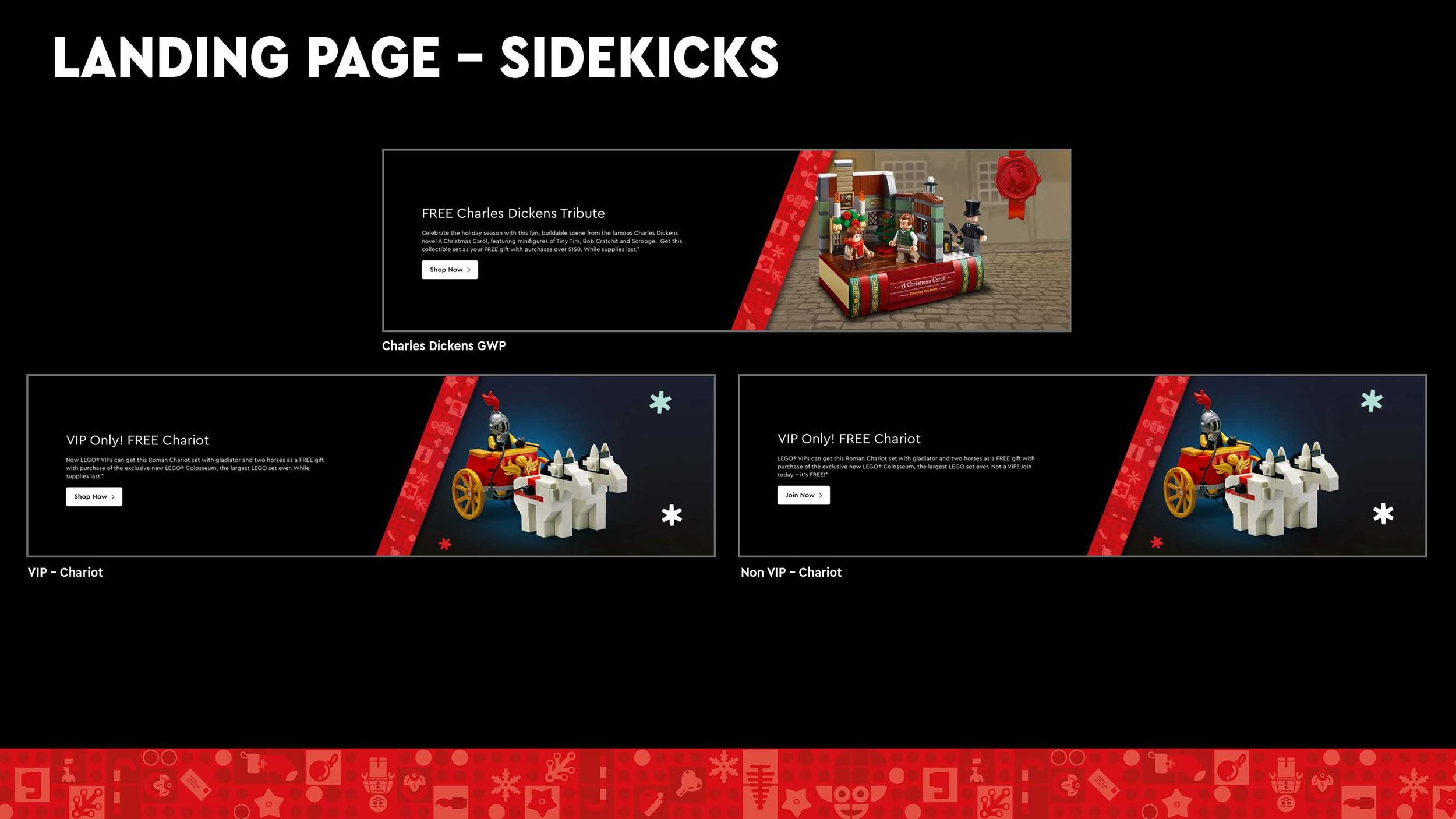
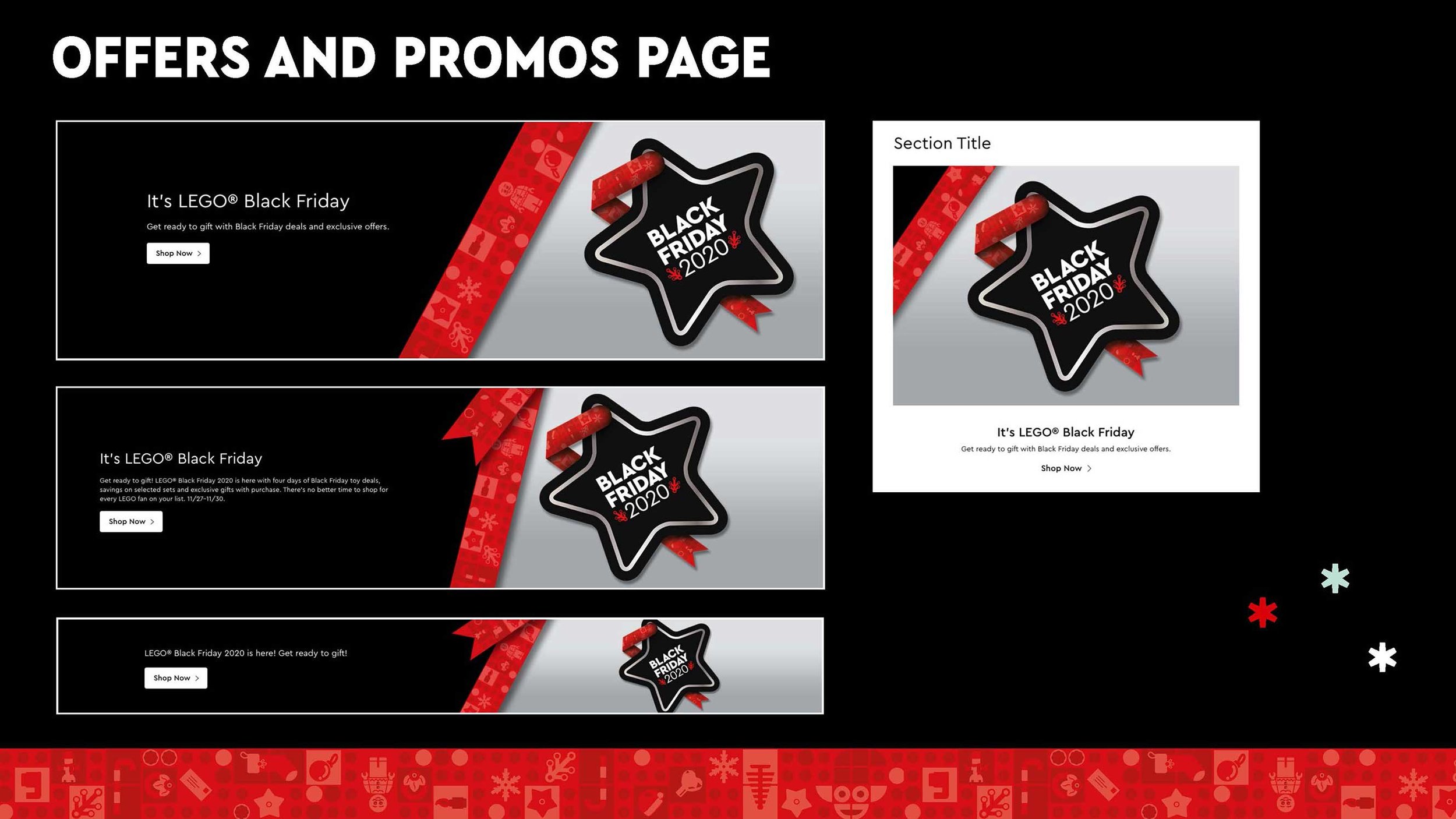
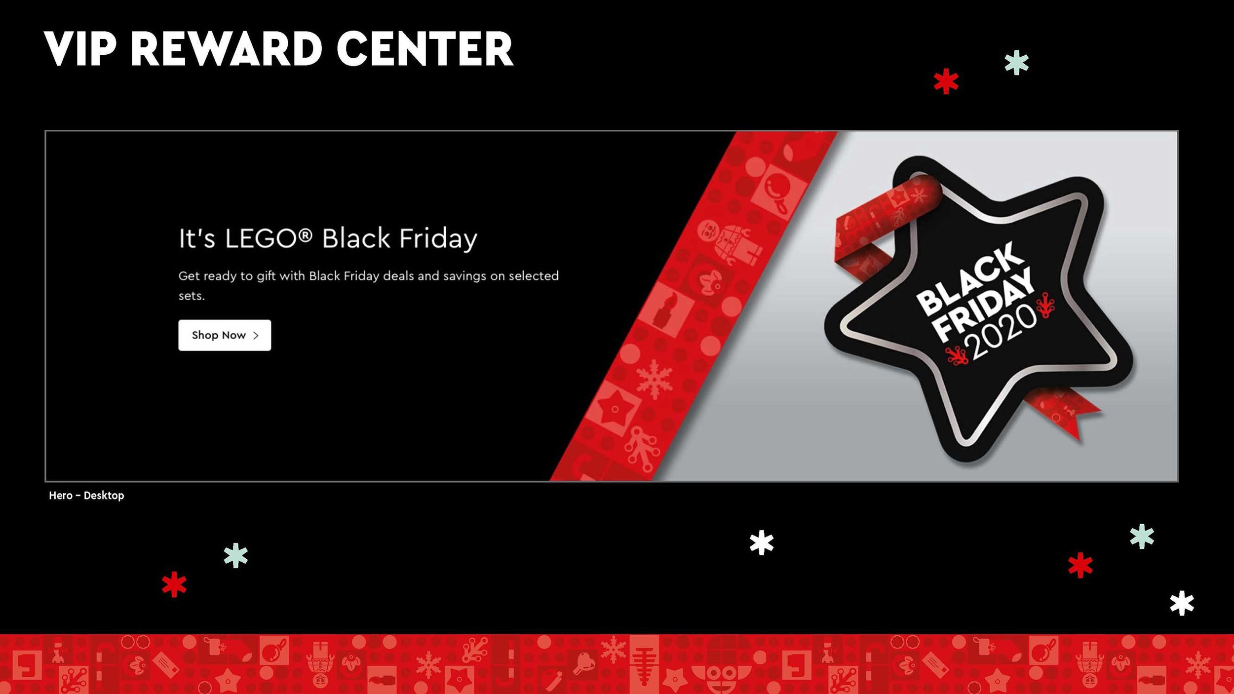
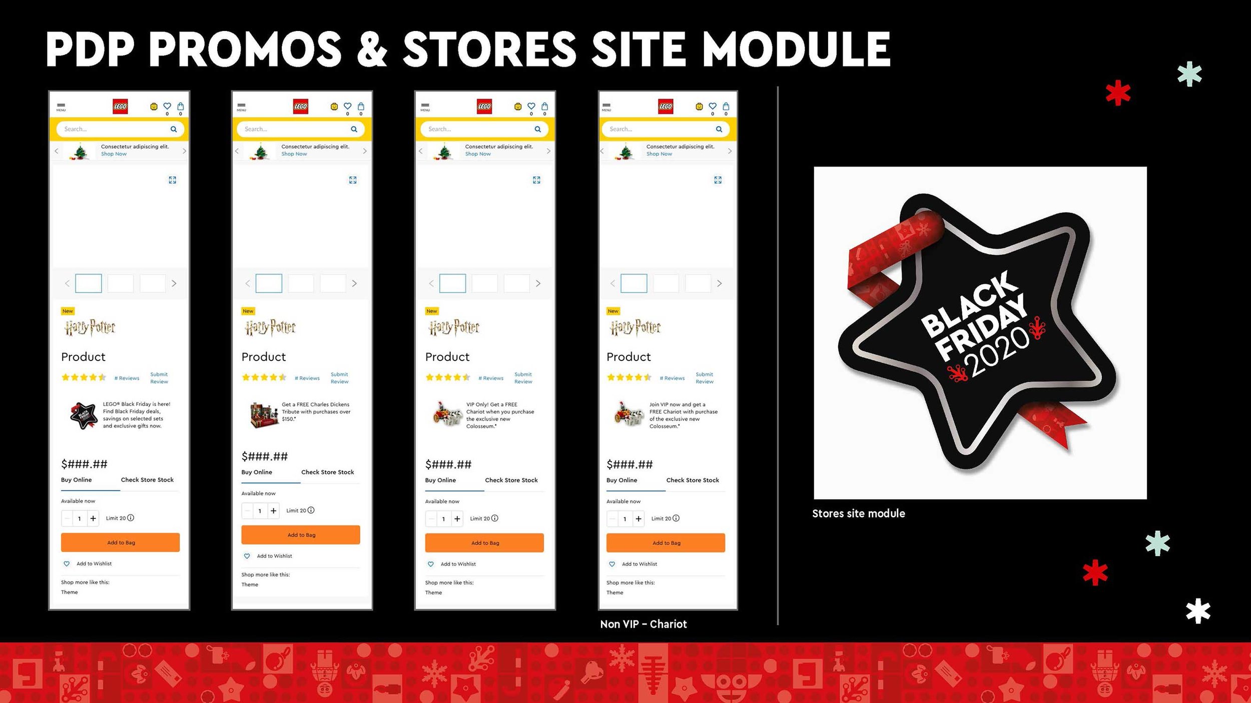
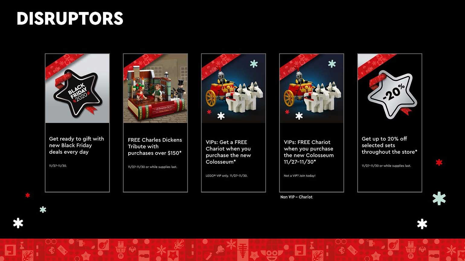
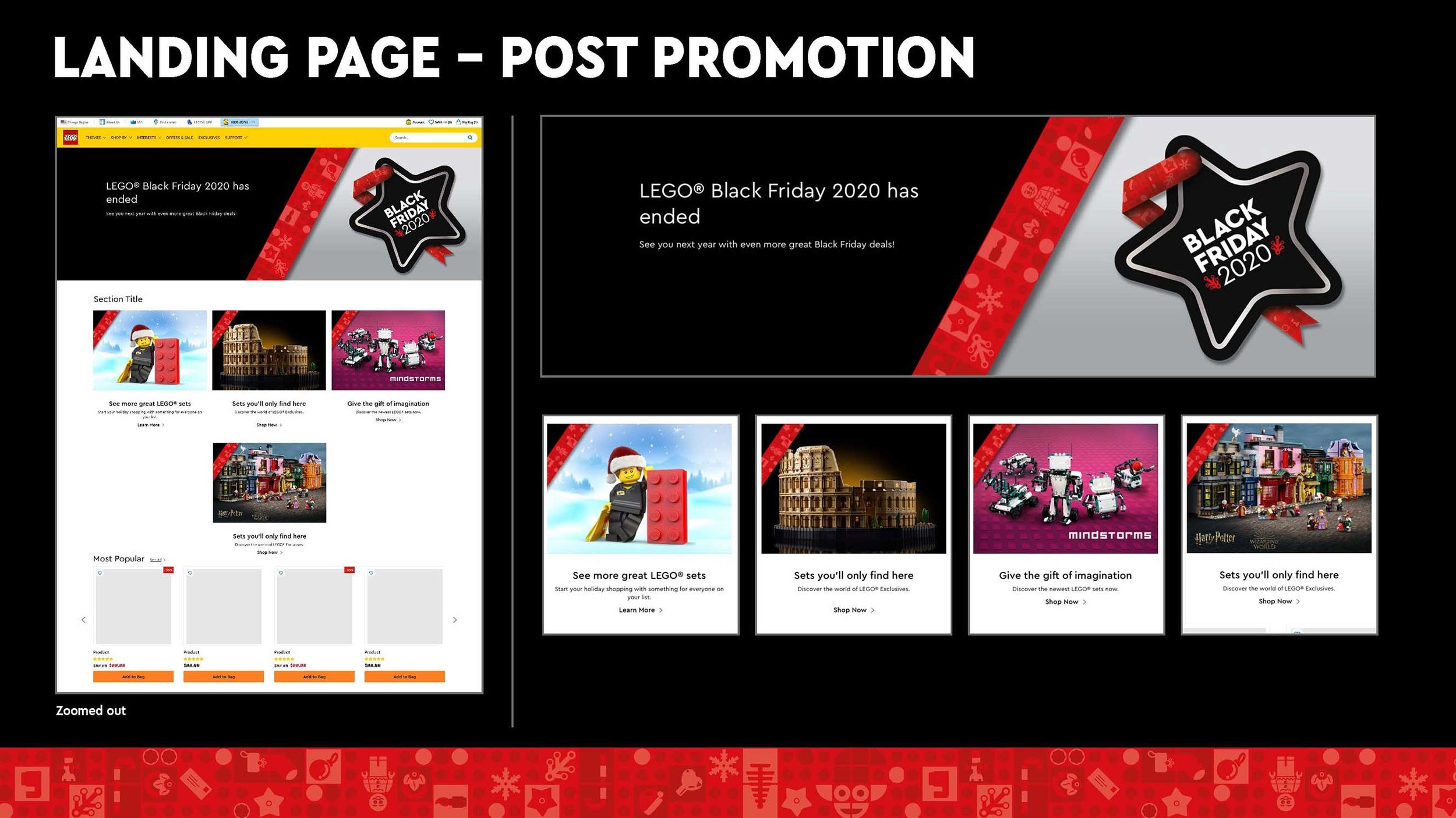
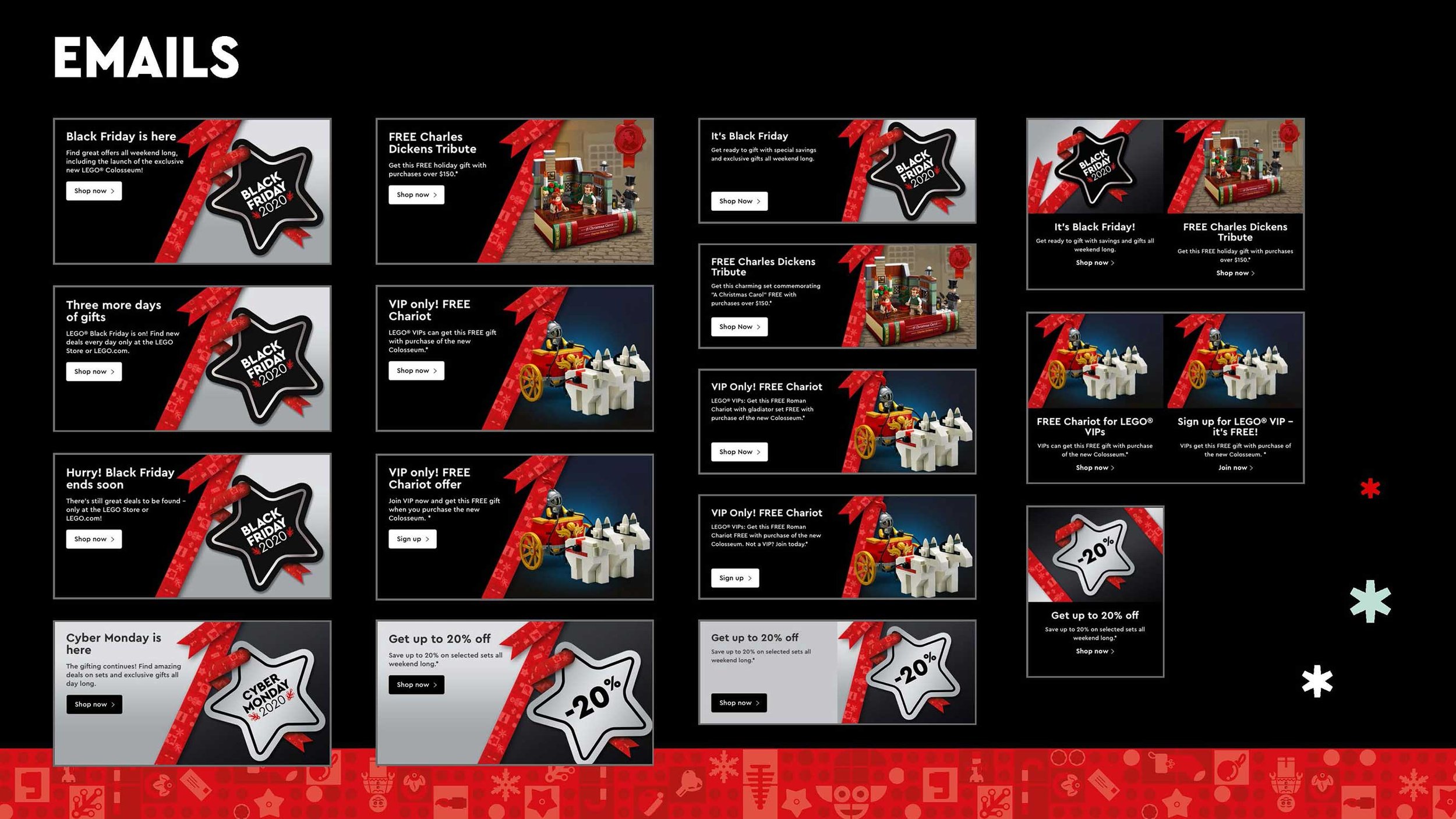
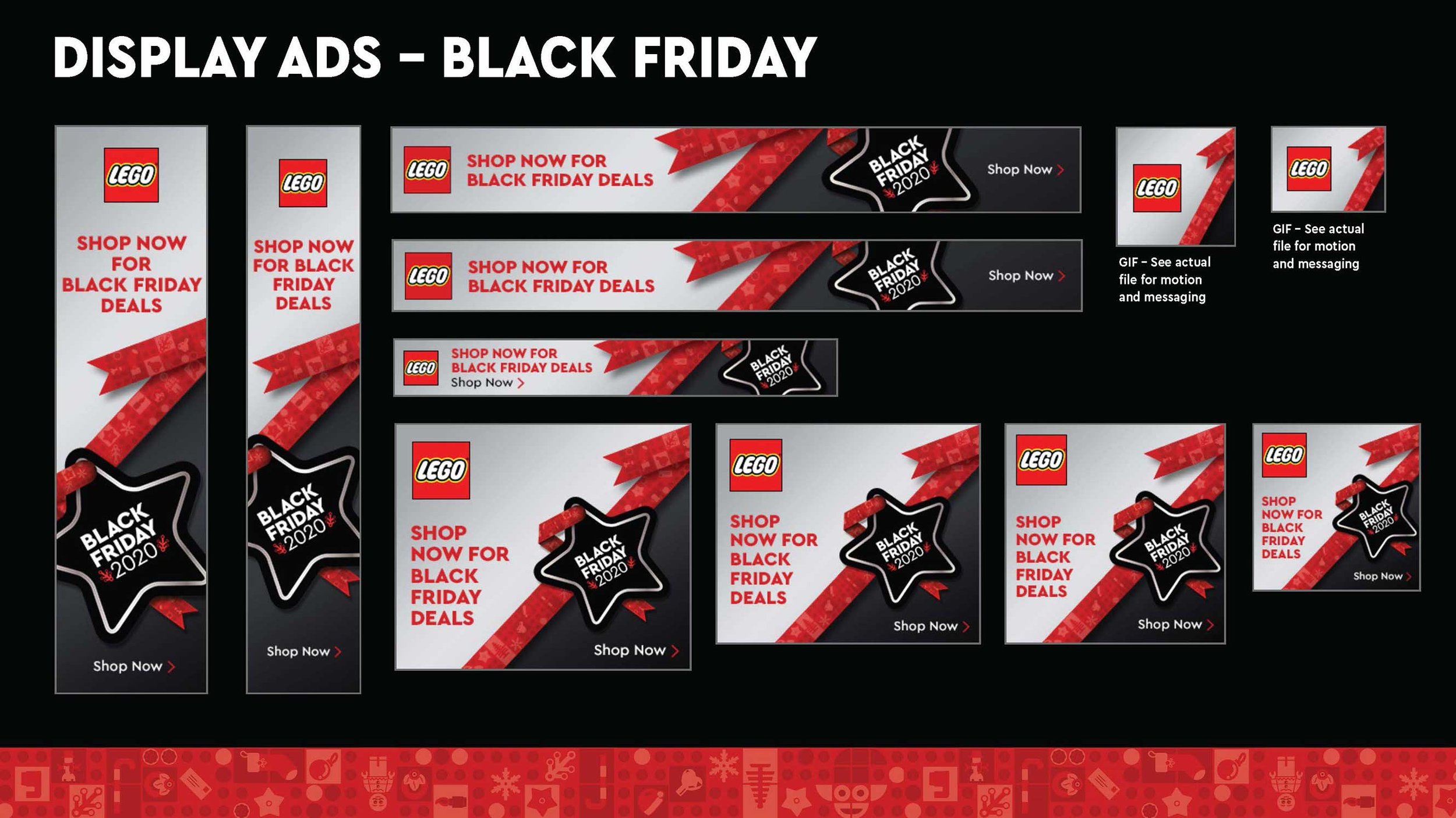
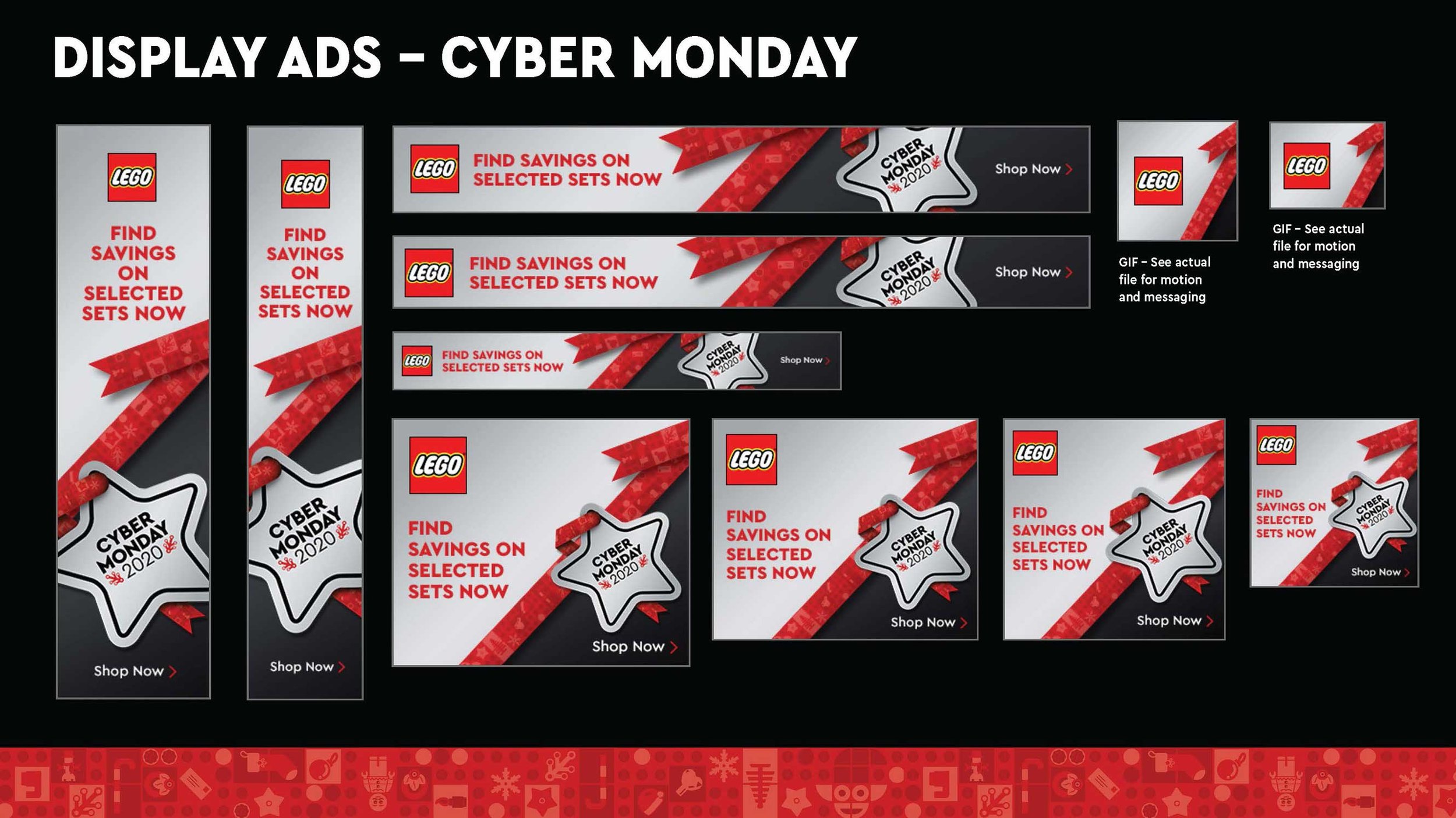
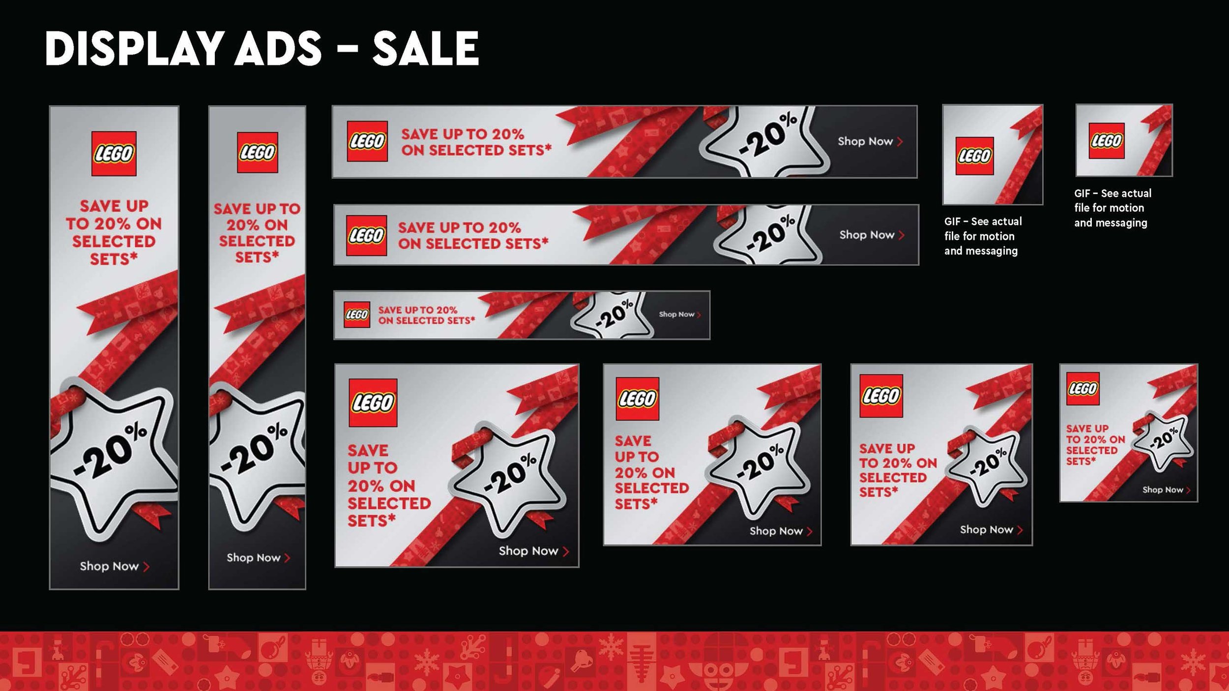
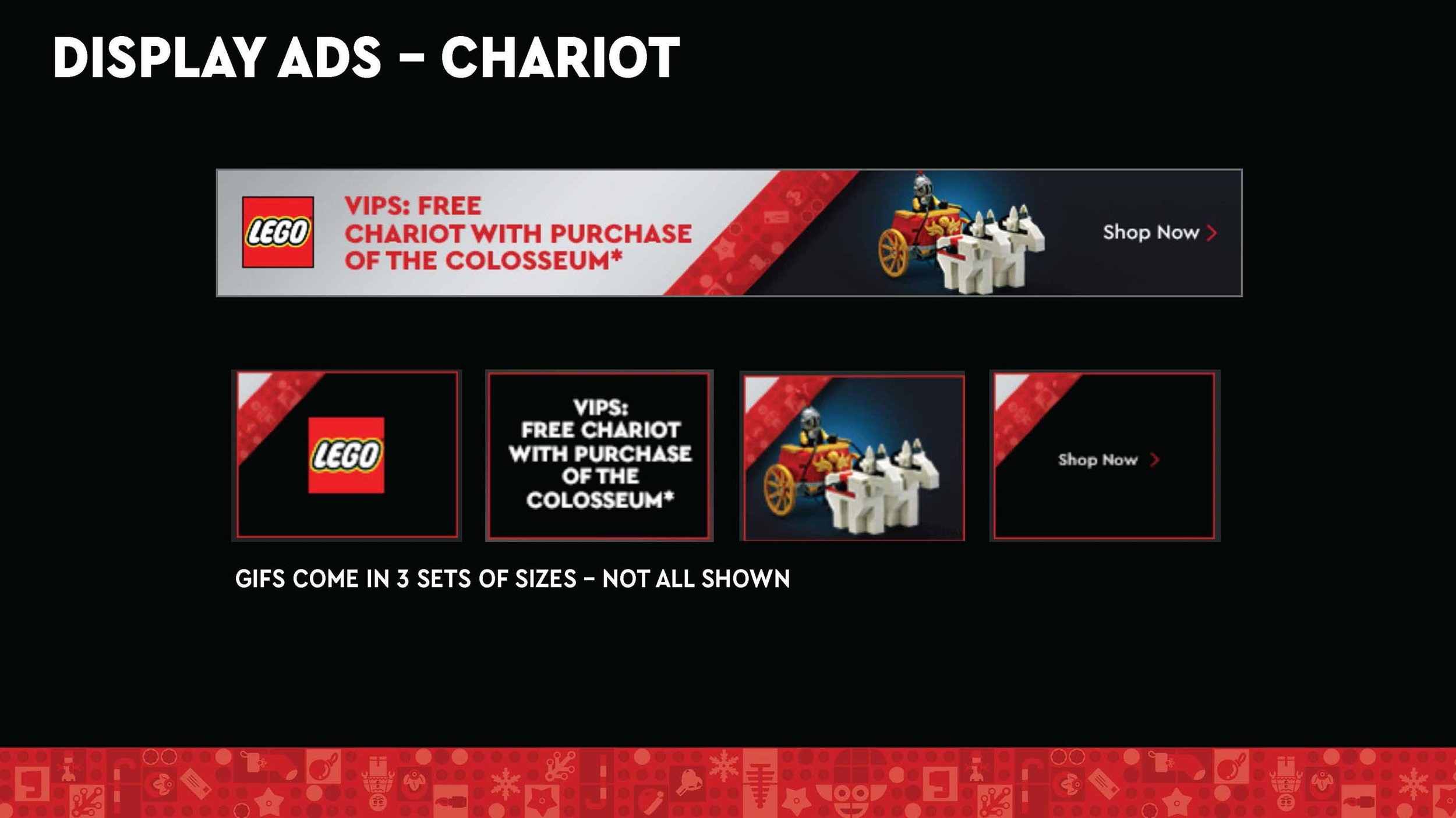
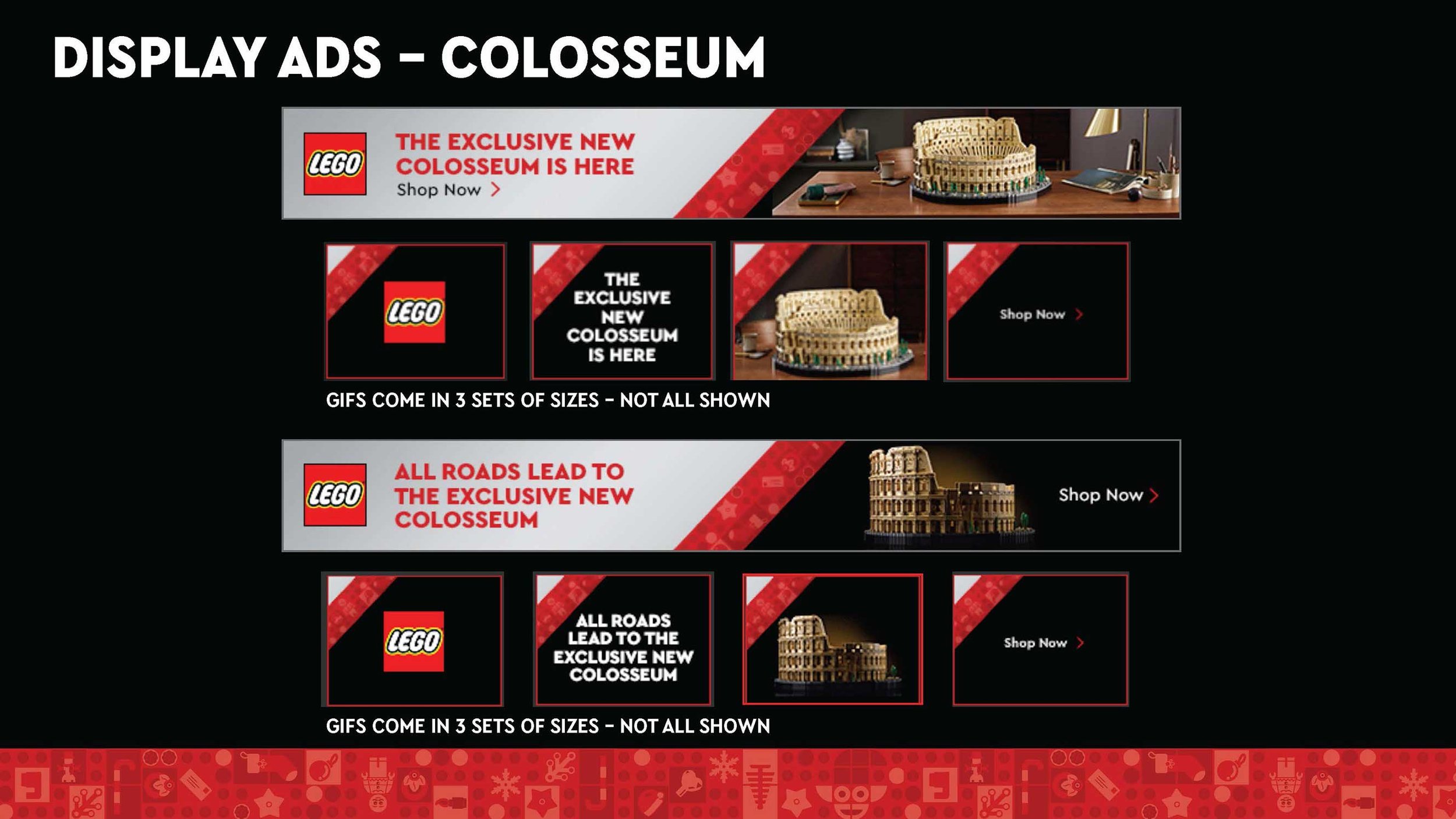
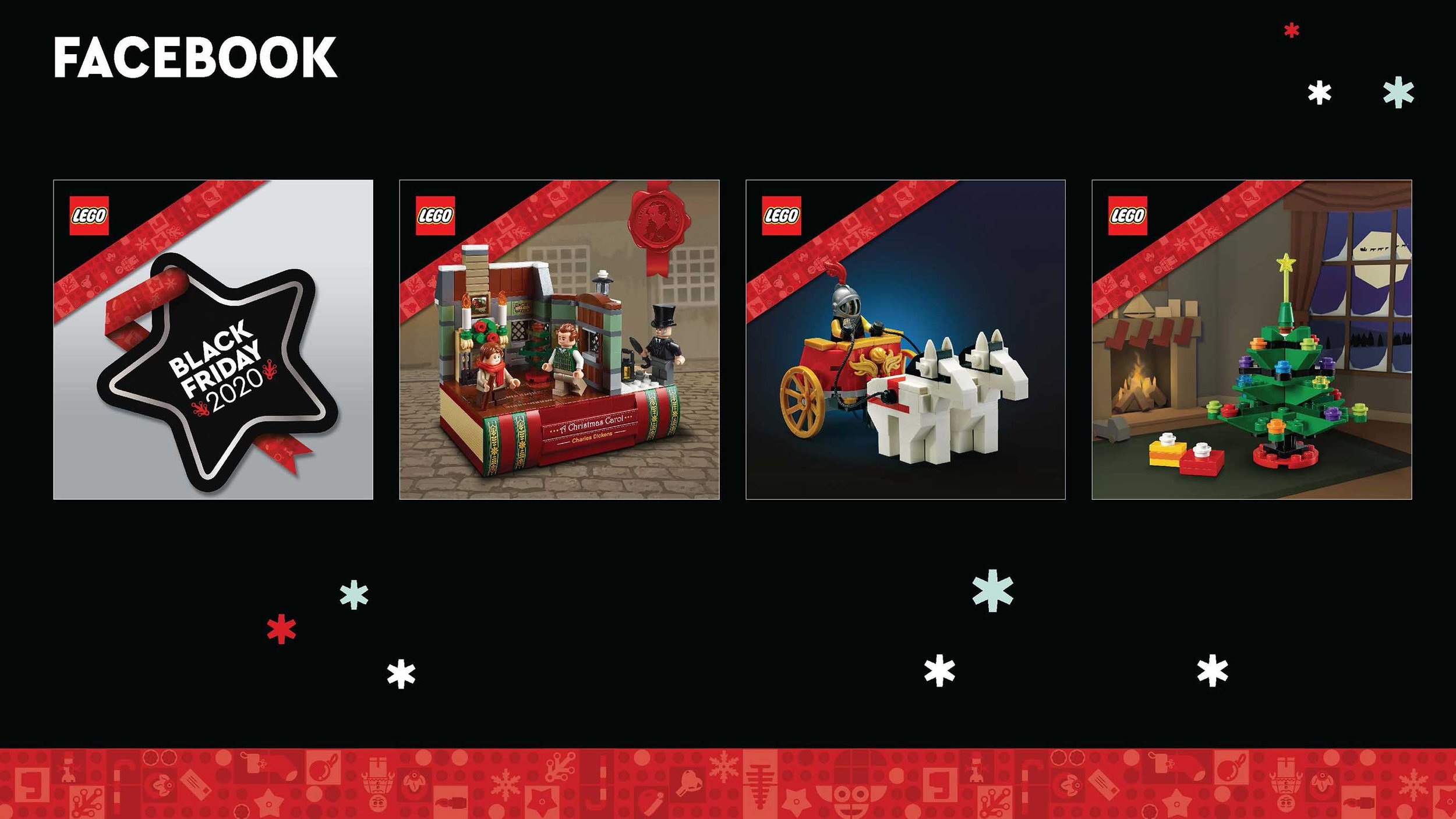
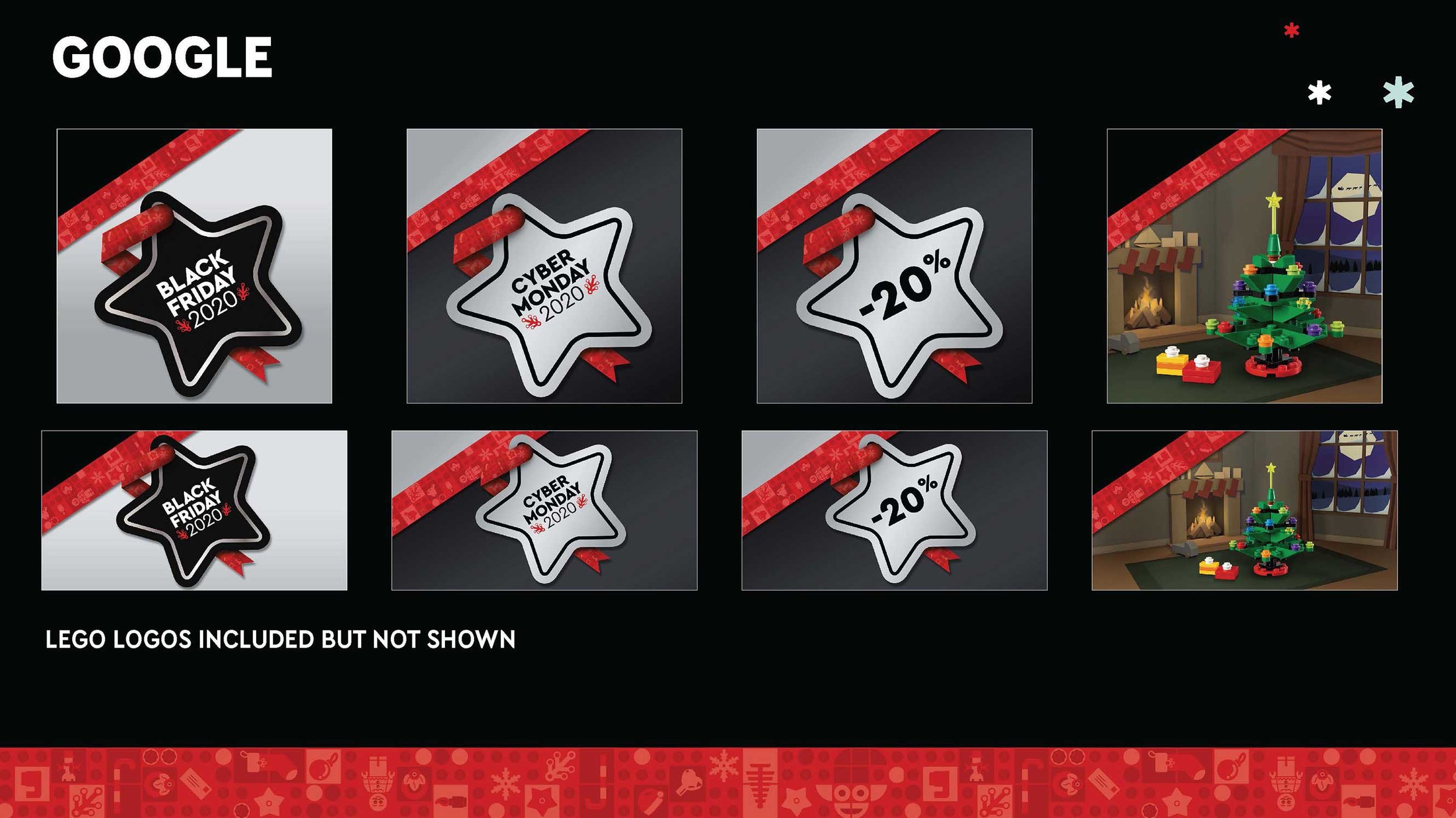
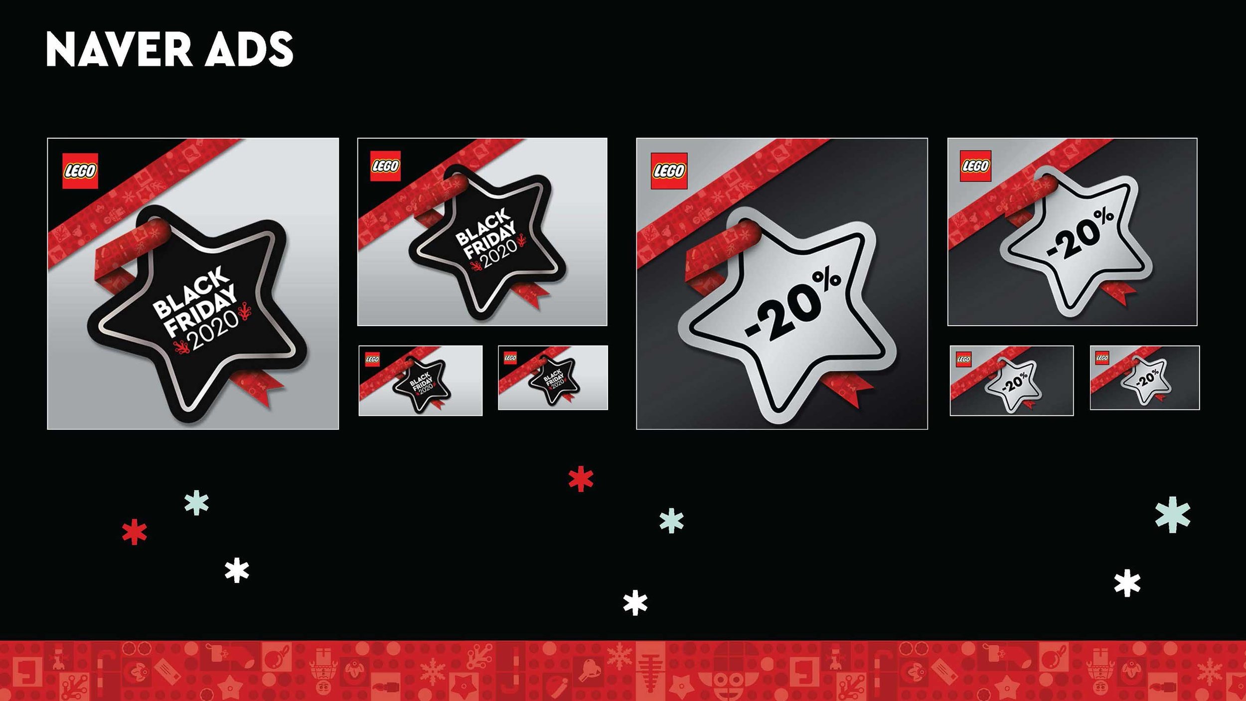
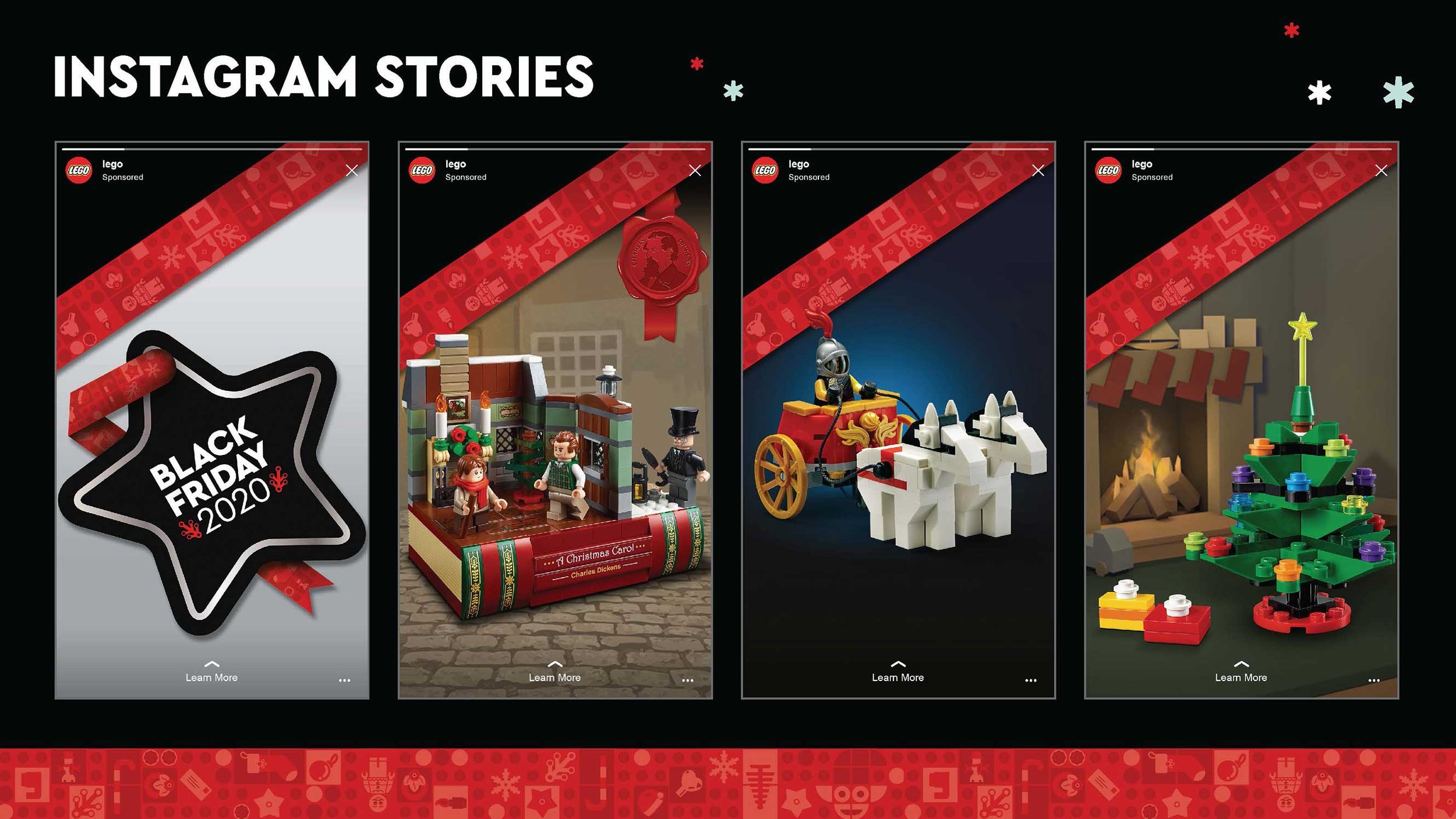
LEGO® Black Friday / Cyber Monday 2020


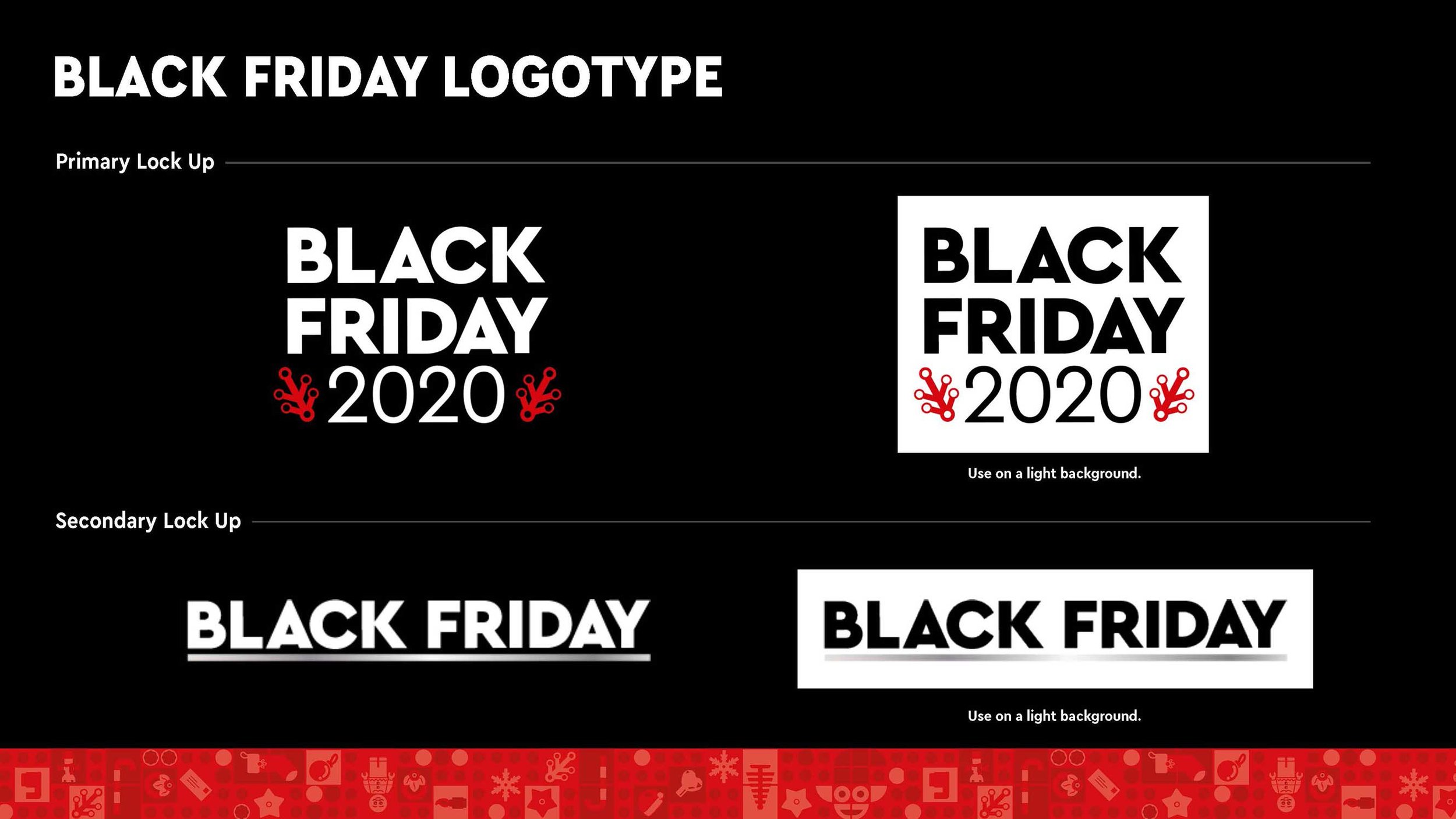


Black Friday Cyber Monday is one of the LEGO® brands biggest promotions of the year. A key visual is not needed, as offers and products are the main heroes during this period of time. We needed a distinct framework around these offers and products. We also need to ensure the look is bold enough to cut through retail noise and premium enough to reflect the quality of the offers.
Working within the guidelines handed down I created the style guide and tool box to be implemented across all channels, both instore and online. The star was based on a LEGO brick element and the “holiday ribbon” was used as a through line and content partition.
Final Instore Channel Implementation
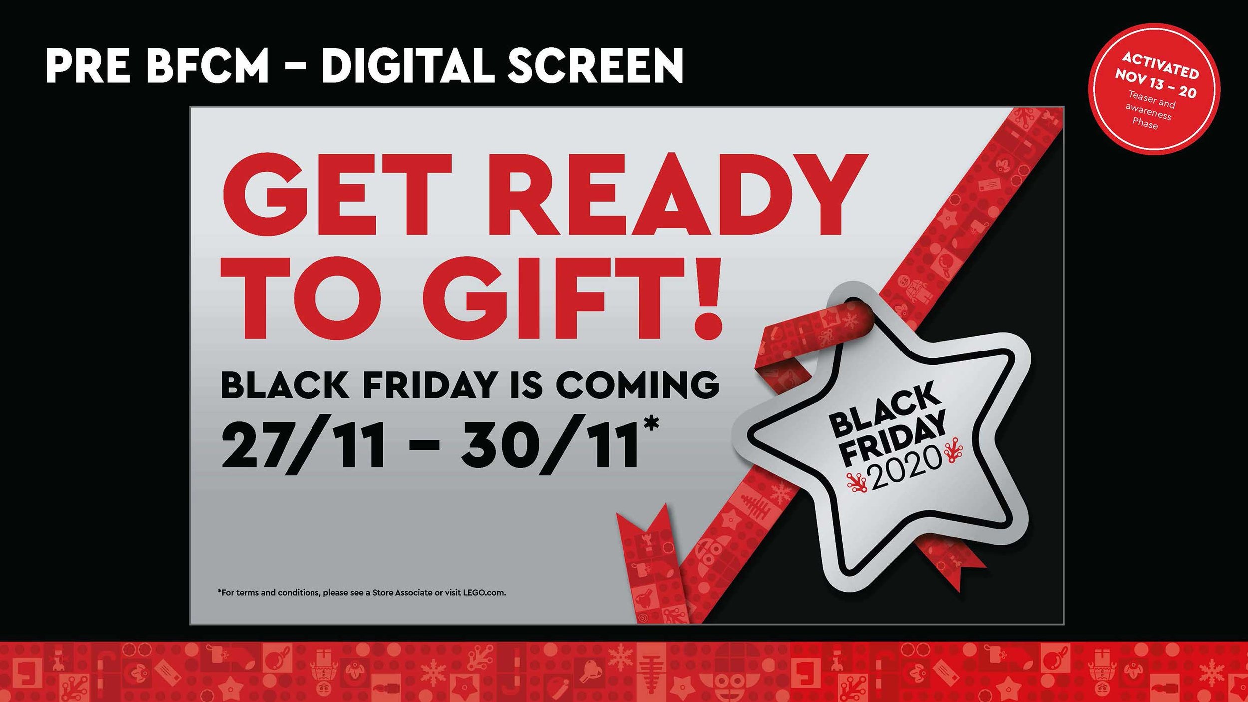
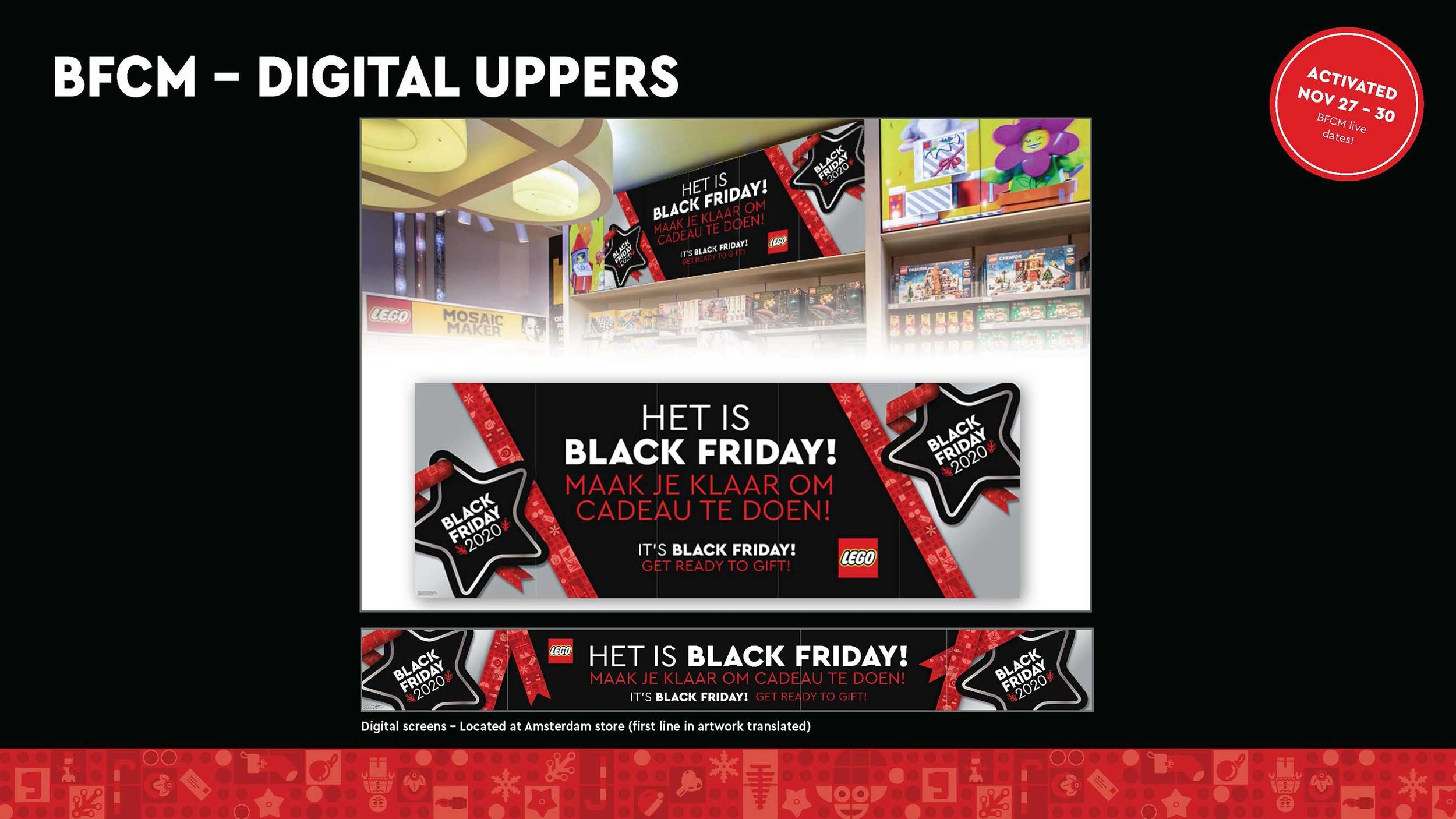
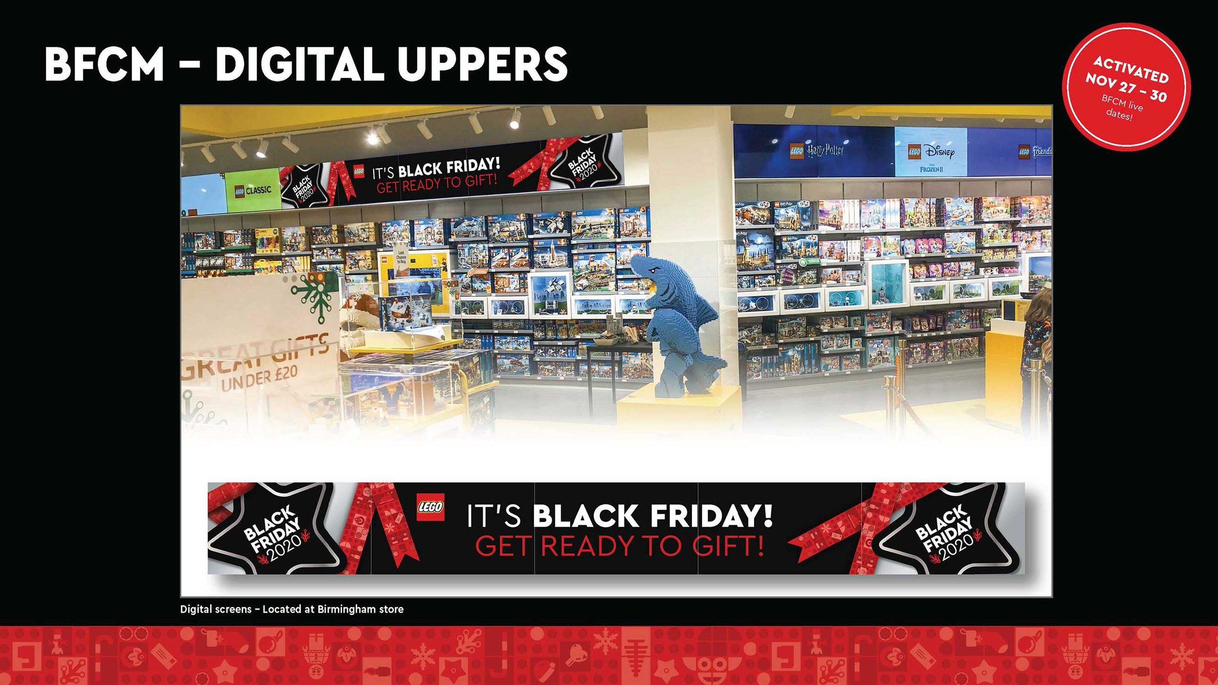
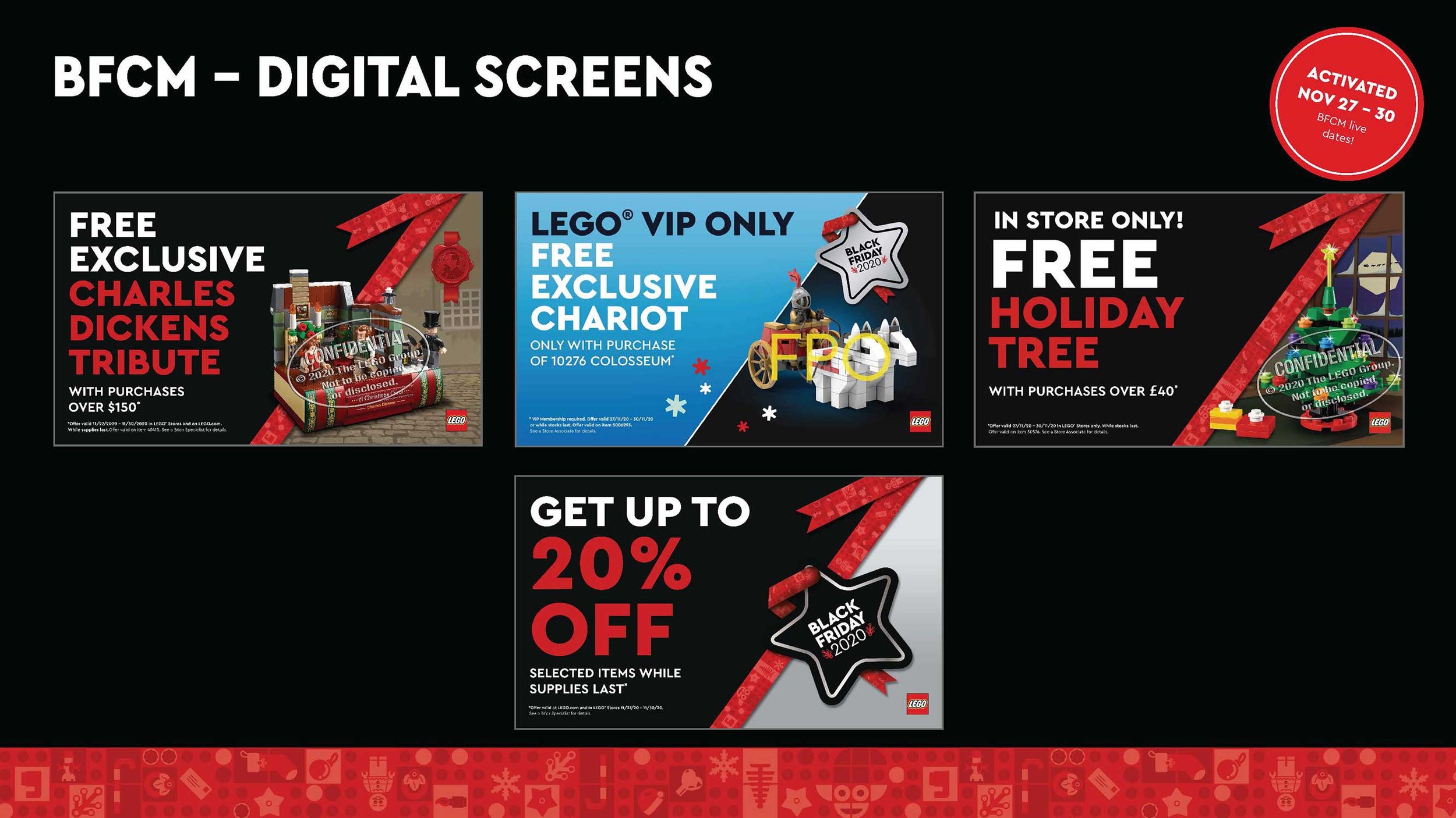
Final Digital Channel Implementation
Bidwell Energy
Bidwell Energy deals with wholesale energy procurement and transactions. They pioneered the wholesale energy auction market more than a decade ago, conducting thousands of online pricing events. In addition, their platform has transacted billions of dollars of energy products. The goal was to create a brand identity that was modern while feeling traditional and established. Using color we highlight the bidding aspect in their name while the counter shapes in the “B” are derived from electrical circuits.

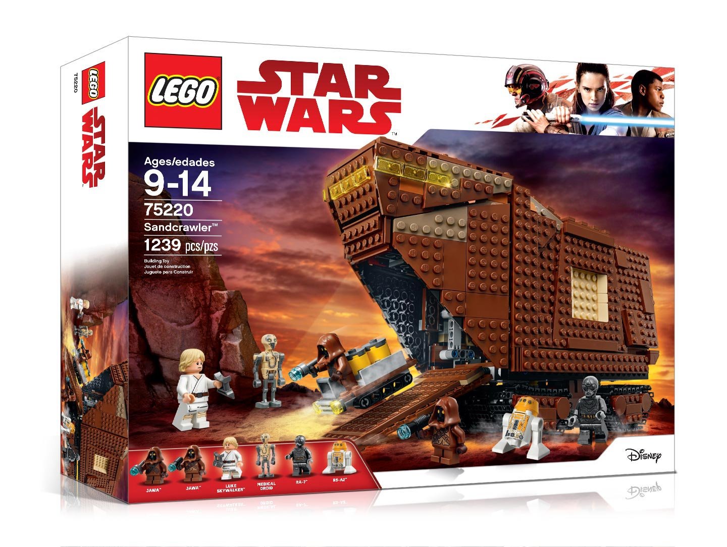
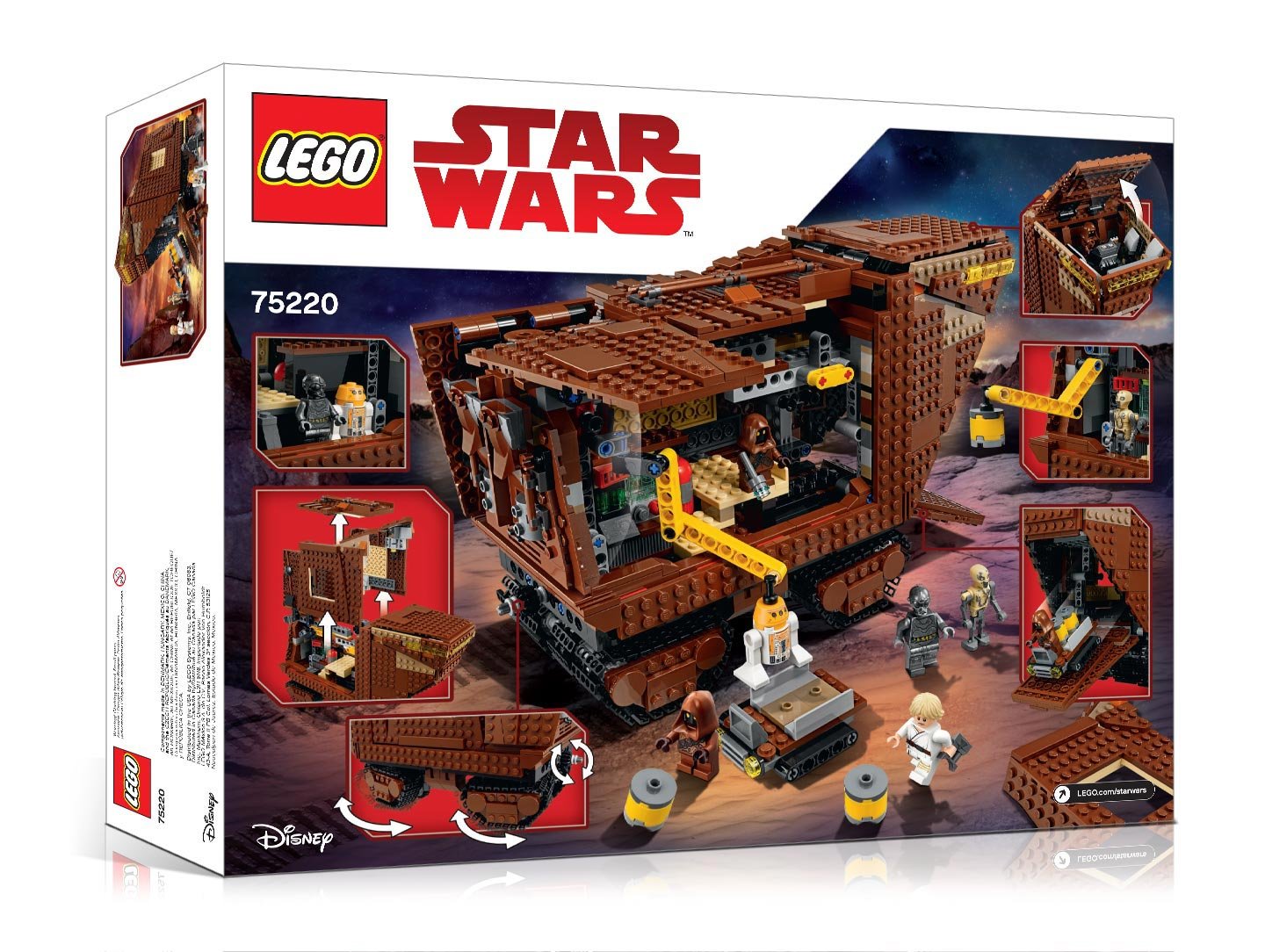
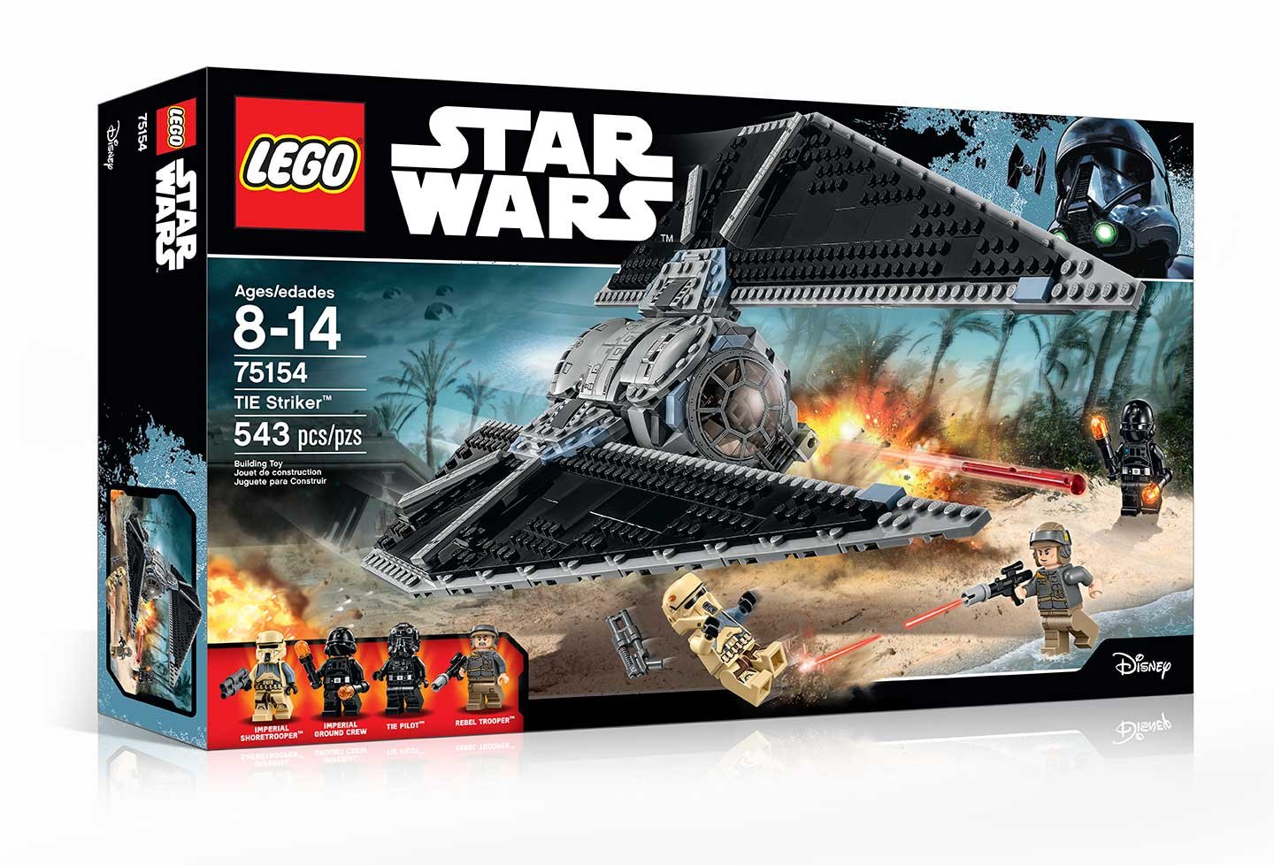
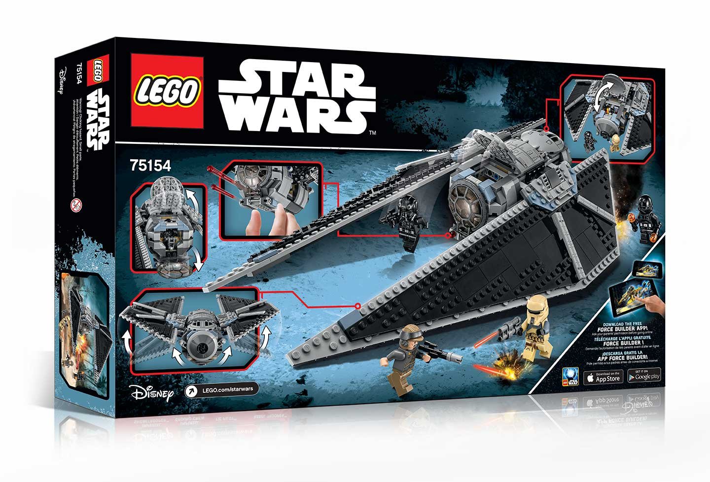
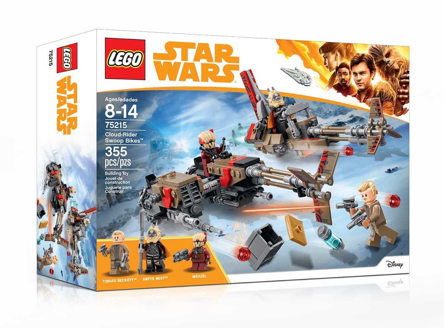
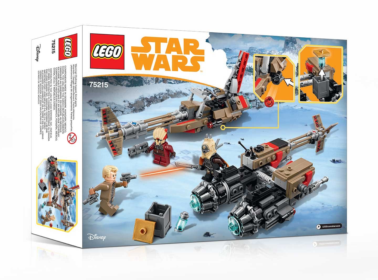
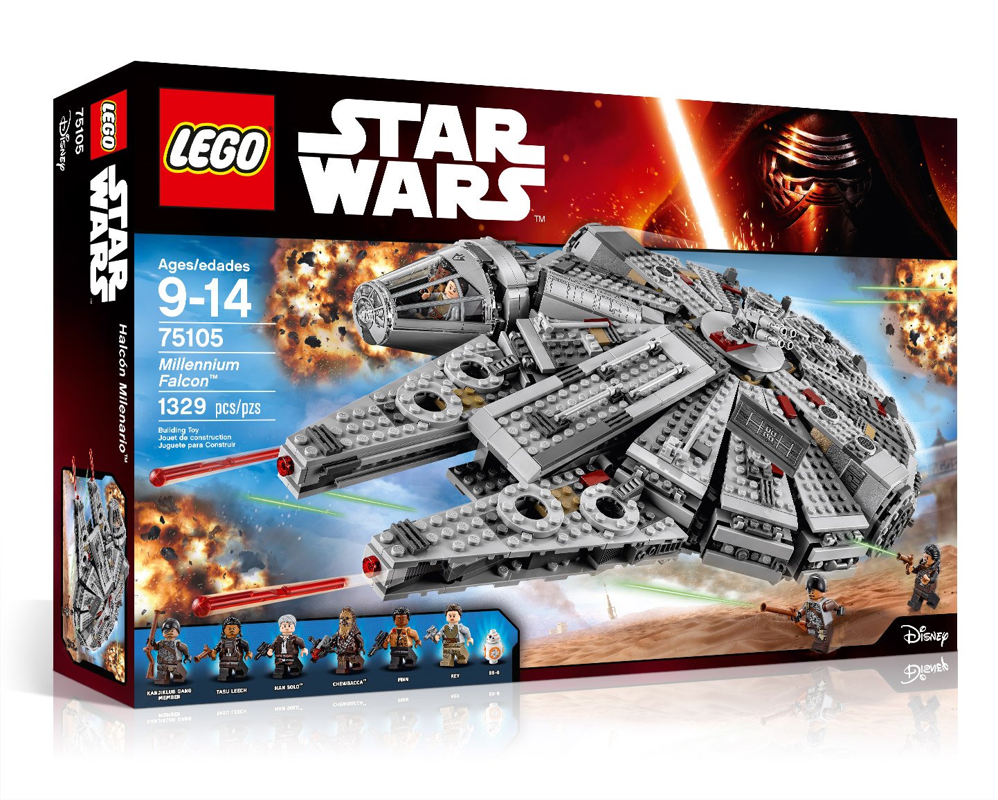
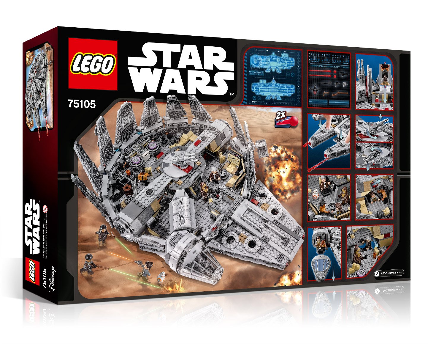
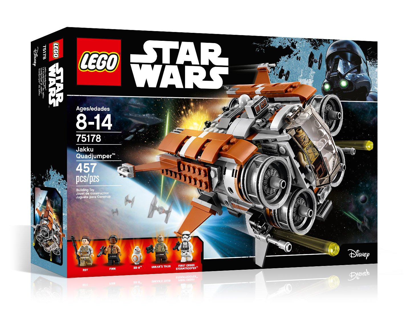
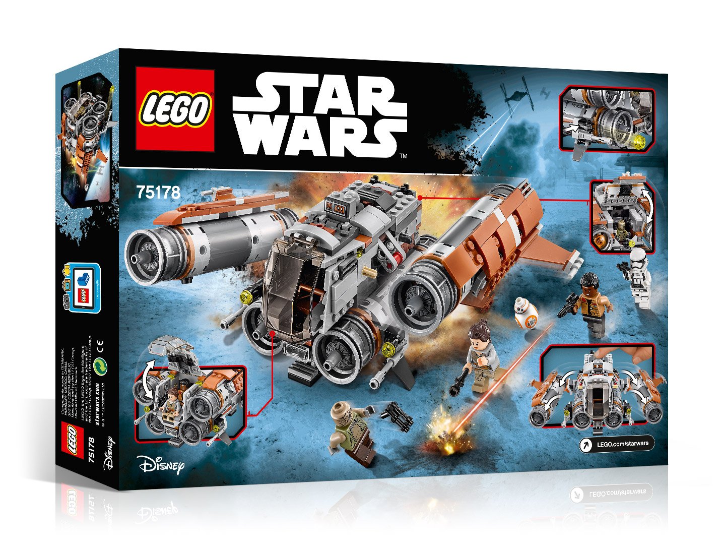
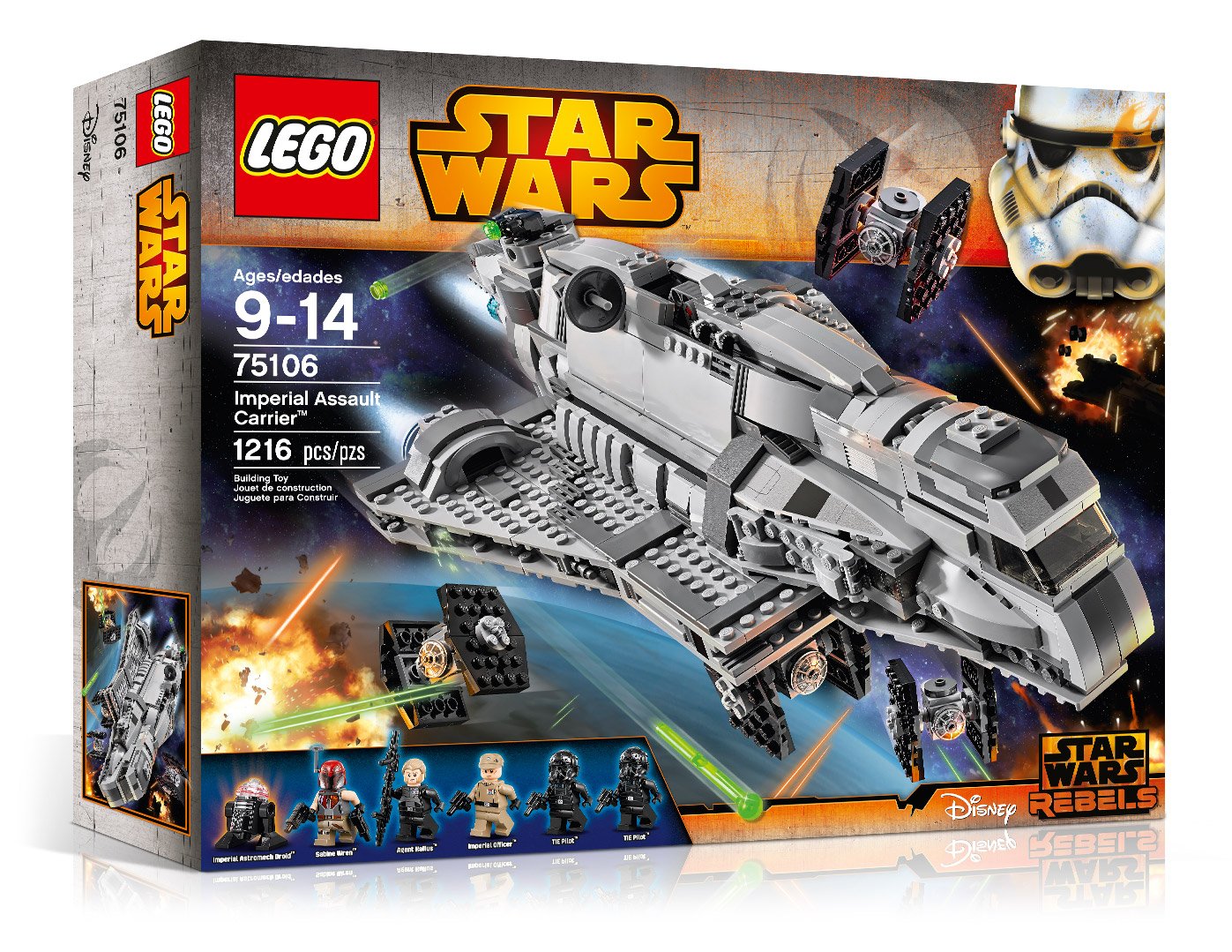
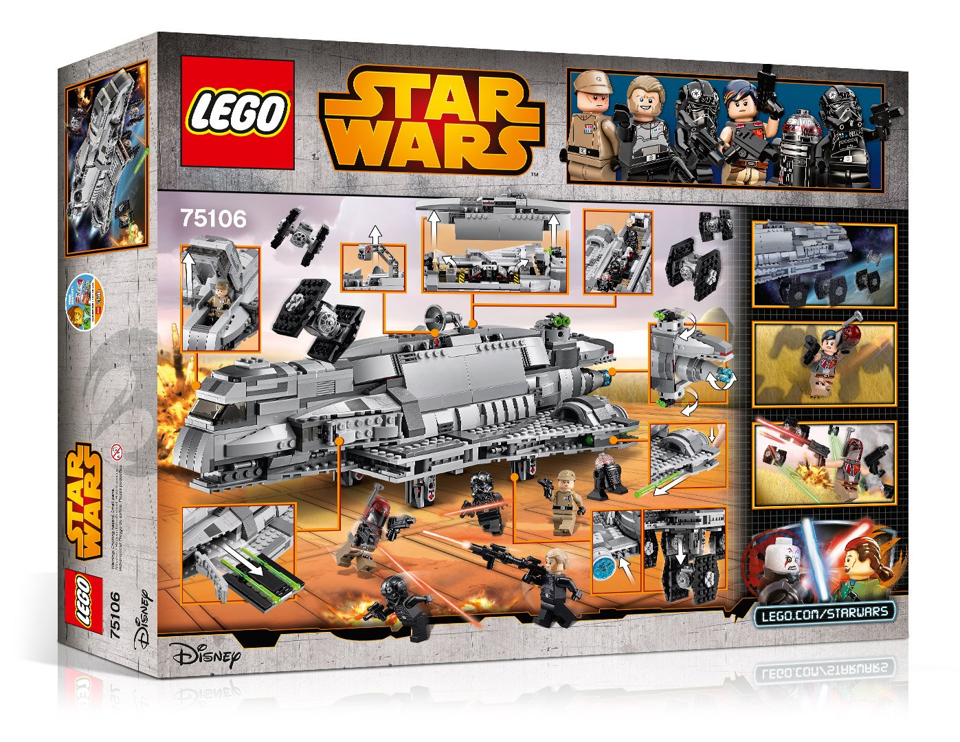
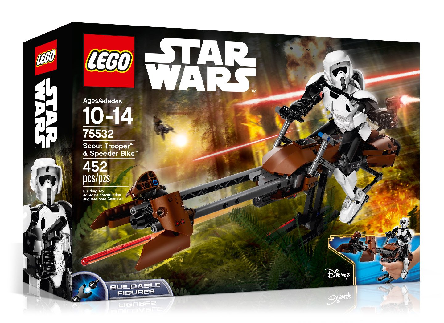
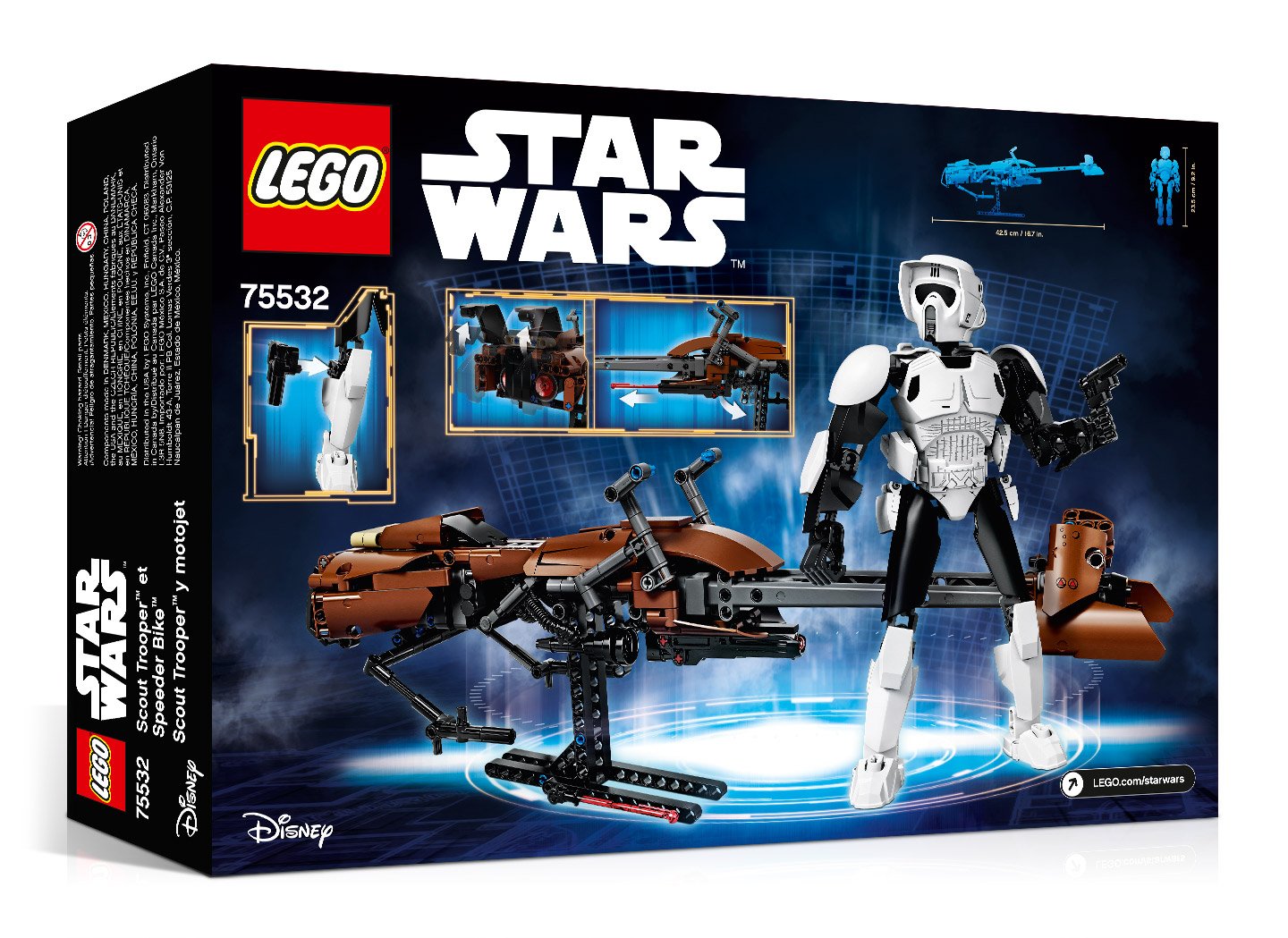
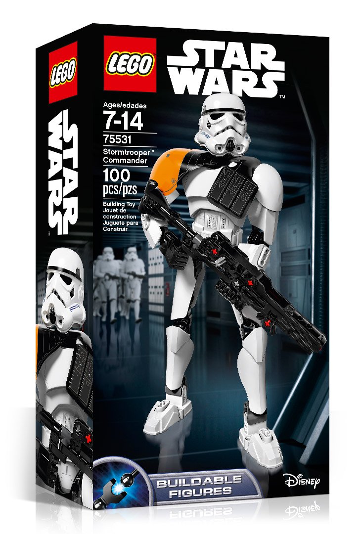
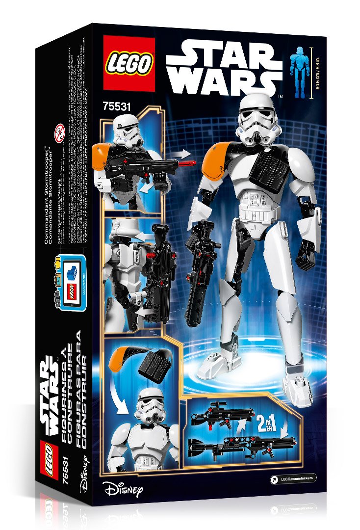
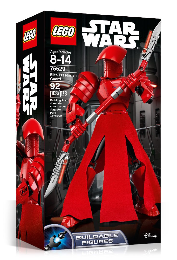
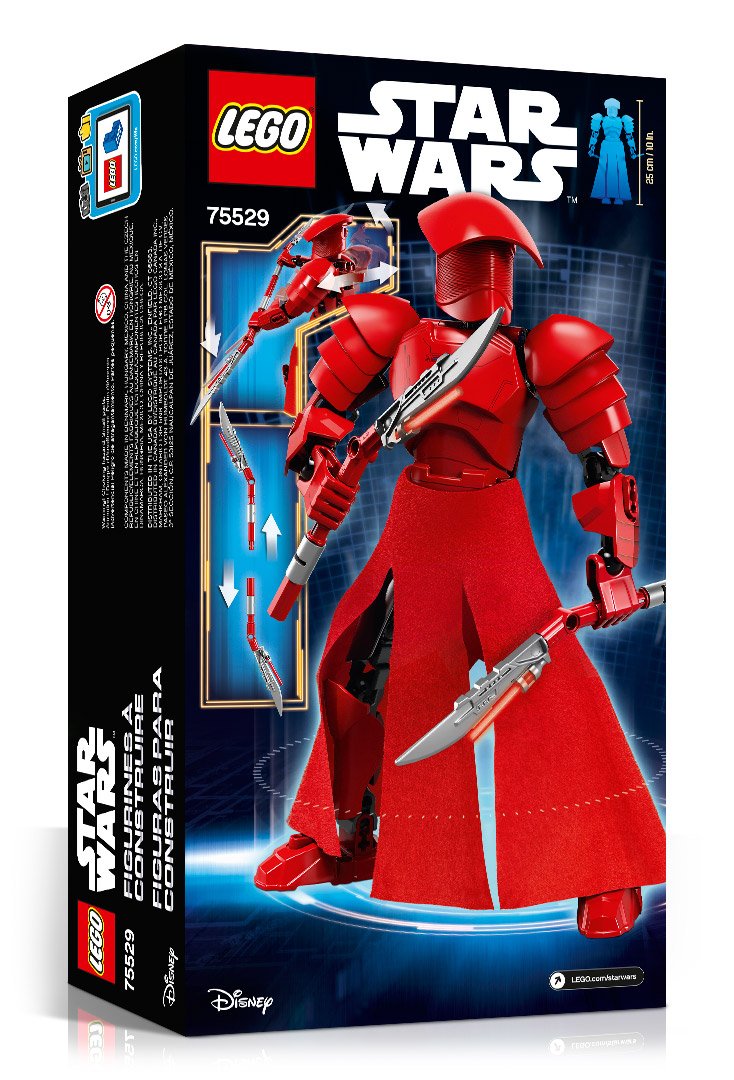
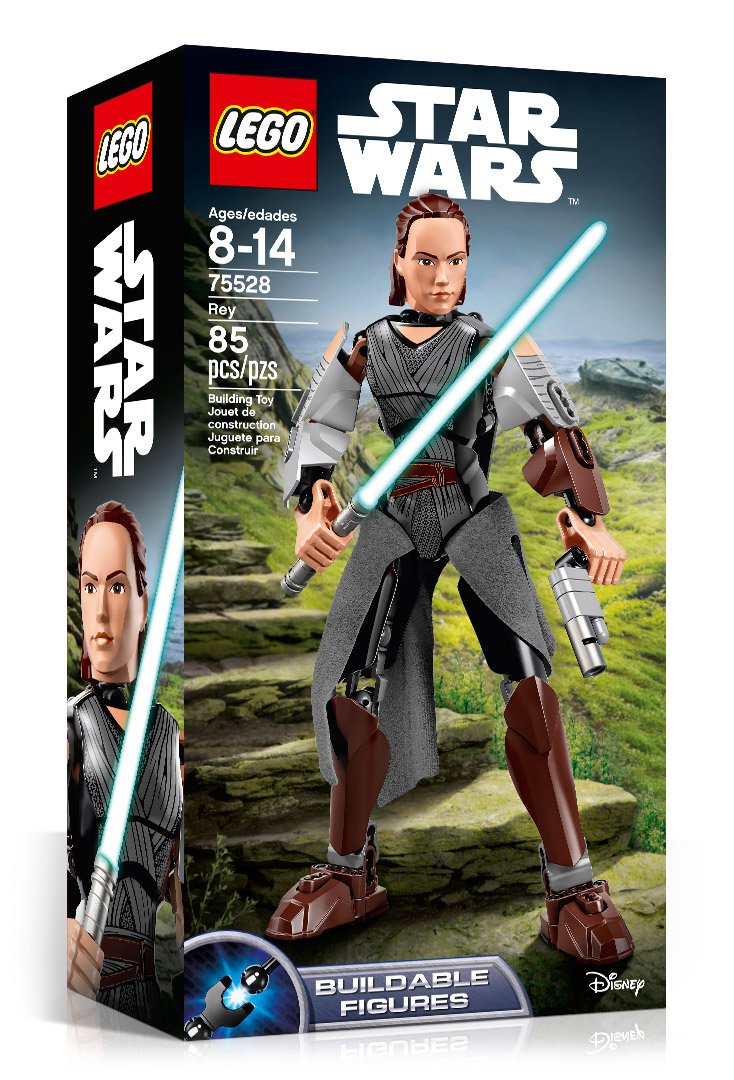
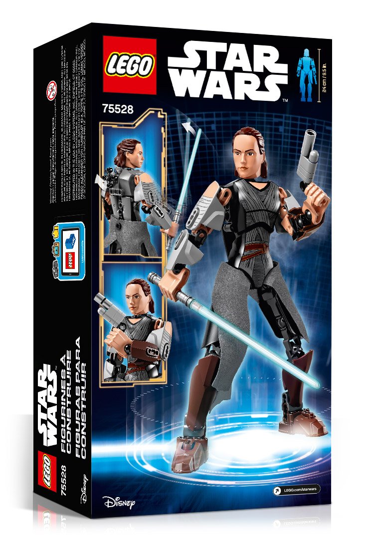
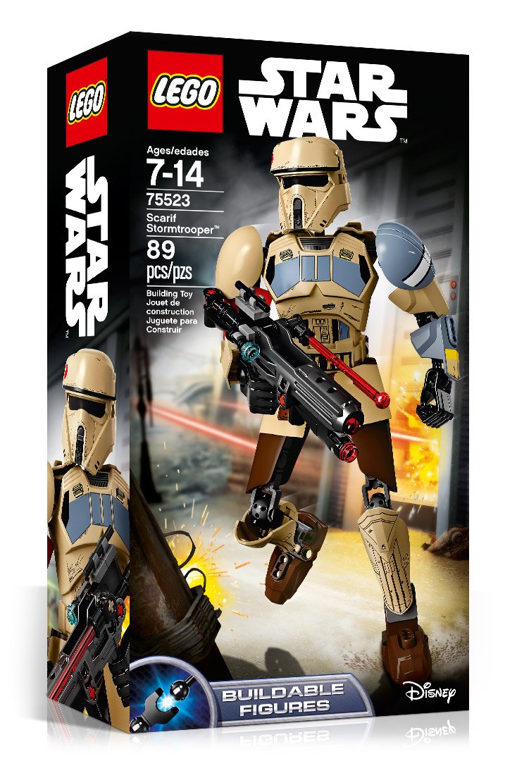
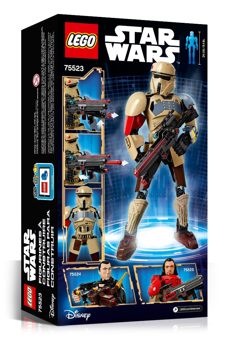
LEGO® STAR WARS™ Packaging
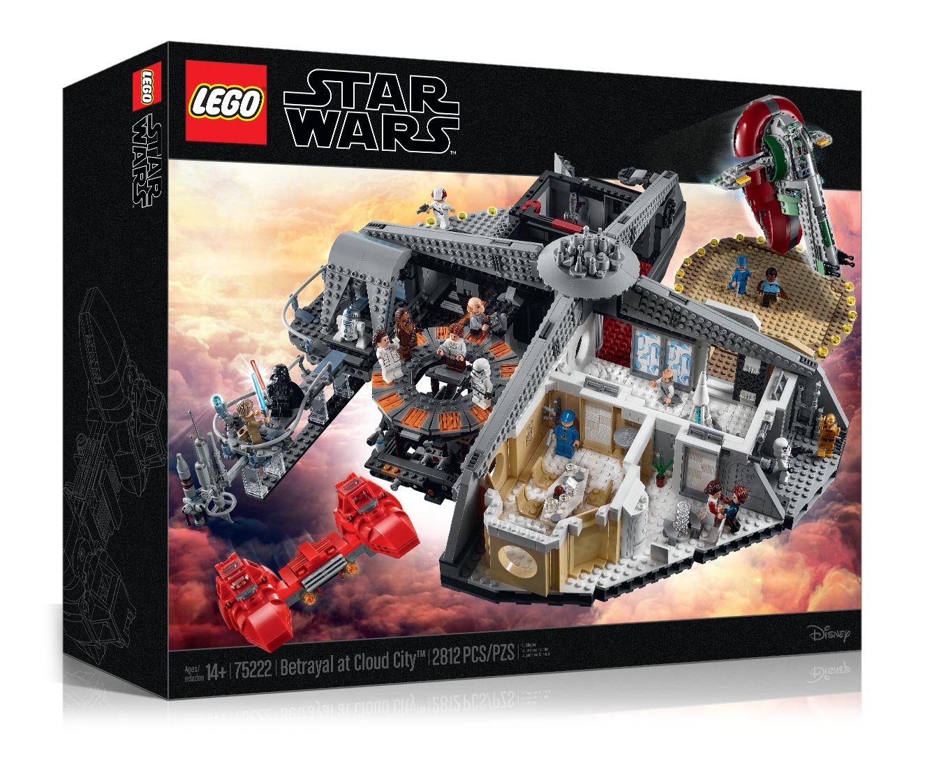
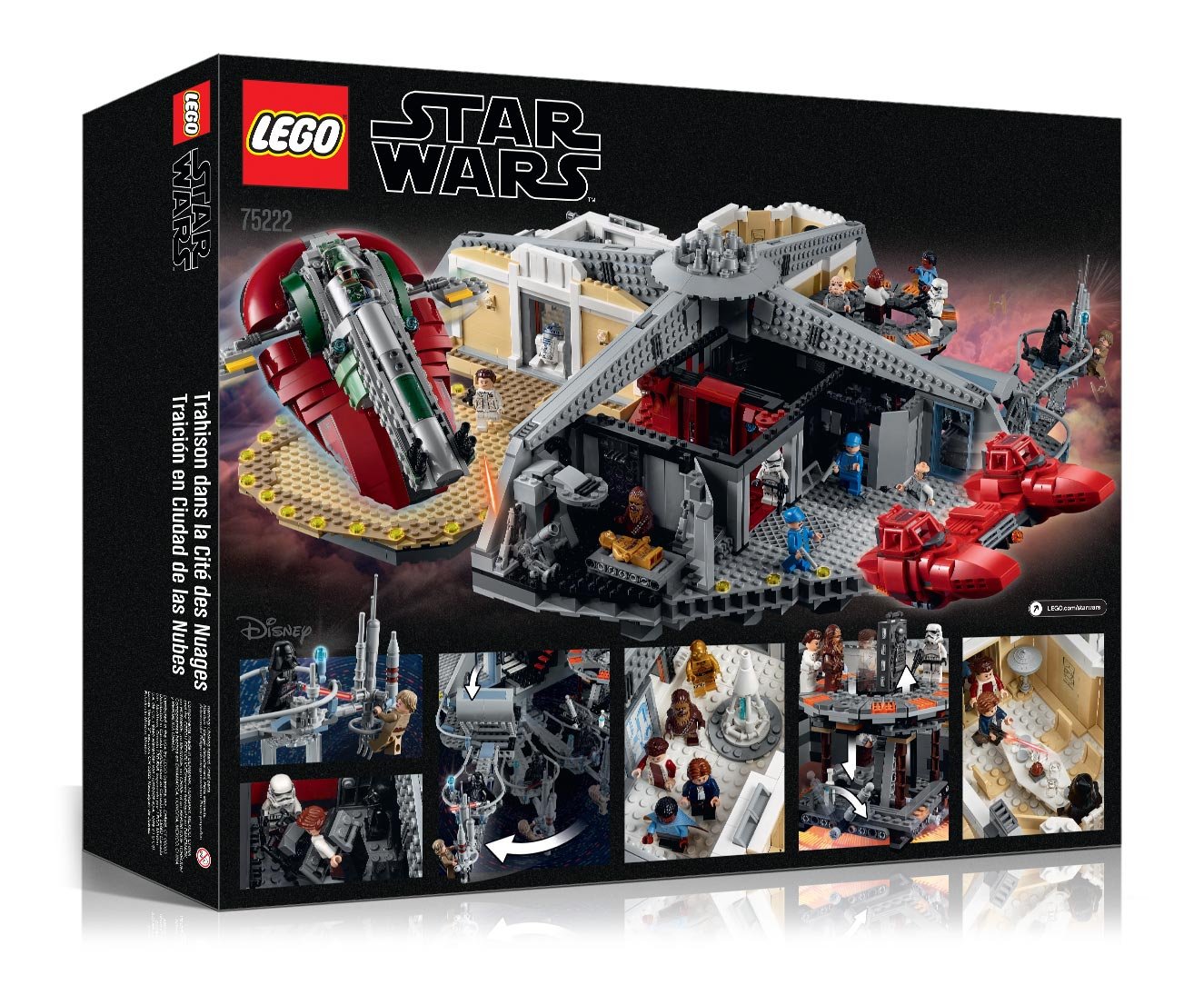
For five years I created packaging for the LEGO® Star Wars™ line. Coordinating designs between marketers, model designers and Lucasfilm Ltd. always proved a challenge since models were preliminary. The movies were set to be released at least a year out, making them subject to change.
Aside from laying out principle design for each package, I positioned the preliminary models in Maya. After dropping them into the layout, I created backgrounds and effects to complete the scene. Once approved, I oversaw photography of the final models which are composed to match the approved layout.
LEGO® STAR WARS™ Phase 2 Visual
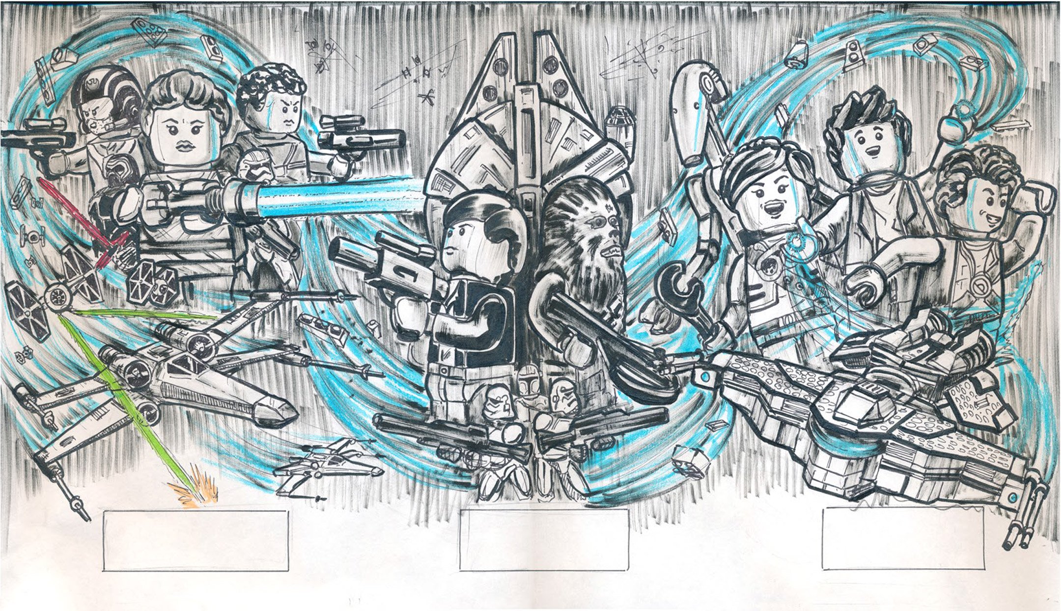
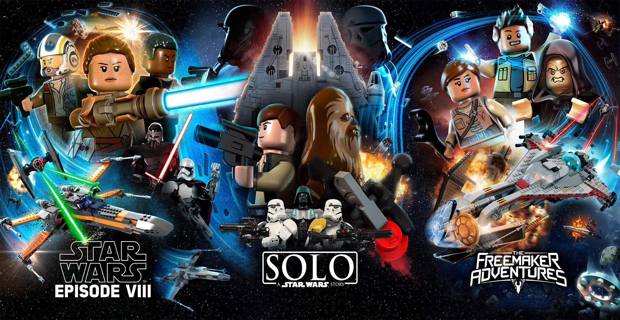
This 55” x 116” panel backed a podium display that was an internal marketing piece we used to sell our portfolio of products to corporate leadership. The goal was to unify three separate Star Wars™ properties under one key visual. The biggest challenge was to find a way to combine the classic miniature with the larger buildable figures. We chose to use the "Force" swirl featured in the "Master Your Force" campaign to carry the viewer’s eye through the product line assortments.
I was responsible for the overall composition, effects and positioning of 3D characters. After sketching a direction for the marketers, which you can see in the slideshow below, I positioned the 3D characters and directed our 3D team on model positioning in the final render.

Kleeberg Octoberfest
Kleeberg provides the utmost precision and quality of metal work fabrication in the Northeast. For their 60 year anniversary the company held a celebration in conjunction with Octoberfest. I created a version of their logo with a German hat and mustache creating a whimsical and clever design. It was then implemented across multiple applications including printed materials, beer steins, shirts, and fire drums.


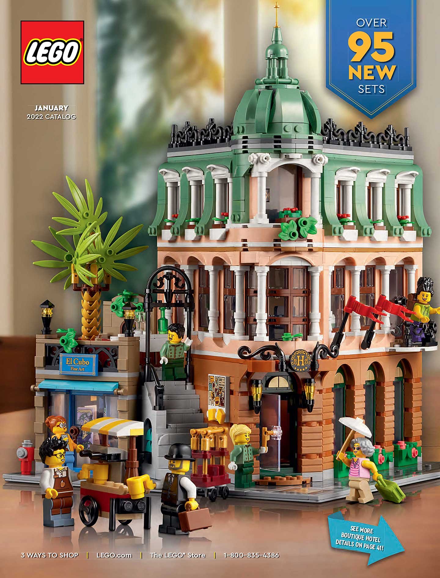
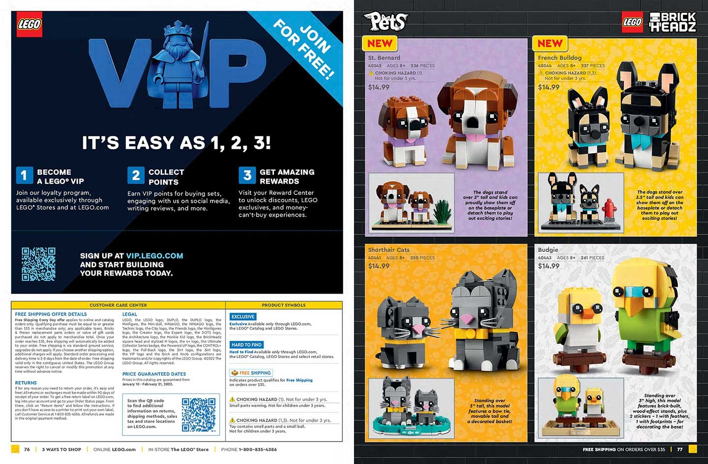
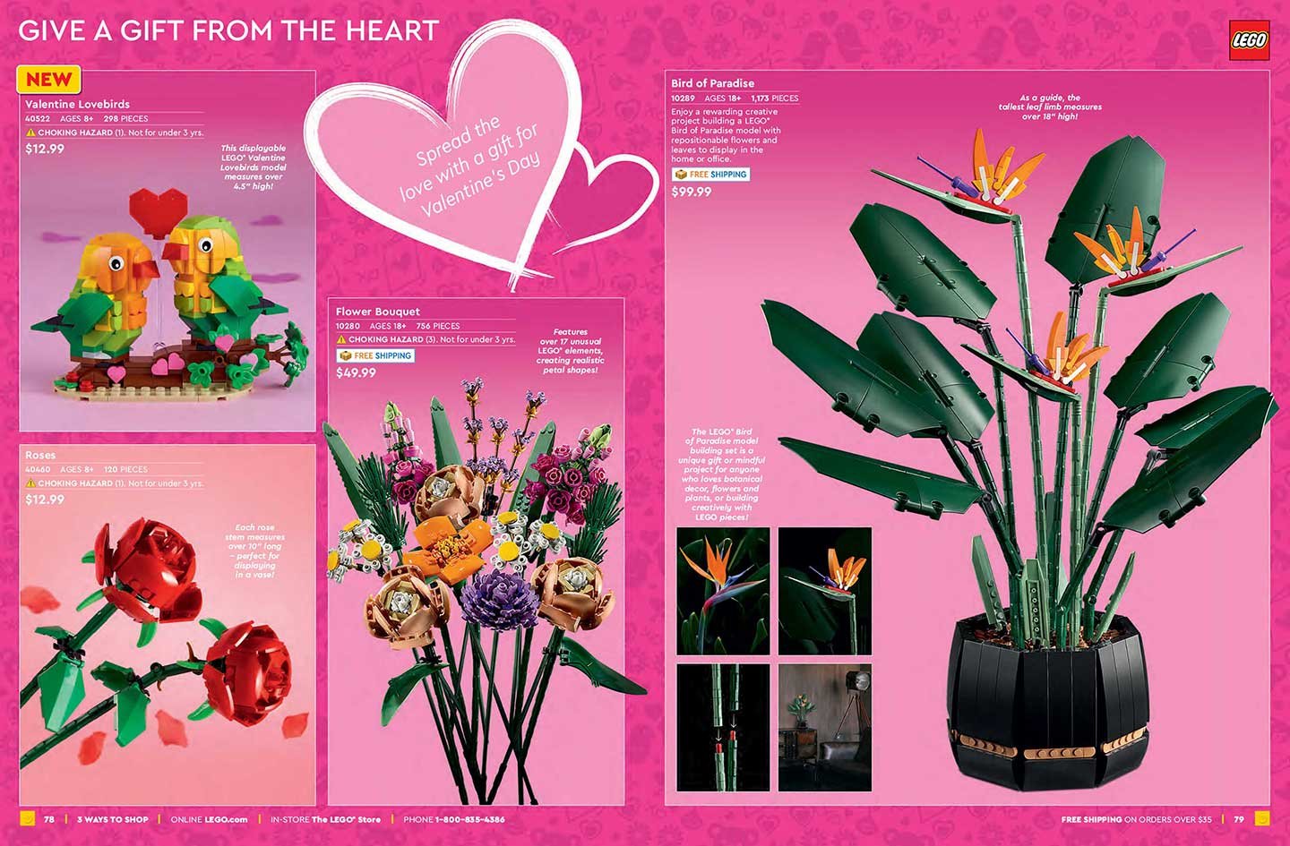
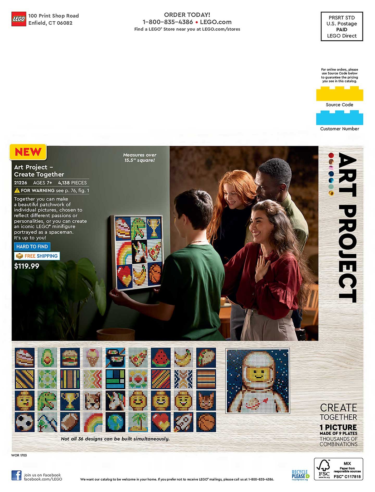
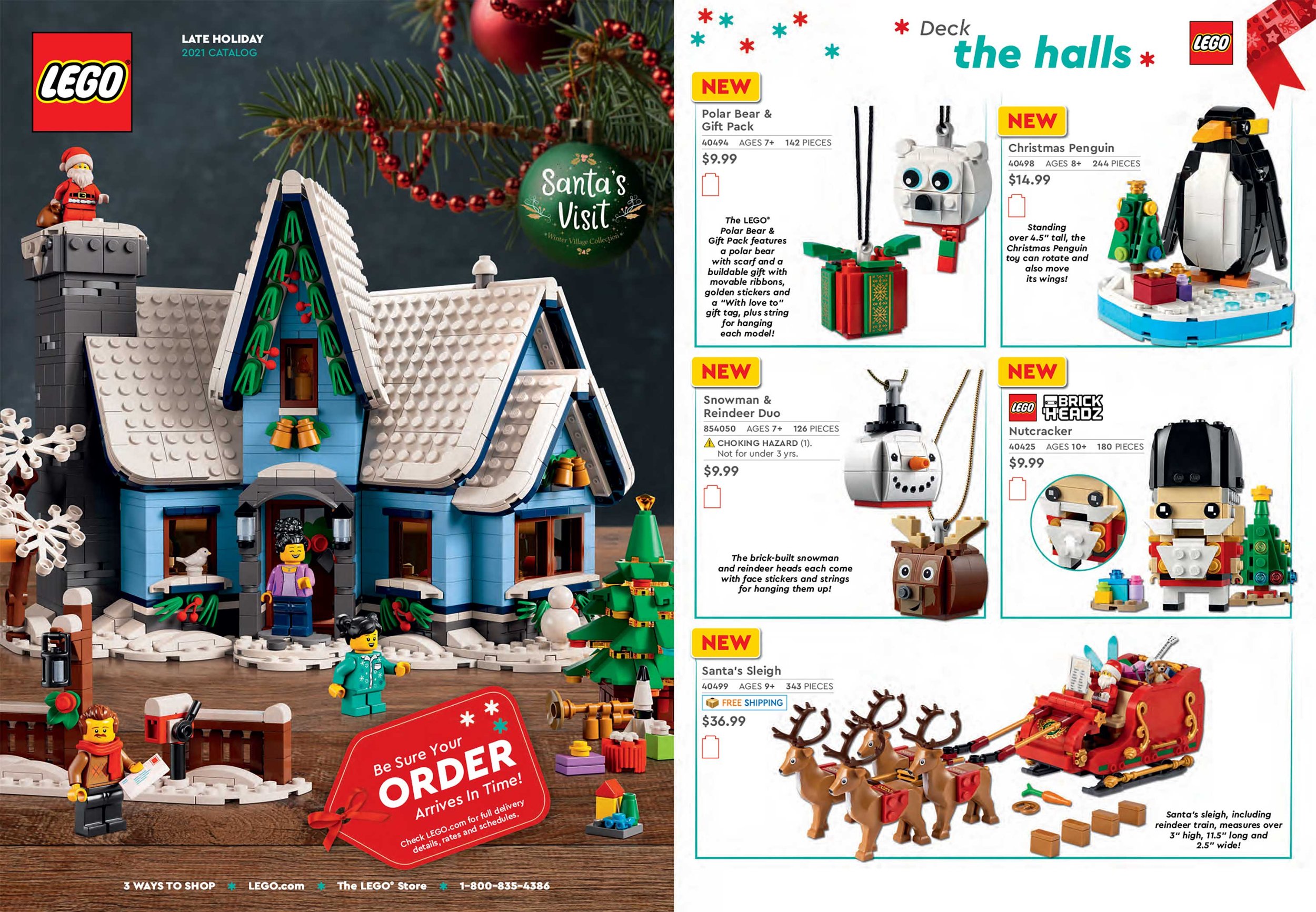
LEGO® Catalogs
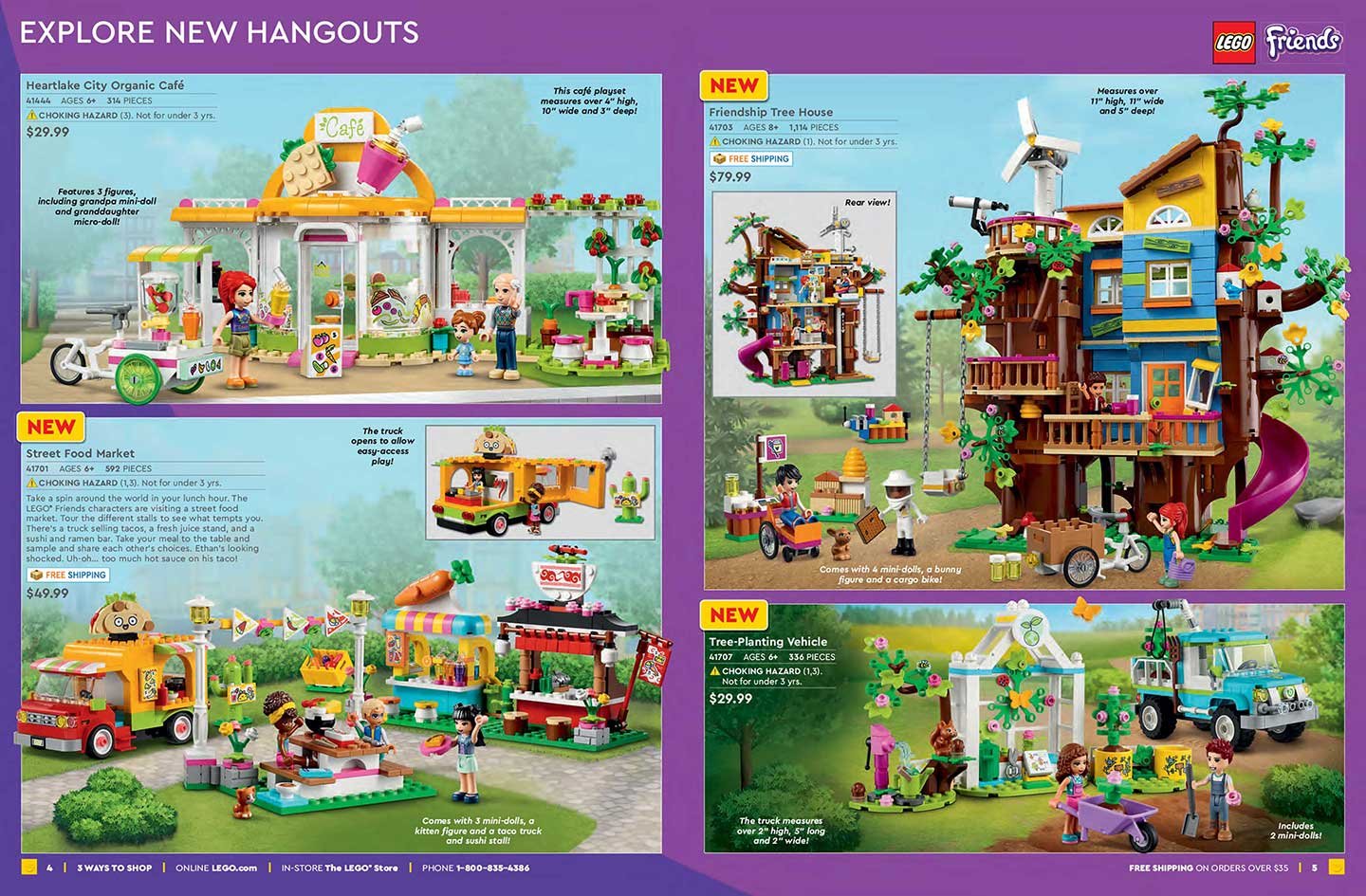
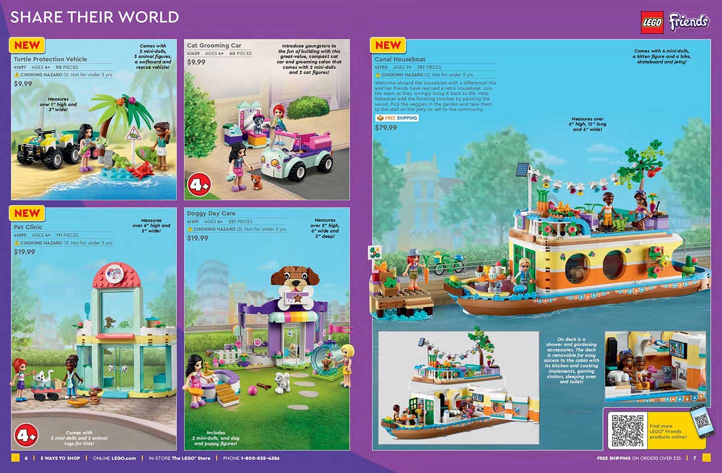
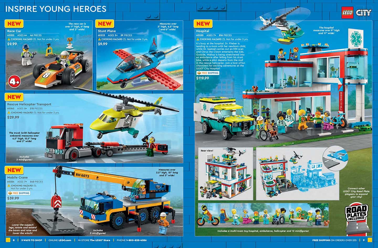
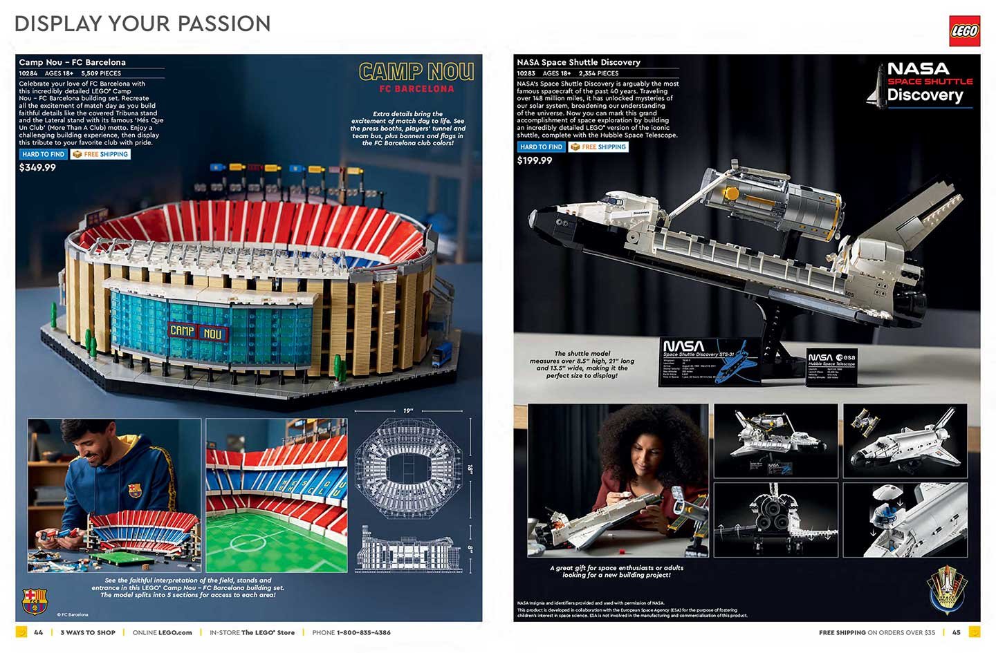
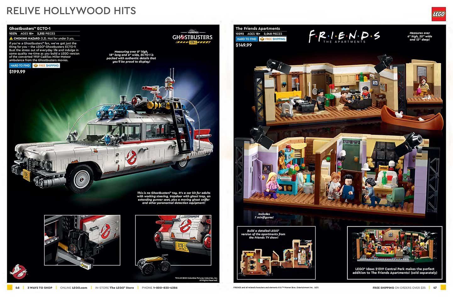
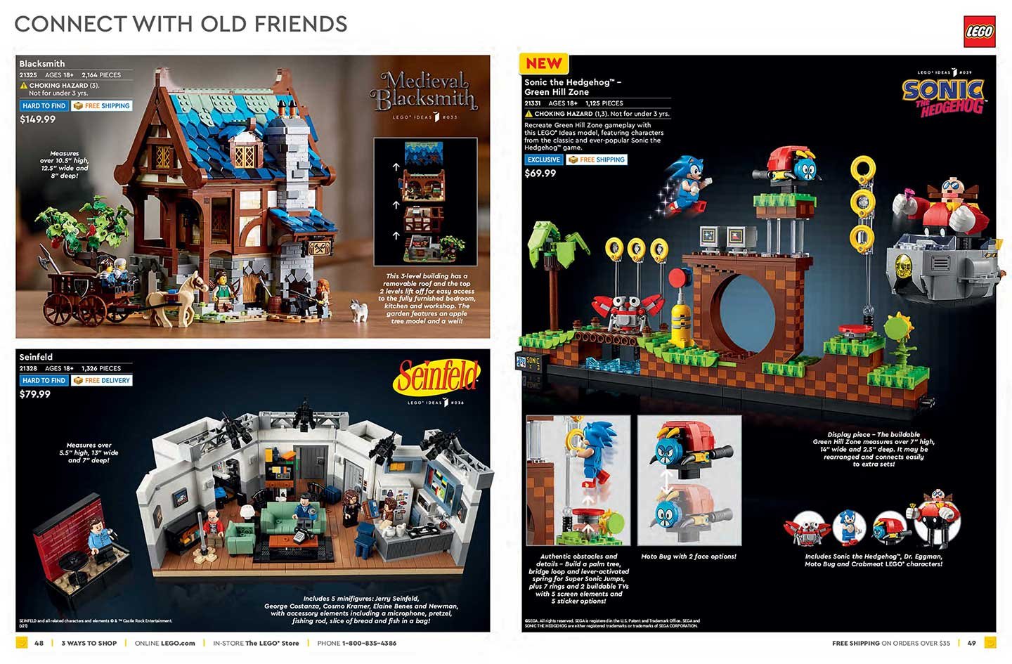
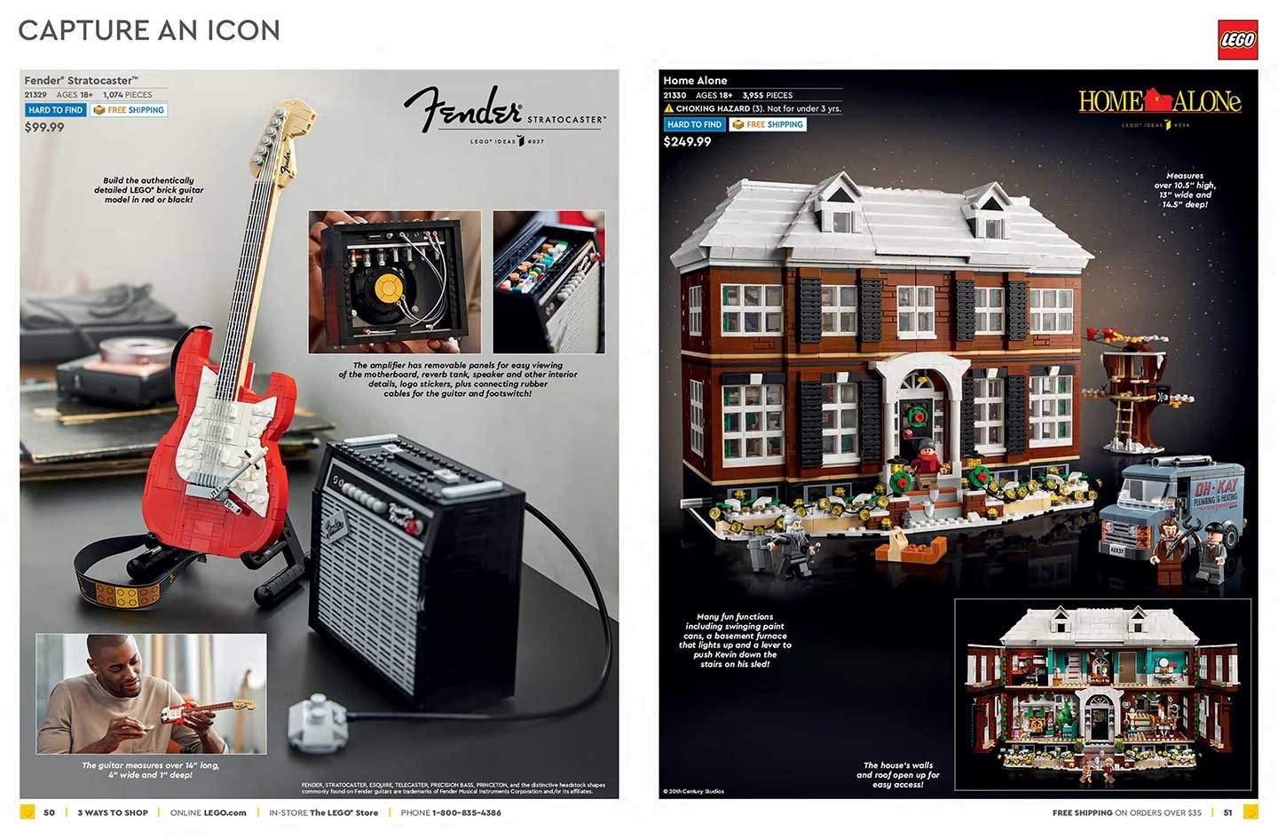
The LEGO Catalog ships globally, is translated in up to six languages and is a huge driver of sales. The page layout was discussed with the marketing department to make sure the products were given proper exposure according to price point, supply and demand. I was responsible for the layout and design of each spread along with insets, gatefolds, front/back covers and templates along with creating special page themes/styles that would coincide with current campaigns and the seasonal holidays.
January 2022
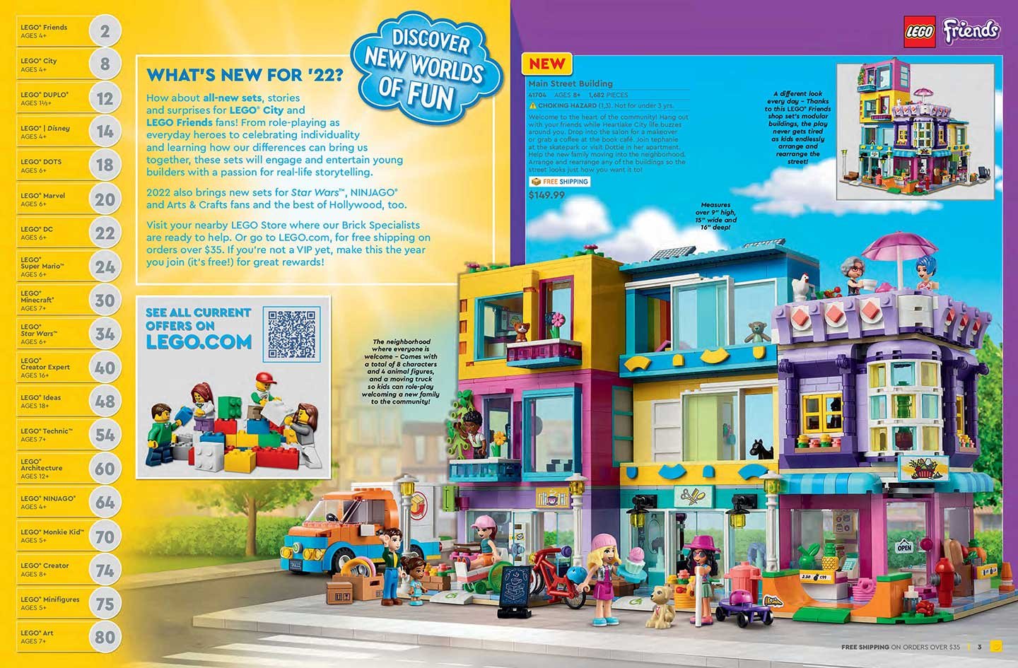
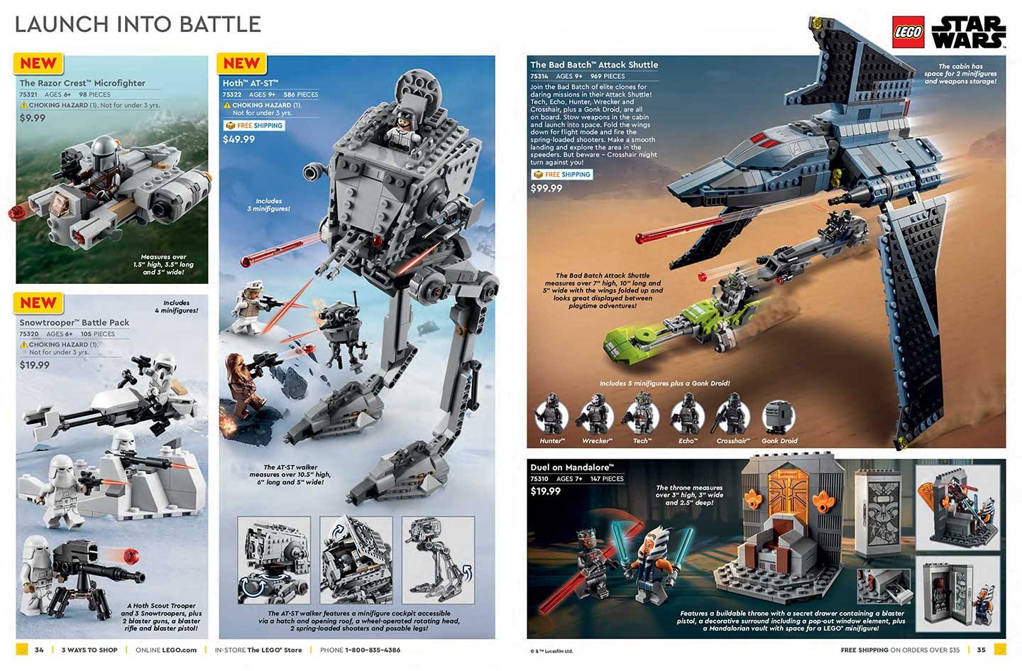
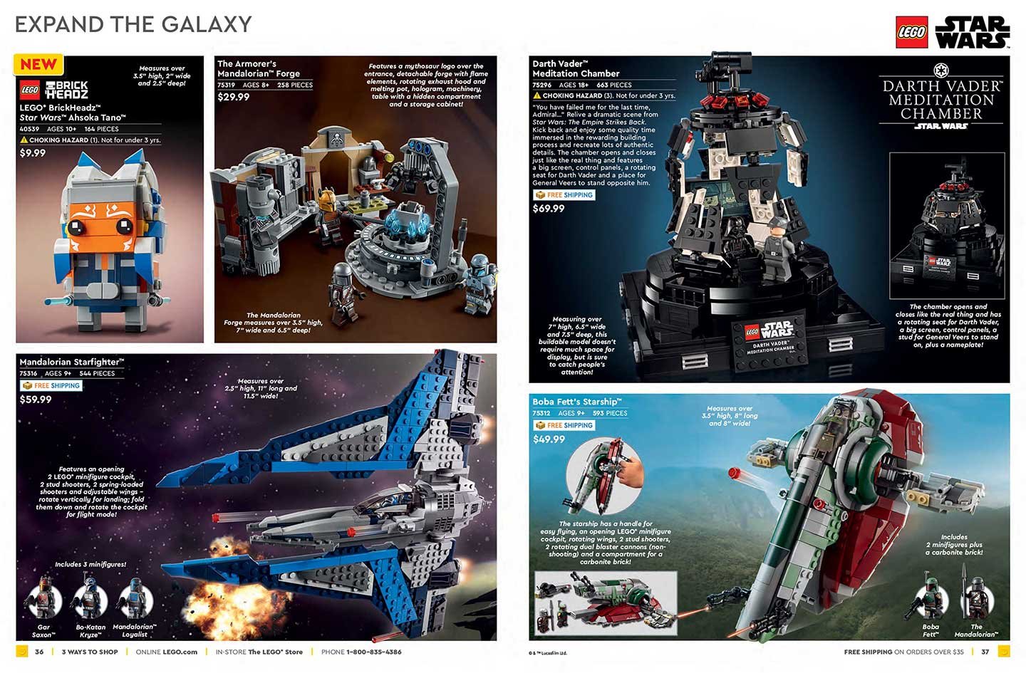
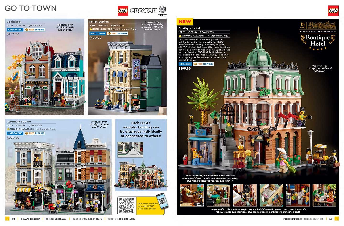
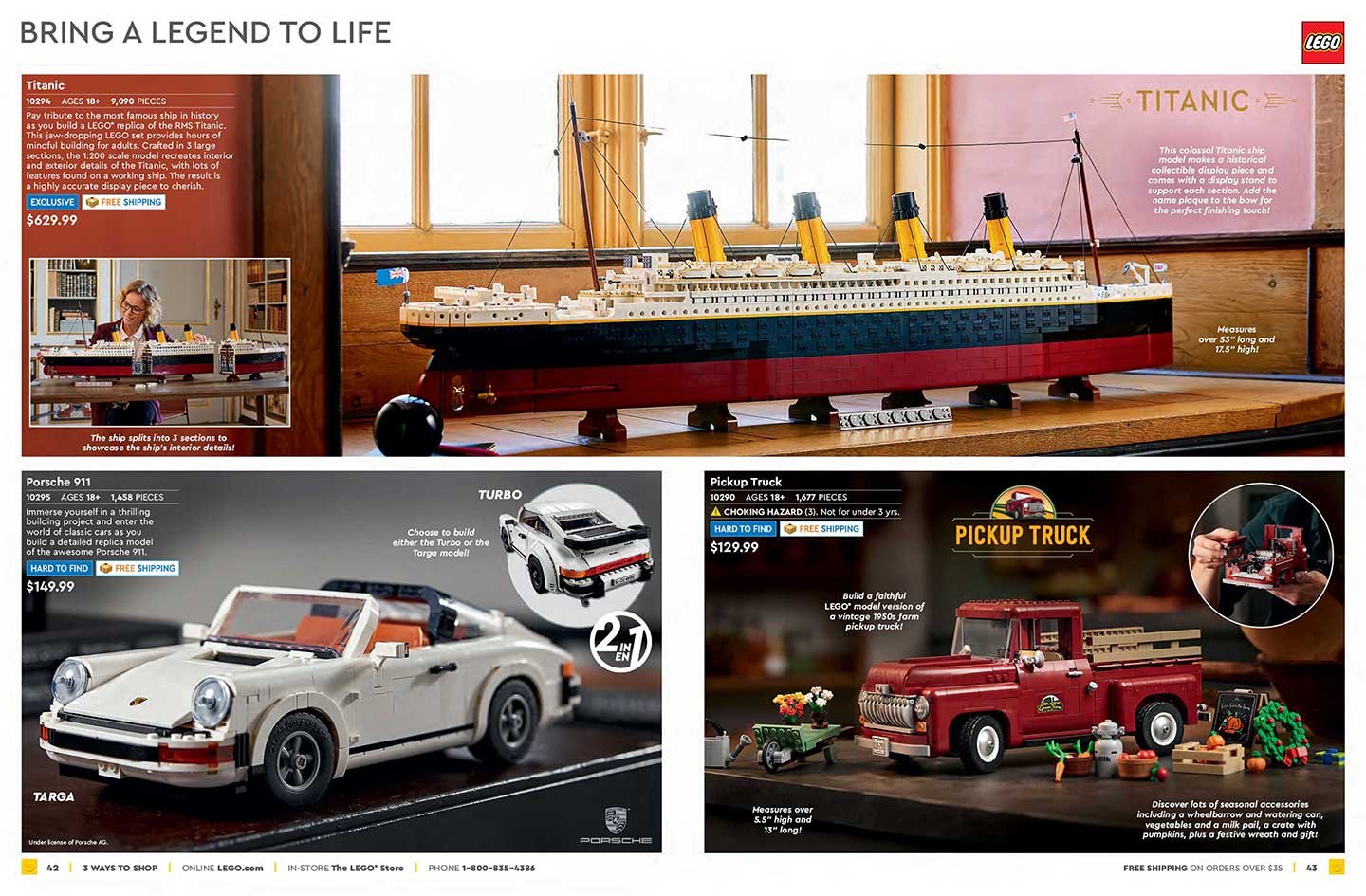
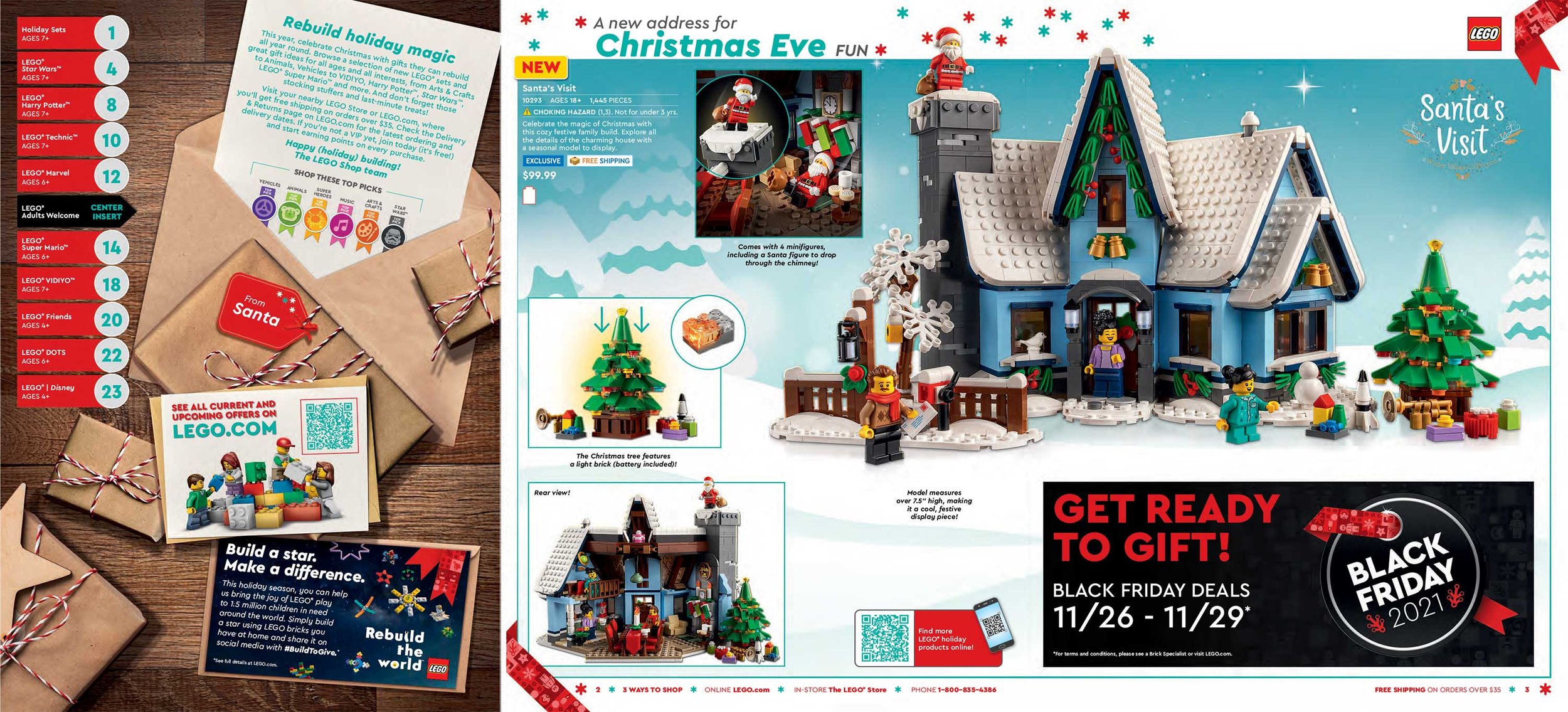
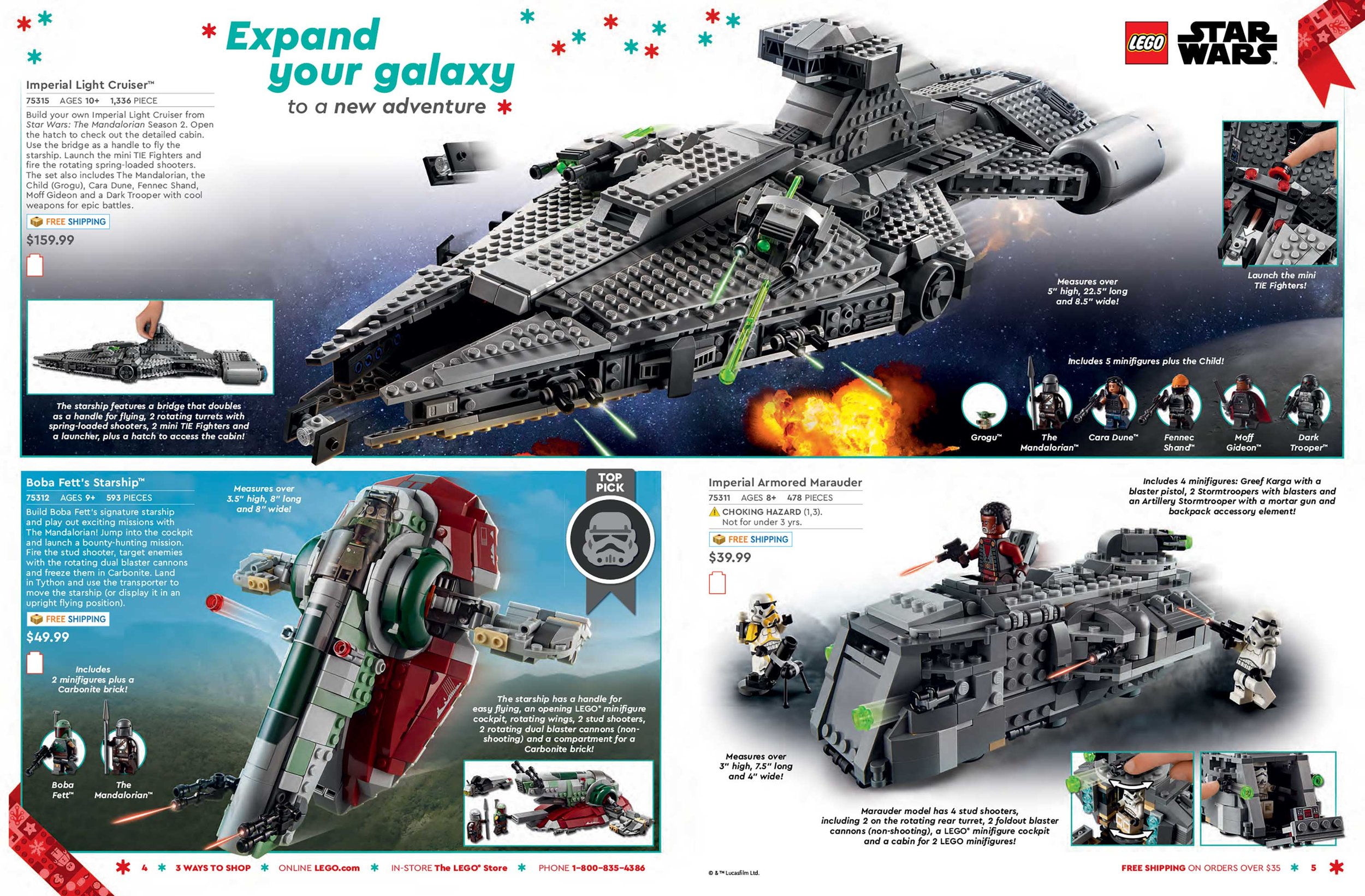
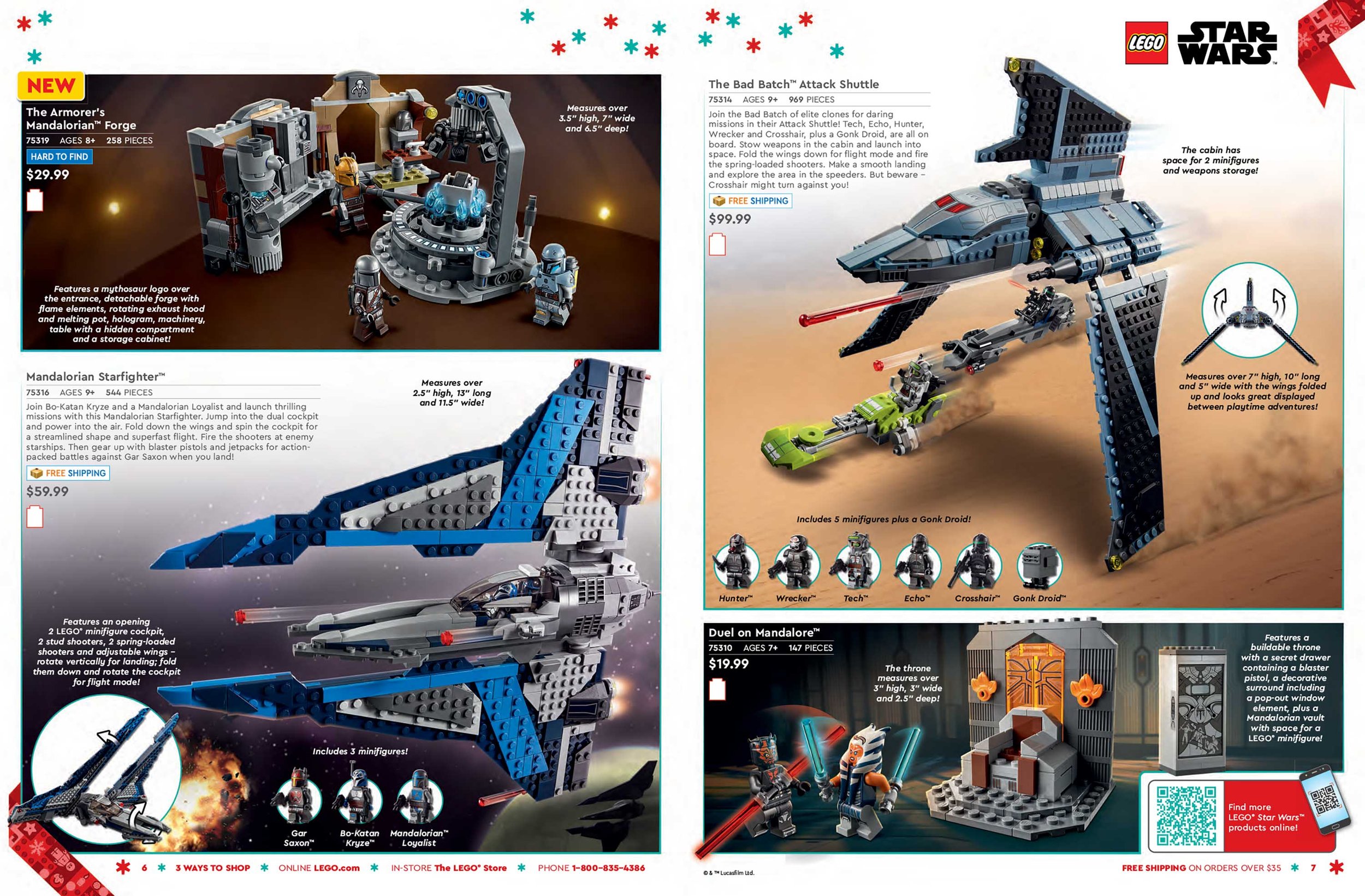
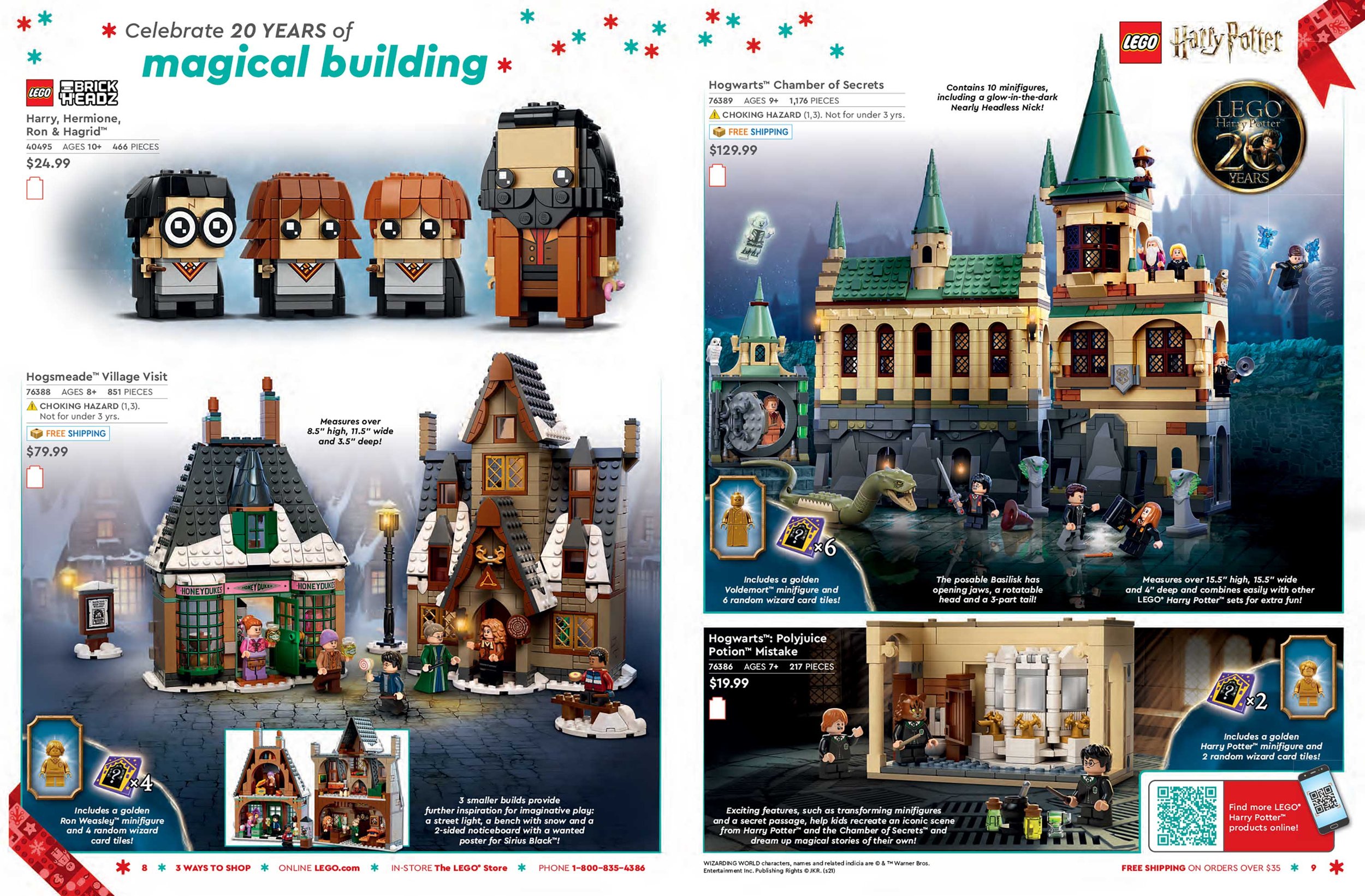
Late Holiday 2021
LEGO® Club T-Shirts
The LEGO® Club Magazine is a recruitment publication distributed across domestic and foreign markets. T-shirts were given out during special events such as conventions and store openings. The t-shirts featured were drawn in Illustrator.


MILLENNIUM FALCON BUILDING INSTRUCTIONS
The Ultimate Collector Series is an exclusive line of Star Wars™ products that offers the consumer an in-depth building experience. Catering to adult fans and advanced builders, the goal of these pages is to deliver an exclusive look into the model design process in addition to behind the scenes film content. The 75192-Millennium Falcon LEGO® set is the largest and most expensive set to date and the instructions book had to reflect this value.
I orchestrated the layout and content, created graphics, set direction for photo shoots and worked closely with writers to deliver a rich and comprehensive experience to collectors. I pitched the concept of a timeline highlighting the previous Millennium Falcon sets and researched specifications of each set that would highlight the evolution of this beloved model through the years.